I recently stumbled across screenshots of old websites of mine and was hurled into a state of reminiscent shock. I knew they were bad, but wow they were outstandingly horrible (redeemed only by their microformats support! I kid, I kid). Several years and a few Georgia Tech design and HCI courses have passed since those atrocities graced the web but I archived them in a sort of reverse portfolio as a personal reminder of how much my design sensibilities have matured. Only in the last year have I begun feeling slightly more confident about my design quality and process.

I have yet to consider myself a real designer and there are quite a few things I would do differently with my most recent work on Notifo and Pic A Fight. But I've learned why my work nowadays is better than from years past. I am aiming to somehow share some of these thoughts brewing in my head with this post today.
I have been brainstorming for the past few days about how to scope this article. Unfortunately I don't think I can distill everything about design into this or any number of posts. For one, design can be very subjective (or just plain wrong at times). Second, there's a sharp distinction between graphic design and user experience that deserves its own article. Third, there's a whole world of typography, color theory, gestalt laws, fitts' law, hick's law, visual hierarchy, UI patterns, layout mastery and copywriting that needs to be explored first hand. But most importantly, I'm still learning too. This is not a definitive guide, just a friendly pointer for startup folks getting into design.
What I can do is share what has worked for me. I won't get into how to do the technical side of things, because let's face it that's just a Google search away and you'll probably find a great article on Smashing Magazine showing you Sass, writing mixins, learning to put CSS3 vendor prefixes ahead of real properties and so on.
Subtle is key! Except when it's not.
When I was a wee pixel pusher I would overuse whatever graphic effect I had just learned. Text-shadow? Awesome, let's put 5px 5px 5px #444. Border-radius? Knock that up to 15px. Gradients? How about from red to black?
You can imagine how horrible everything looked. Now my rule of thumb in most cases is applying just enough to make it perceivable, no more. This usually means no blur on text-shadow and just a 1px offset, or only dealing with gradients moving between a very narrow color range.
Then what do I mean about "except when it's not"? Take for example visual hierarchy — where to draw someone's eyes first with color, contrast and proportion. If you are going to increase the font size of a particular element, don't increase it by 1 or 2 points. Increase it by 10. Here's a nice test: take a screenshot of your website or layout and make it 3 times smaller. Can you still see the main headline or call to action well? No? Make it bigger!
Get Inspired and Stay Organized
This is not a new concept by any means, but it bears repeating: keep the right side of your brain engaged by regularly seeking great website designs, reading about design, sketching site layouts (or anything really) and more. Whenever I see a website I like, or even just a particular element of a site, I take a screenshot and archive it. I have been doing this for at least a year with the help of LittleSnapper. Be warned, the app is a little slow. I wish someone would make a better competing product. I would pay 100 for it.
 Easy to use with their browser bookmarklet. LittleSnapper stays out of sight and saves the screenshots.
I have amassed over 700 screenshots so far. Not a day goes by that I don't archive something nice I see online. There is an app in the Mac App Store called Galleried which is the desktop app equivalent of browsing many CSS galleries and helps too.
Process
My typical site redesign process usually goes like this:
-
Get in the mindset of the target audience. Since this is your startup this probably won't involve much research as you are likely already the domain expert and ideal customer of your product. If not, checkout the Five W's of UX: Who, What, Where, When, and Why. Keep a clear cut use case in mind throughout the redesign.
-
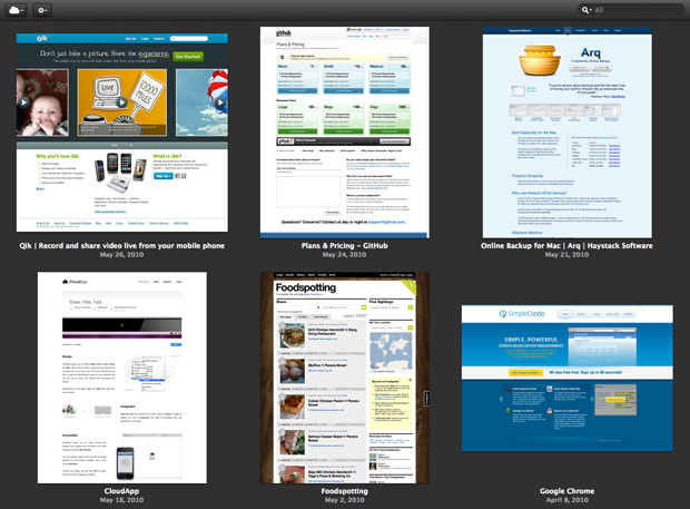
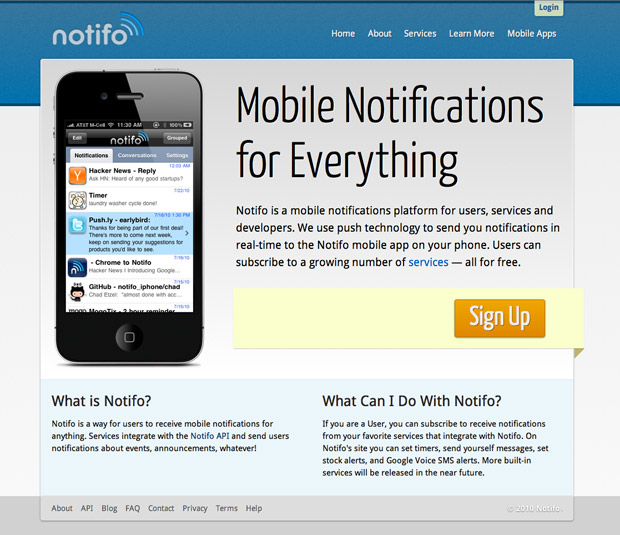
Spend a few hours trying to formulate my thoughts about how the first step affects layout. Should it have one big call to action for a primary use case? Are there multiple needs and products that need to addressed? What will the hierarchy be like? What gets the most attention? Flip through the aforementioned screenshots I take everyday and find 5 or 6 layouts I admire most. It might not be overall layouts, but particular elements I like. For example, these were some sites I had in mind when in the early stages of planning Notifo's layout. The key feature I liked from all these sites was strong header navigation. I always start with navigation, determine the primary call to action and accompanying graphic/illustration/video/et cetera. The rest seems to follow naturally.
- The next step is either a few quick layout sketches with whatever I have on me — either my trusty Cambridge notepad and uniball Super Ink pen or UI Stencils pad — or straight to HTML/CSS. More often than not I start directly in HTML/CSS. This is a big point of contention for designers. There's a large camp of folks that start with mockups or wireframes with Photoshop, Mockingbird/Balsamiq, OmniGraffle and so on, and those that begin in markup. The points for starting with the former are that it's easier to change things on the fly and you're more open to trying radical changes that would usually require substantial markup changes. Kyle Neath of GitHub prefers a mixture of both methods: screenshot stuff, cut it up and tweak in Photoshop, then implement.
 Little known fact: the Ballmer peak phenomenon doesn't only apply to coding, it works with design too. That explains the two buck chuck.
-
I sketch 2 or 3 simple layout variants on a notepad, no more than 20 minutes, then go straight to markup. I setup Sass, import my mixins, a reset and get to work. Once a basic semblance of a website is up I actually do a lot of design tinkering in Chrome Dev Tools. I used to staunchly prefer Firebug but webkit and Chrome Dev Tools have come a very long way.
-
And then I take more screenshots of the Chrome Dev Tools-edited variations I like. I probably had 10 variations before I went with the one I liked for Notifo.
-
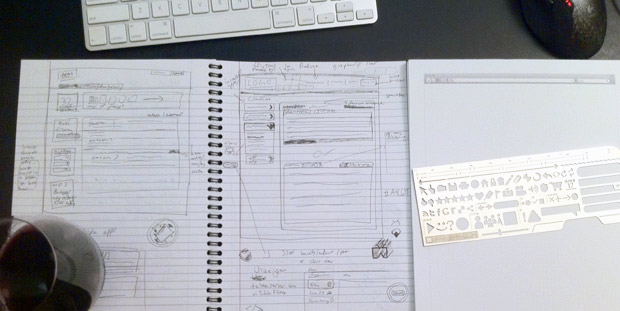
I tend to start with grayscale then tinker with color after I have the visual hierarchy down. I use xScope to help align anything and everything. It's perfect for quickly measuring space between elements (the red lines and measurements in the first image in this post is xScope).
 One such work in progress/tinkering with chrome dev tools screenshot. I had just started to add color and texture to the header. Up until then it was all gray. Not really worrying about copy just yet.
-
Color adjustments and typography tweaks usually continue through to the very last minute. I'm always experimenting to see what it would look like with other tones, hues and font stacks.
-
Most work up until now has been for the homepage. Mentally prepare a sort of style guide — modules or patterns that will be used throughout the site. Classes to use for various sidebar elements, secondary navigation and so on. Update layout to work for content pages and style one-off pages like login, signup and a tour or benefits page.
-
Ask around for feedback and incorporate changes.
For smaller sites like Pic A Fight I skip all this and just wing it in HTML/CSS. On the other hand sites like Skribit have several layouts — i.e. the homepage structure was completely different to the structure used on logged-in user pages, so there's some extra work there.
Required Reading
While I could easily recommend many great design books, such as "Universal Principles of Design" and Norman's classic "The Design of Everyday Things", I'll start with some of what I consider to be the essentials for web and graphic design.
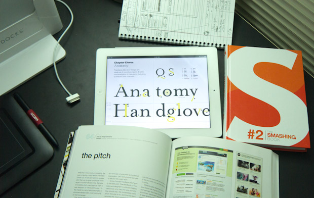 Coders that get stumped usually do something non-code related for a while and come back to see that the code gremlins have fixed their problem or going for a walk helped them think outside the box. Something similar applies for design. Keep your brain active by constantly seeking new sources of inspiration and creativity. I got a Wacom tablet to doodle in Illustrator and found that helps with idea generation a bunch. Yes, this is a long caption.
Read the Non-Designer's Design Book and learn about basic color theory and C.R.A.P. — Contrast, Repetition, Alignment and Proximity. Cool colors like blue recede while warm colors like orange seem to move toward the viewer.
For example on Notifo I used a tint of orange and analogous colors for the foreground and call to action, respectively, with complementary blue as the background. Learn about color complements and analogous colors; they are used most often and absolutely come in handy when doing the most daunting task for new designers, picking colors.
Mark Boulton's A Practical Guide to Designing for the Web is fantastic. I purchased the PDF to help support Mark, but a free online version is available as well. There are some sections in the book about how to get started freelancing, business plan stuff, dealing with client briefs and so on, but you can skip that. You're already well on your way with your startup.
If you were going to only go with one design book, this would be it. Mark covers it all: type classification, typesetting, everything about color (with site examples), color as emotion, designing without color, using and not using grids, composition basics including lead room and movement1. It makes for a fairly quick read. Knock it out on a lazy analog Sunday and achieve design enlightenment.
 An old design class homework assignment of mine in Adobe InDesign. Reminds me of my PageMaker 6.0 days on high school yearbook staff.
The Elements of Typographic Style by Robert Bringhurst is widely considered to be one of the great works discussing typography but it is mainly concerned with print. Fortunately Richard Rutter and Steve Marshall have adapted Bringhurt's work vis-a-vis the web. The Elements of Typographic Style Applied to the Web is a great foundation in typography for the web, including various CSS snippets throughout. For example, never use line-height with absolute units as that can actually result in negative leading on browser font-size increases. Use a unit-less value2 greater than 1.4 to keep leading proportional to text size.
More Homework
Get a Typekit account and rigorously browse through fonts. Take note of their organization structure. Learn about font stacks. Try out some fonts on a site of yours. Make sure you set fallback fonts. Experiment. Learn about lettering.js. Aim for contrast while avoiding conflict. Play with font size, weight, structure, form, direction and color. Typography is easily one of the most overlooked aspects of design for new web designers. It makes a huge difference and is worth exploring. Great designers treat text as UI has always been Cameron Moll's mantra.
A design is in conflict when you set two or more typefaces on the same page that are similar — not really different and not really the same. [...] When you put two faces together that look too much alike without really being so, most of the time it looks like a mistake. The problem is in the similarities because the similarities conflict. Robin Williams, The Non-Designer's Design Book
Briefly read up on the Gestalt Principles as they refer to user interface design: proximity, similarity, good continuation, closure, common fate, past experience, figure & ground. And Fitts' Law too. Then find out what UX really means.
But Stammy, we launch in one week!!?!111
Yikes. In that case, here are a few pointers:
- Nothing in this list matters if you have shitty marketing copy. Run your copy through a fine-tooth comb. Then do it again. Sell people on benefits, not features. How long has your site/service/app been around? Will you be around in a year? Tell me about your team (I want an about page with mugshots!3). Who are your current customers and how do they use it? How can I trust you with my info? Can you share any interesting usage/et cetera numbers?
- Buy a nice set of icons and use sparingly. If I see yet another site using Silk icon's I'm going to go crazy. Try Picons, Pictos or Helveticons.
- Everything that can be clicked needs to have a hover state and preferably an action state as well. Feedback is important in good interface design. LoVe H****Ate: link, visited, hover, active

A button I added two states to for Skribit's (my first startup) Twitter integration.. feedback galore!
- If it can be aligned, it should be aligned.
- When selecting colors for gradients in Photoshop, keep in mind that adding black (shade) or white (tint) to a hue (pure color) desaturates it. Not always a bad thing per se but it often makes for some muddled colors. Spice it up by trying different blend modes.
- Use complementary or analogous colors to start and don't have more than 2 dominant colors. There are many exceptions to this when you get better. For now, find some palettes on ColourLovers or pick tints/shades from 0to255.
- Textures! Download tileables or make your own grain, fabric or other such texture and use as a transparent, repeating background for large elements that would otherwise just be solid colors. But keep it subtle! The texture should only be perceivable when looking closely, not when 3 feet away from the computer. Also make sure that your texture goes with the theme of your design. A rust texture doesn't play too well with your futuristic iPhone app landing page. That can conjure up some cognitive dissonance. Your app is telling me it's the new hotness while your rust background texture is telling me it's old and busted4. Similar issues can arise with picking fonts that don't go with the mood of your site.
- "Always adjust opacity. Nothing is totally black or white, dark or bright. A semi-transparent black or white line, glow, shadow or shape goes a long way." -Mike Rundle
- Put non-essential links (anything that doesn't help new user signup conversion) in the footer. That's the first place users go when they know what they're looking for. Regulars in the footer include a link to a contact page, about, blog, and sometimes sitemap. Available yet out of the way.
- Plain edges are boring. Add a subtle 1px inner line slightly lighter than the background if dark. Use rgba(255,255,255, [value from 0-1]).
- Not quite sure how to style a particular element? Browse through UI-Patterns.
- More white space. A good rule of thumb is that your padding and margin should be roughly equivalent to the font size used near that element.
- Do you have a definitive call to action on your homepage?
- Aid gestalt proximity and closure by grouping related items together with light bounding boxes or borders.
- Have a long list of elements? Zebra-ify them and use alternating and subtle background colors.
- Putting padding on your form inputs! Tooltips or extra description for non-standard fields. Style
:focustoo. - Avoid having more than three levels of boxes inside of boxes — especially if they all have drop shadow and borders, they tend to make a bad effect on the bottom when you see 3 chunks of lines.
- Is the largest element or headline on your homepage the most important thing? Make sure that's what you want them to see first.
- Finally, you don't have to fill up all of your available space!
And if you have an extra minute to spare before launch, setup Optimizely5. Start playing with some simple A/B testing on your homepage. Yeah I know A/B testing sounds scary at first. Optimizely makes it easy, just give it a shot.
Try New Things
While it's not quite the best strategy for my inbox, whenever I see a new site or service launching I readily toss in my email so I can be sure to tinker with it first thing when it comes out. I get to experience new layouts, designs and good UX almost every week by doing this. My co-founder, Chad, is the same way when a new API comes out and must tinker with it.
Most of what I described in this post is about design, not user experience or usability. Your site can be sexy and pixel perfect but if the flow for a user to complete a specified task is unintuitive and requires too many steps, it makes for a poor experience. Likewise well-researched information architecture (layman's: the organization and labeling of your site's sections and pages) is crucial. UX is a field I'm just diving into. Check back in 10 years for my definitive UX how to guide. Probably best if you subscribe. :)
In the meantime, checkout 52 Weeks of UX.
More books..
For those that want a massive list of good design reading, indulge below. I've only read or skimmed through about half and heard good things about the rest. You'll probably want to start with Steve Krug's work. Much of the rest is not quite geared for the web but helps paint a bigger picture about design as whole.
- Envisioning Information by Edward Tufte
- The Elements of User Experience by Jesse James Garrett
- Don't Make Me Think by Steve Krug
- Rocket Surgery Made Easy by Steve Krug
- User Interface Design for Programmers by Joel Spolsky
- Designing Interfaces: Patterns for Effective Interaction Design by Jenifer Tidwell
- The Nature & Aesthetics of Design by David Pye
- Designing for the Digital Age: How to Create Human-Centered Products and Services by Kim Goodwin
- The Humane Interface: New Directions for Designing Interactive Systems by Jef Raskin
- The Inmates Are Running the Asylum: Why High Tech Products Drive Us Crazy and How to Restore the Sanity by Alan Cooper
- About Face 3: The Essentials of Interaction Design by Alan Cooper
- The Smashing Book by Smashing Magazine
- The Web Designer's Idea Book #2 by Patrick McNeil (great for inspiration)
- Designing Interactions by Bill Moggridge
- The Information Design Handbook by Jenn Visocky O'Grady
- Change by Design: How Design Thinking Transforms Organizations and Inspires Innovation by Tim Brown
- The Art of Innovation Lessons in Creativity from IDEO, America's Leading Design Firm by Tom Kelley
- Thoughtless Acts?: Observations on Intuitive Design by Jane Fulton Suri and Ideo
Thoughts?
Drop me a comment below. This post was very much a raw brain dump. There are many facets to design, especially ones I admittedly have no clue about and am learning, that I couldn't get much deeper than this without making it a 10 part series. Chad says I should. Maybe I will after my secret redesign and UX challenge starting this month. Thanks for reading.
Disclosure: some book links use my Amazon associates code because I'm broke as a joke.
1 I can't stress enough how important this is! I very much dislike when sites have screenshots facing or angled the wrong direction. The subject of any photo or image can draw the reader where to look next.
2 Aside from z-index, line-height is the only CSS property that can go unit-less
3 I want to know you and your company's story. This is a chance to make an emotional connection with the prospective customer. Lure them in so you don't have to waste your time with I N C E P T I O N later! Win.
4 MIB reference for $1000 Trebek. Did you know they're filming MIB 3? Crazy.
5 Full disclosure: Pete, who you can read about from the Optimizely about page (see footnote 3), once bought me a grande iced tea at a Starbucks on Van Ness.