
It was March 2020, I was in New England when covid quarantine had just begun and I found myself much more homebound. In these situations I'm not one to just do nothing. I always have some sort of project or hobby to keep me busy, be it taking and editing photos, writing detailed blog posts, or coding something.
I had always wanted to learn iOS development, so this felt like the perfect opportunity. I was particularly keen to learn SwiftUI to build my designs natively. Years back I had dabbled with writing an Objective-C app, but it never quite filled me with joy, to say the least. As a designer, I've spent the last decade getting good with prototyping tools and frameworks to mimic realistic, interactive mobile prototypes. Building it myself was the natural next step to give me even more control over the experience, and get even deeper into the craft.
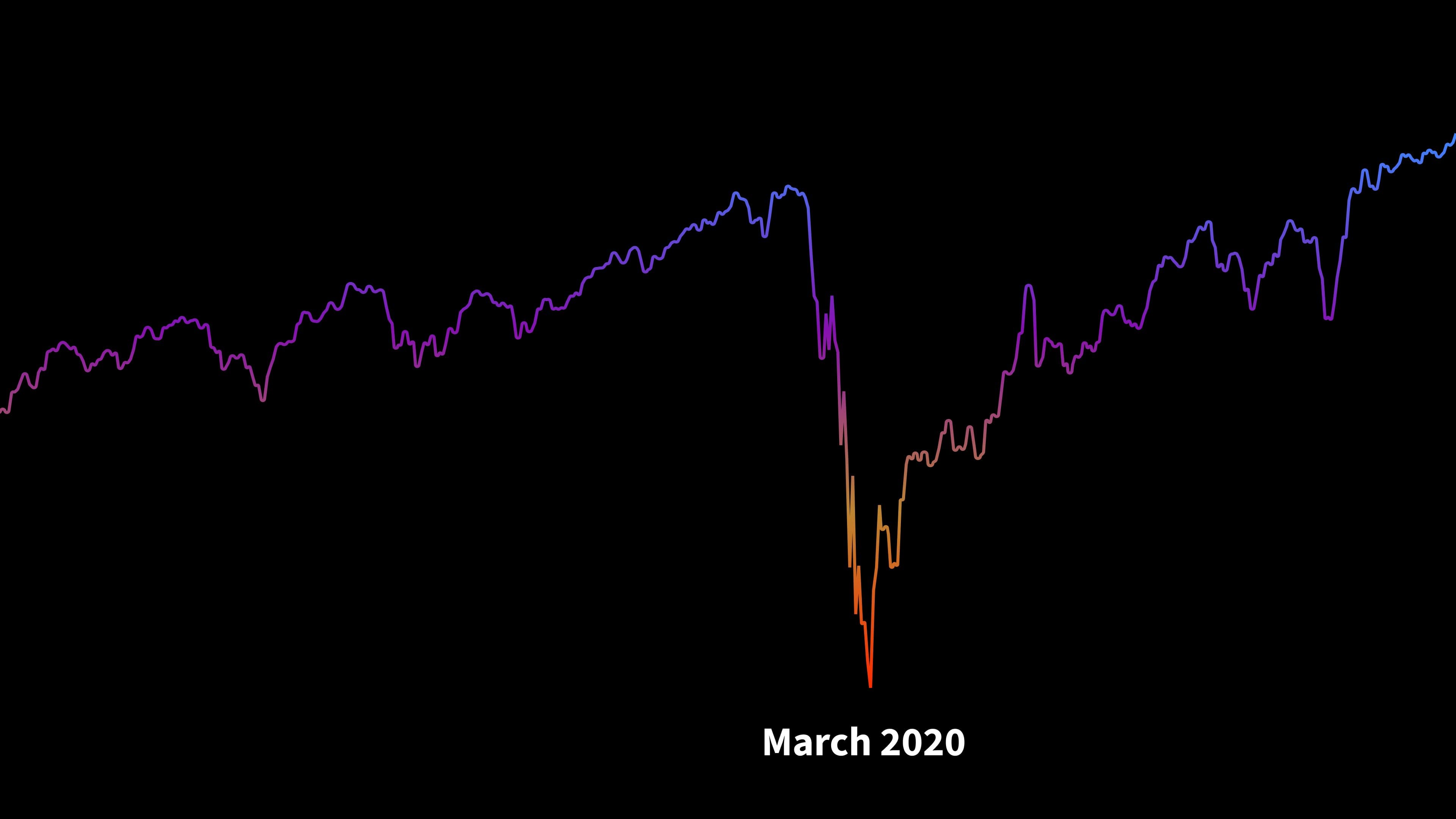
I started learning Swift and SwiftUI basics with courses like Design+Code, and Hacking with Swift. But I knew myself—I learn best with a project of my own. I knew exactly what I wanted to build: a better stock portfolio tracker. The stock market had taken a plunge with covid and I was doing dozens of trades per week with everything on sale. It would be fun to have a simple app of my own to track the performance of my trades instead of dealing with the subpar sites and apps from my stockbrokers.
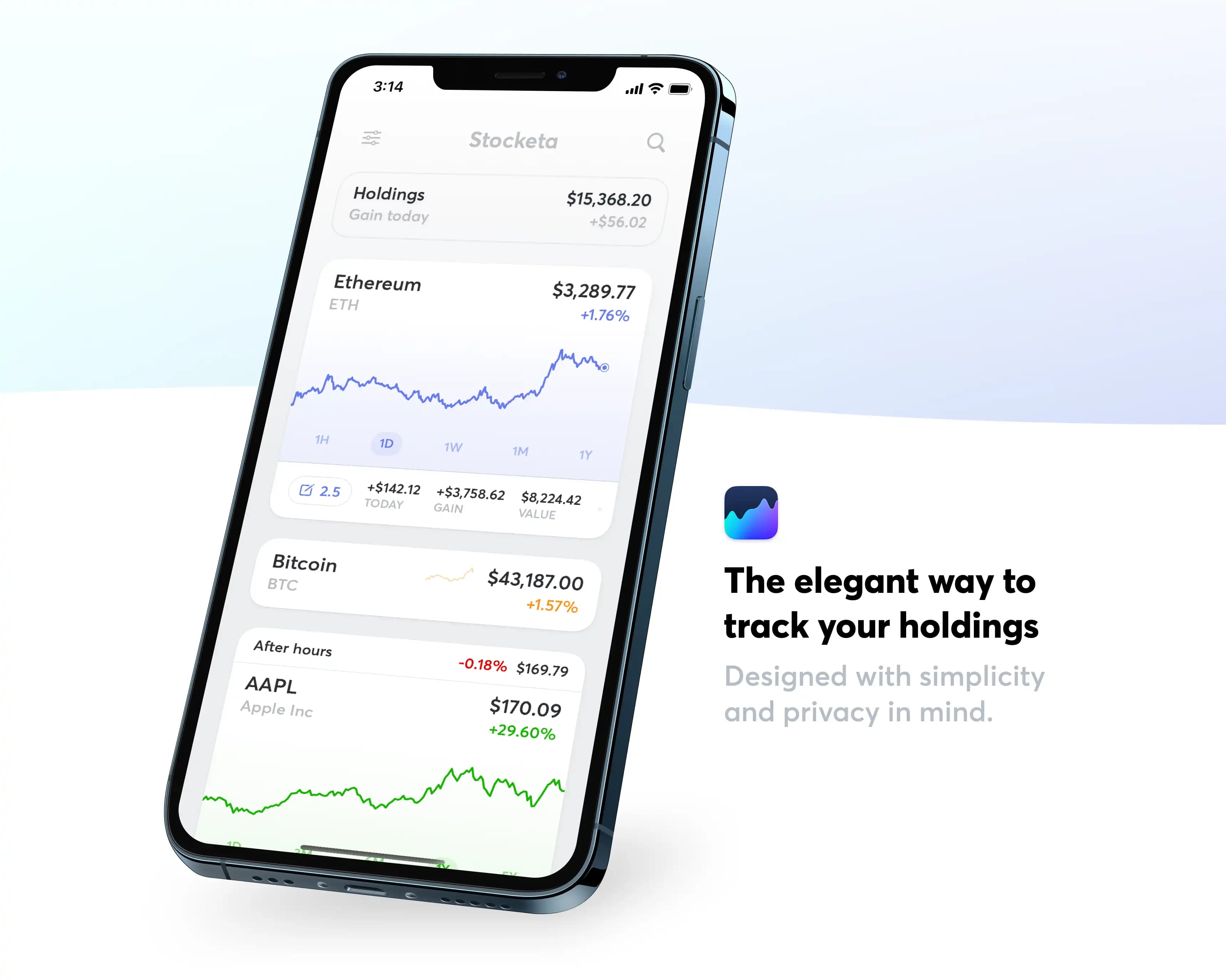
Little did I know this project would consume my nights and weekends for over two years, often spending 10-20 hours a week on it. I built a ton of functionality, sweat all the details, wrote a comprehensive node backend for it, created an LLC for it, and managed an active Testflight. I was learning Swift and SwiftUI along the way, so I was often redesigning and rebuilding as I went.
Eventually, I decided to stop pursuing it. I'll get into the why a bit later. This post is for me to document Stocketa. I designed and built a lot that I'm proud of and want to have somewhere to archive it before I pull the plug.
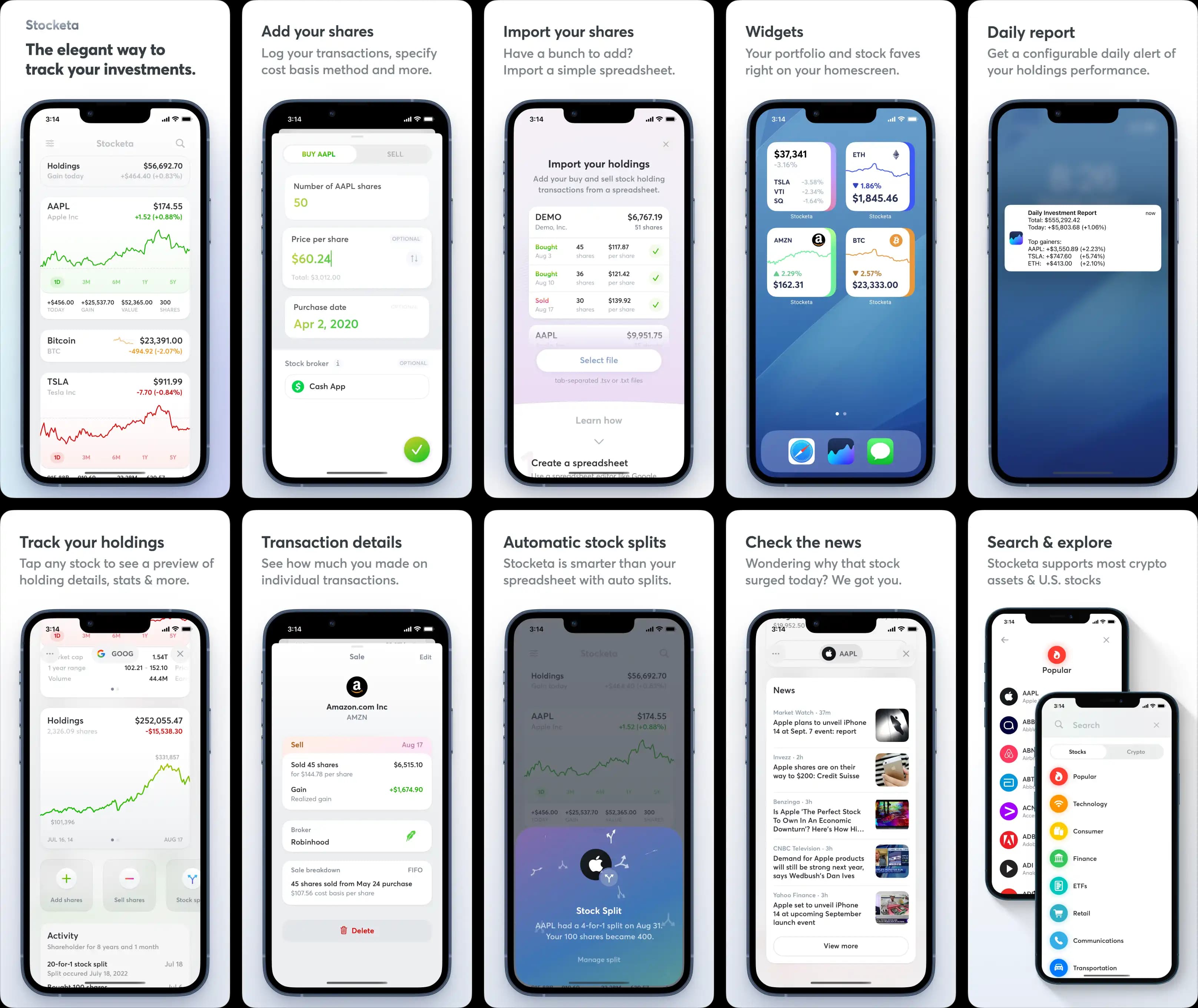
The mostly-finished App Store screenshots that would have been published.
What is was Stocketa
Stocketa was a simple portfolio tracker designed with care. It came out of my frustration of having to check the clunky apps and sites that my brokers had just to get a glimpse at how my investments were doing. I'm a casual investor and don't need much from a tool like this but I had assets in various places, and I just wanted one easy and well-designed place to check them. I wanted to see real per-transaction gain/loss info, based on my own cost basis.
While there are tons of apps, brokers, and neobanks that address this, nothing quite felt like what I wanted. There were several types of solutions in this space:
- First off, there are simple stock apps like Apple Stocks that let you see stock charts, news, and more. They have good data and don't require any accounts to use. However, they offer no functionality to log your holdings and track your gains/losses.
- There are lots of broker apps (e.g., Robinhood) that let you trade and track your holdings, but they only let you see your holdings from them, not from any other financial services you might use.
- Then there's a whole category of what I'd call advanced stock services like TradingView (and several that have since died or pivoted over the years), but they're not mobile-first or as elegant as I wanted.
- There are broader investment advisor services like Personal Capital. While they do often have some aggregator functionality to link up your other accounts, they're not that powerful for diving into individual assets, aren't particularly well-designed, and are primarily focused on upselling you on their own investment advising services (seriously, I used to get endless 8am calls from Personal Capital).
- And there are lots of smaller apps on the App Store where you can track your holdings but the design and UX leaves a lot to be desired. I've tried most of them.
From a design perspective, I generally found that financial apps bias towards density when displaying your assets. They assume you have tons of stocks and prioritize a list view where you have to tap in to a detail view to see more info. I found myself constantly tapping in, manipulating a chart or looking at some basic stats, then swiping back and repeating all that for several stocks. It was not easy or the kind of at a glance info I wanted.
That left me with my challenge. I wanted a simple portfolio tracker aimed at the casual investor. It didn't have to do it all, but it should aim to do a few things well. An app just for me.
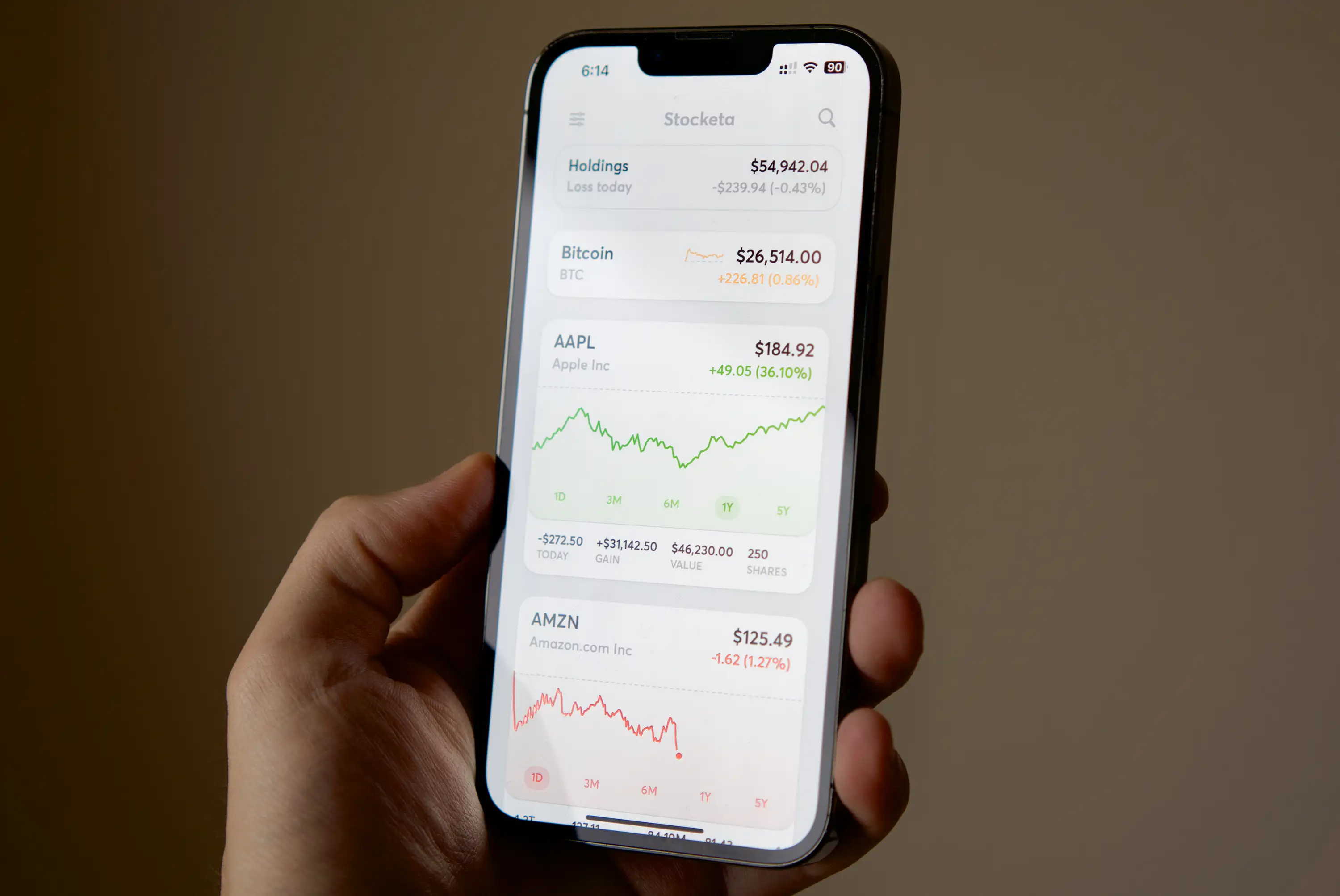
Going custom
I was more than thrilled to be working on a new app from scratch. After years of working at large companies with rigid design systems and gobs of stakeholders for every little design decision, I was yearning for some creative freedom. Freedom from process, freedom from typical design constraints. I would be in full control, designing and building it myself. It was my side project after all.
I had gotten tired of designing for traditional mobile apps. You know the type.. you add a tab bar, a typical navigation stack, page header and the app already feels significantly basic, muted, and limited out of the gate.
This was my place to have fun. I wanted to go custom and toss out whatever components the system gives you for free. And I knew that by having to figure out how to build various UI components from scratch, I'd learn a lot along the way. Almost all of Stocketa's UI is custom.
I will say that going custom is almost always the absolutely wrong thing to do 99% of the time. The operating system you're working in—be it iOS, Android, macOS—has invested a ton in a highly-considered suite of components. They're remarkably accessible, well-tested, and work on a variety of devices.
It's absolutely no small feat to consider creating a custom component for your app. However, when going custom does make sense and you're okay with the added scope and responsibility, the app becomes your canvas to do whatever you want and make it yours.
The first area where custom made sense for me was general app navigation. When I got started, I knew I wanted this app to have minimal app chrome. I didn't want a standard tab bar and header taking up space. I wasn't going to require much navigation: most things would just live inside the stock cards from the home timeline.
The app would be focused around showing more with less. Personally, I only cared about tracking a few stocks, but I hated the work of constantly having to tap in to see a detail view, or interact with the chart. As such, the main scroll view needed to be more immersive and not get occluded by unnecessary app chrome.
It started with app navigation, custom stock cards, sheets, and more. Needless to say, I spent a lot of time on the details with everything being custom. Below are a few examples:
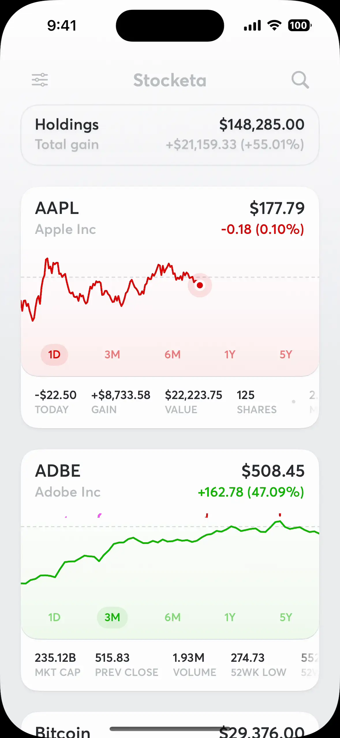
Pull to search
While a pull-to-refresh interaction on a scroll view is common, I didn't want to make refreshing data a core part of the experience. Stock cards automatically update, and pulling to refresh wouldn't introduce any new cells like it would on a social media site, so it didn't make as much sense here.
Instead, I opted to use a pull to search interaction—something that would introduce a new cell to the scroll list after you've found a new stock to add.

Custom stock card, and detail view navigation
Stock cards are the core element on Stocketa and they provide most of the info you'd need inline, along with inline interactions like swipe actions, and chart scrubbing.
For further actions, a tap transports you to another elevation where the stock card stays in place, but everything else vanishes while related cards (like stock news, and holdings details) animate in. This was tricky to pull off well, but the key was overlayPreferenceValue and anchorPreference.
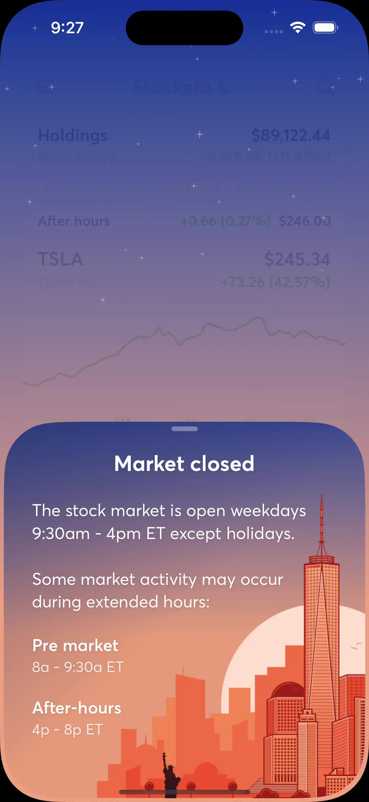
Custom sheets
Stocketa uses custom sheets in a few places, from date pickers to various informational views. The example shown here goes one step beyond, featuring a gradient background with animating twinkling stars via a basic particle emitter. Slowly dragging the sheet up/down also interpolates the background opacity.

Custom app menu
I wanted something a bit more elegant than iOS menus. Something like this would also give me room to advertise Stocket's paid plans, or your current membership status if you already subscribed. It was built in a way where you could dismiss either by tapping anywhere, or by scrolling away.

Custom swipe actions
It feels expected for contained items in a list like this to have swipe actions, such as swipe to delete. I wanted more control over the presentation and decided to build them custom. There's a few details there like the action slowly moving the more you swipe, and then animating to a selected state once a distance threshold has been met.
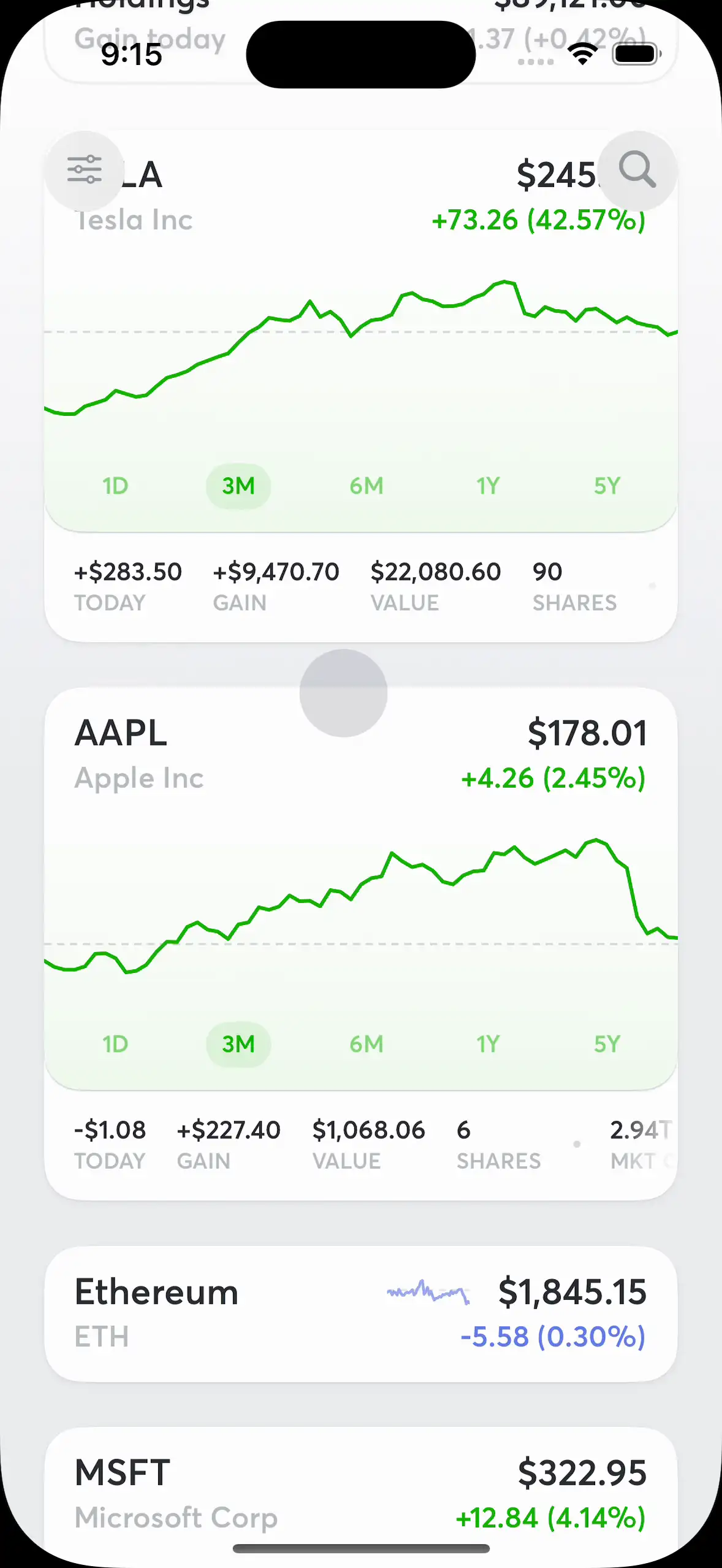
Custom app header
I only need to put two actions in the header, and didn't need a traditional header / navigation bar across other views. I wanted the buttons to be borderless when at the top of the page but transition to subtle buttons on top of the scroll view as it scrolled. I also interpolate the Stocketa text up and away based on scroll.
Designing and building
I started with the basics: getting a scroll view of stock cards working, adding charts, and hooking it up to a database for persistence (initially Core Data before moving to Firebase). Then I added the requisite network calls and polling to update the stock card from a financial data provider. I started with IEX as the data provider as they had a decent API, reasonable pricing, and allowed commercial use, which would be required for a consumer app like this to go on the App Store.
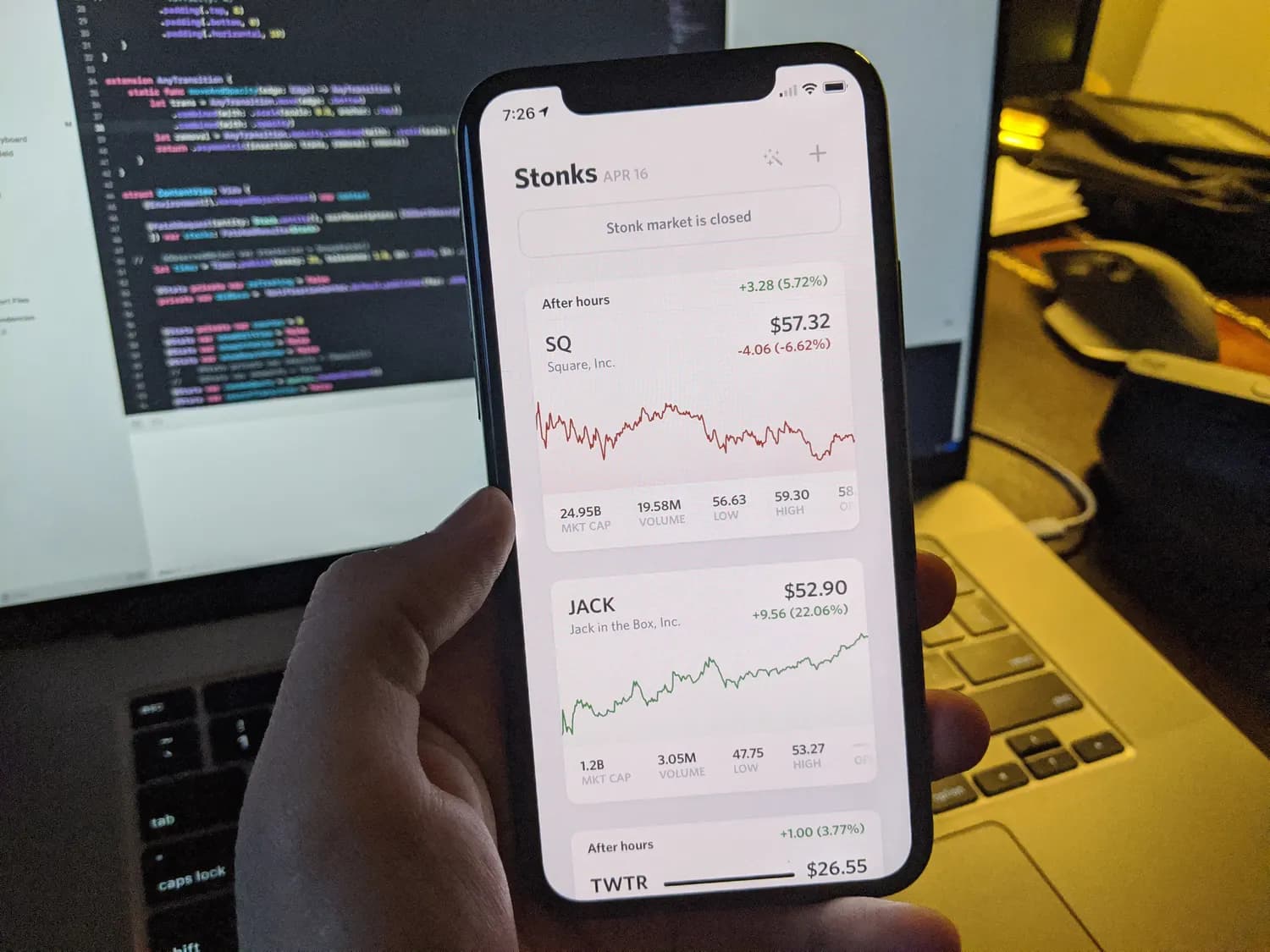
Working on an early build in 2020.
One of the initial key decisions with Stocketa was that I wanted to track stock transactions in a comprehensive way. Simply logging the number of shares you had for each stock was not going to cut it. This ended up being a significant amount of work to do properly, but it was necessary:
- For each stock sale or purchase I wanted to be able to display not only the total gain/loss, but per-transaction gain/loss so you could tell if an individual transaction was a good trade.
- When it comes to stock sales, I needed to know the cost basis method (FIFO, LIFO, et cetera) so I could correctly calculate and display the realized and unrealized gains on a particular transaction. When selling shares, I also needed to know from which previous transaction or transactions the shares would be sold so I could get the correct cost basis and accurately calculate the gain/loss based on the cost basis method.
- And then there was dealing with stock splits, which seems simple at first glance but ended up being quite a bit of work to build in a robust way: not simply altering previous transactions. They should be automatically applied for new splits, but also able to be manually applied if you didn't log split-adjusted transactions.
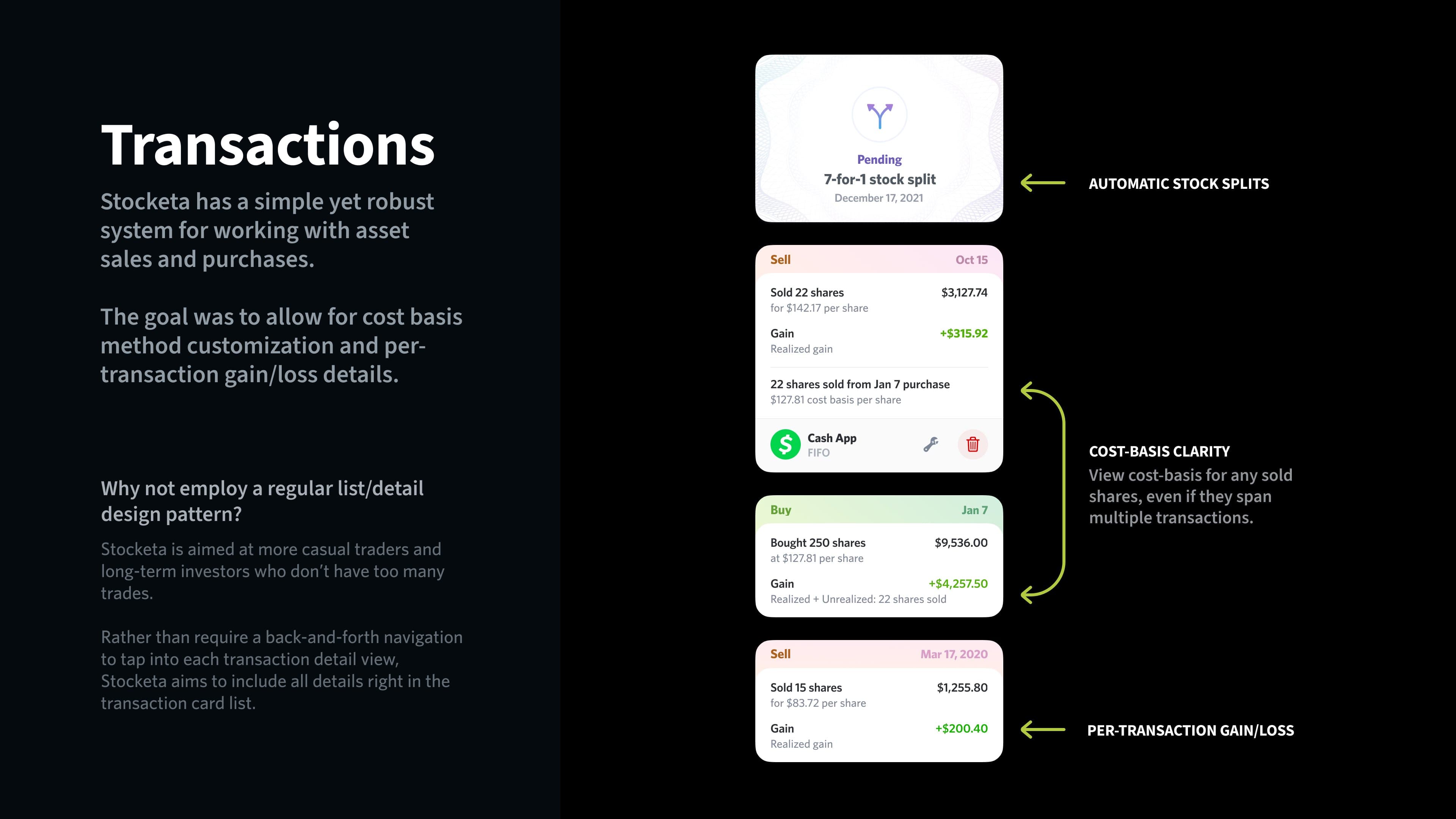
A glimpse at part of how comprehensive transaction types in Stocketa were shown.
At some point I gave it a name: Stocketa. In Greek you might say "marketa" (Μαρκέτα, though αγορά might be a more proper word) when referring to a market, so this was like coalescing Stock and Market with that in mind.
When I was interviewing for a new job in 2021, I created these slides as part of my presentation after talking about my work at Twitter for the previous 9 years. These weren't all of Stocketa slides, and there was a lot of additional talking points I had for each slide, but you get the idea.
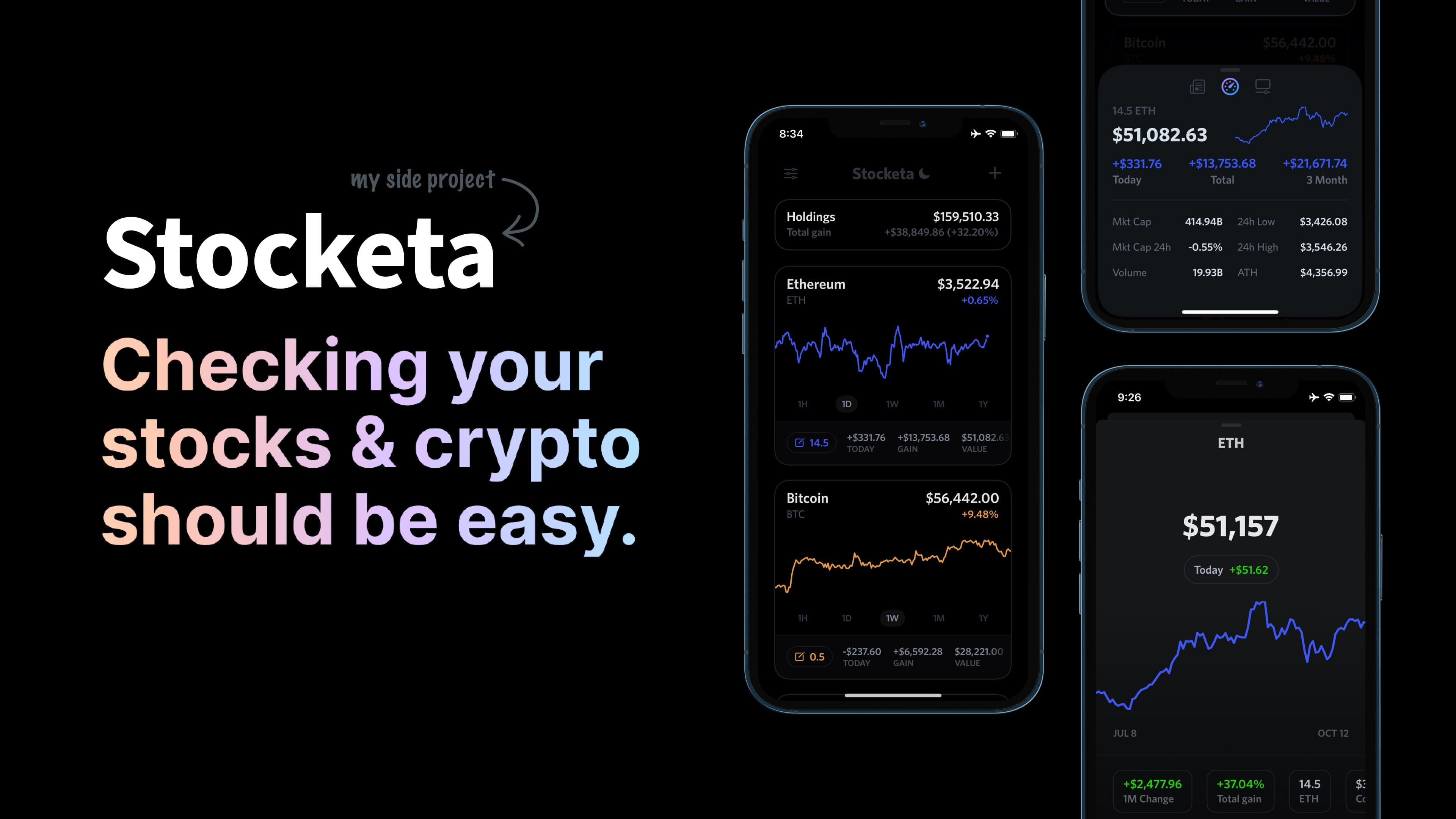
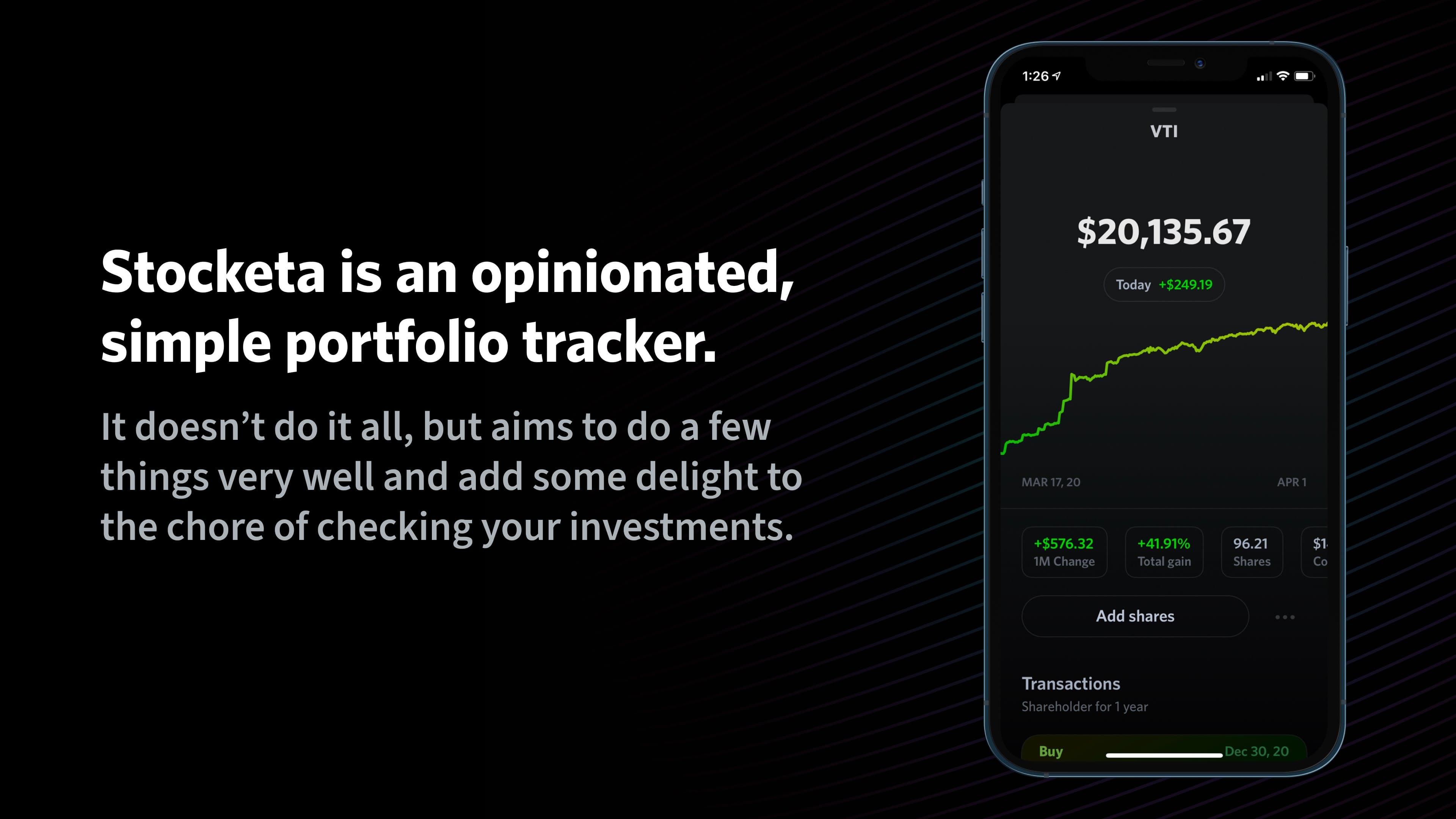

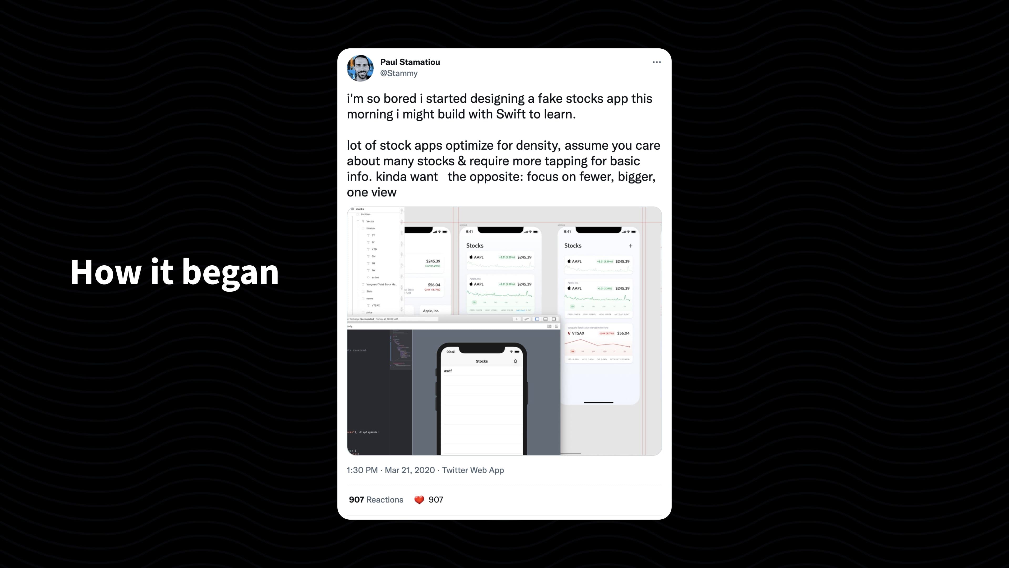
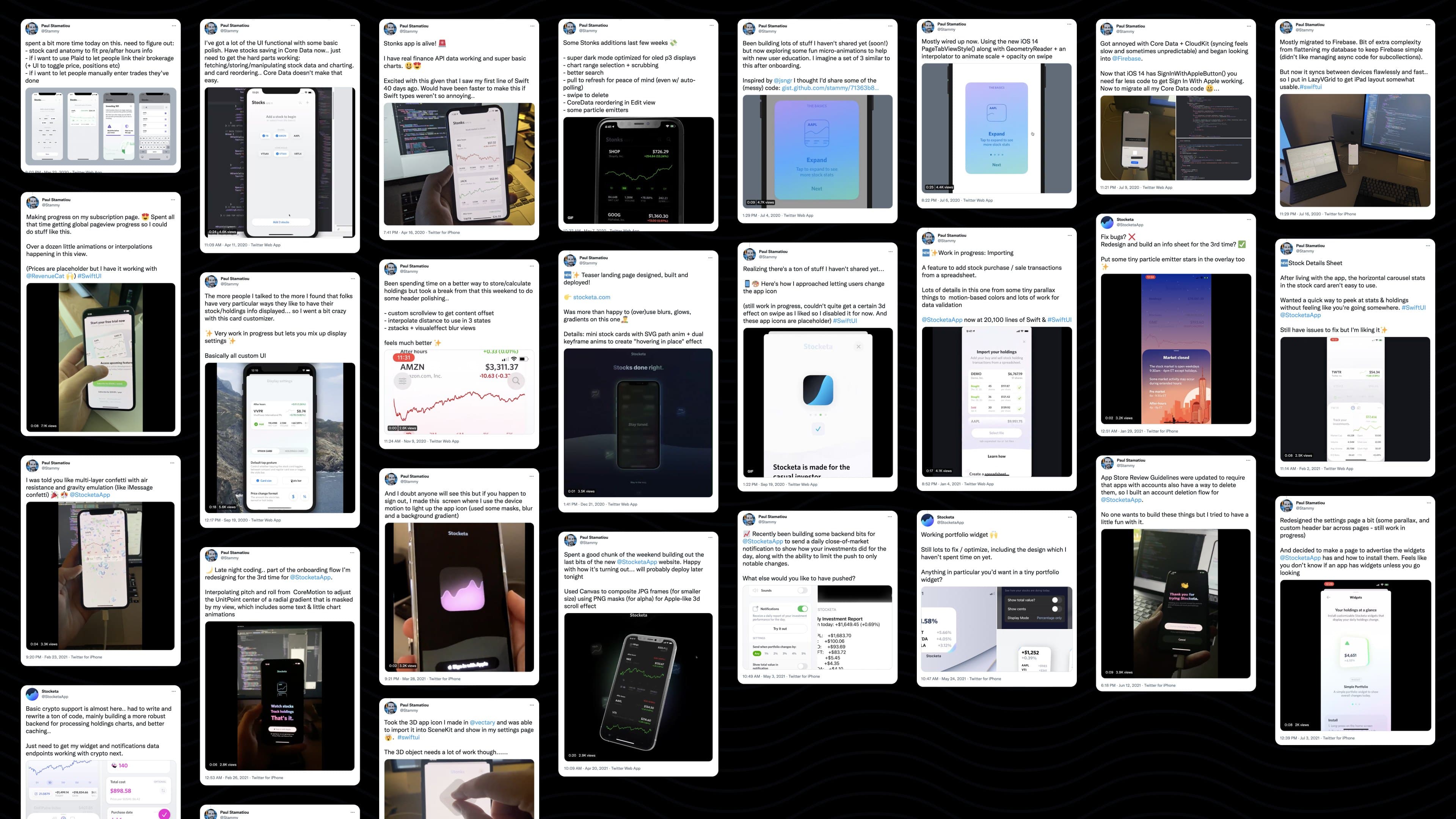


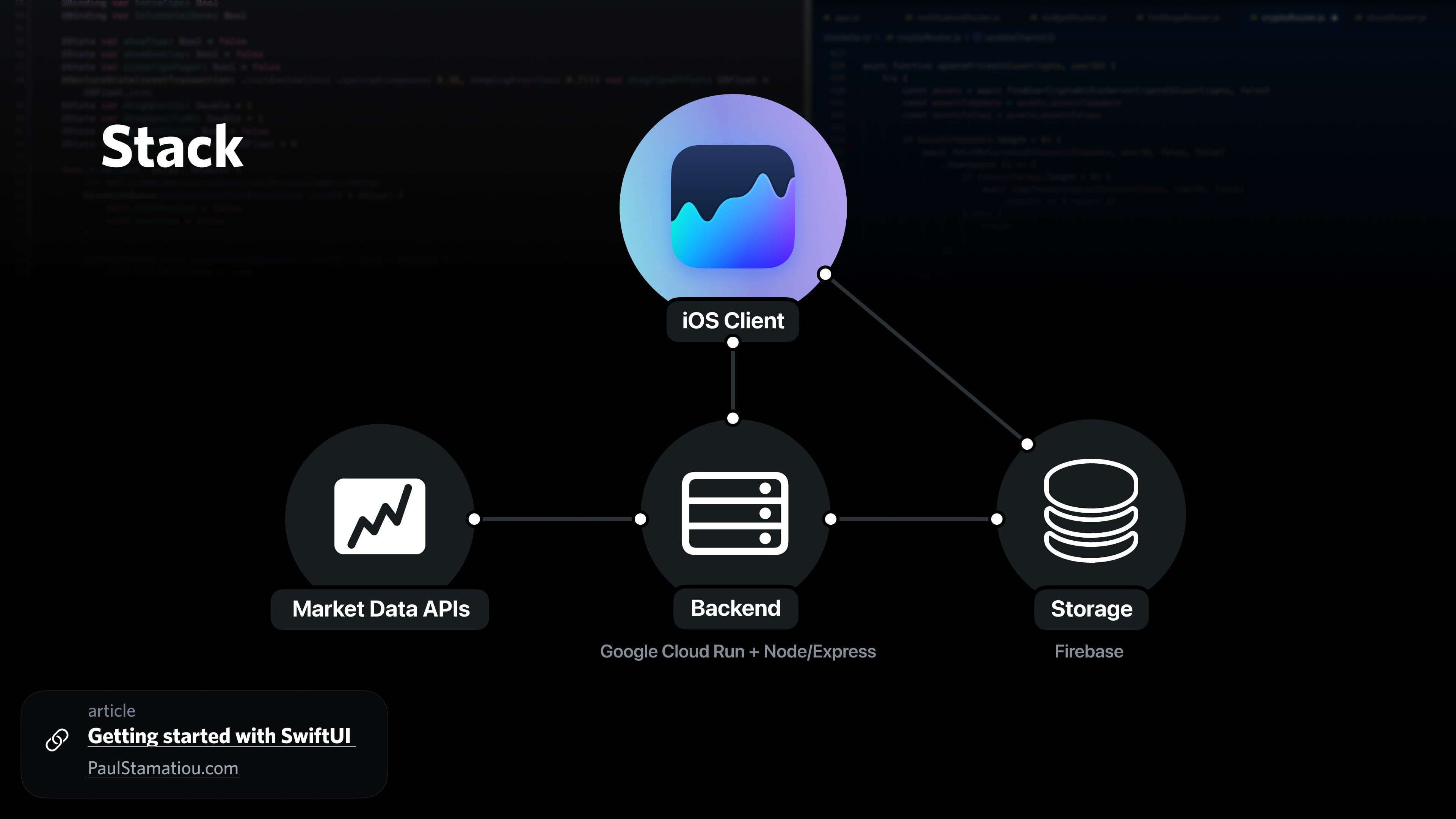
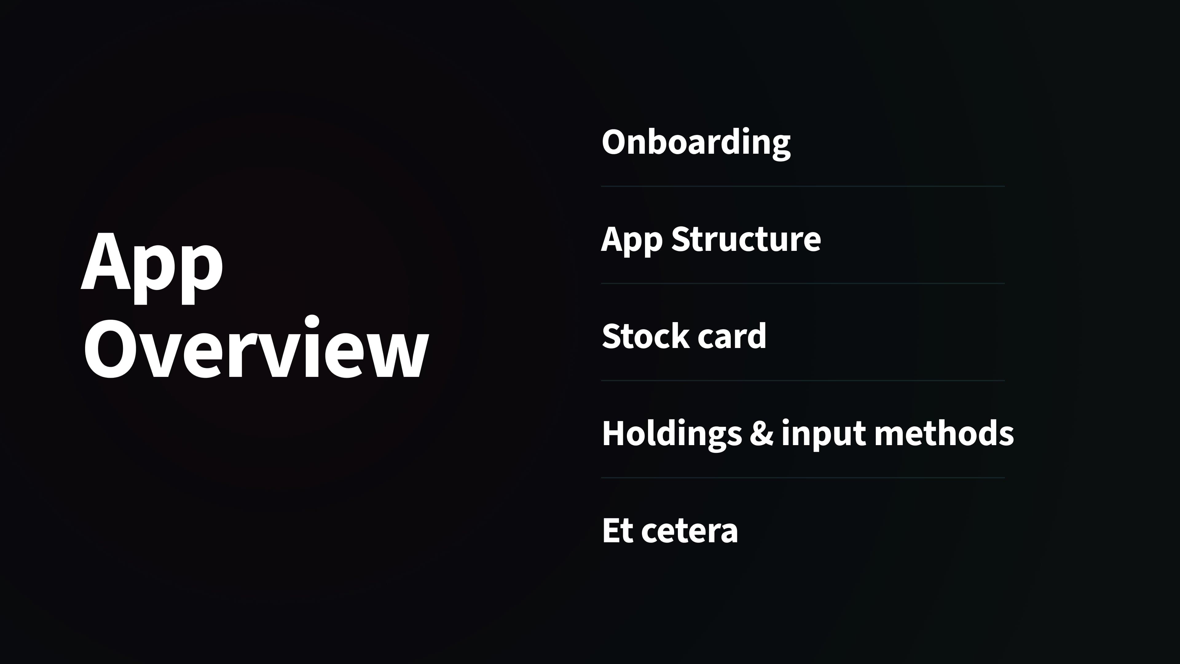

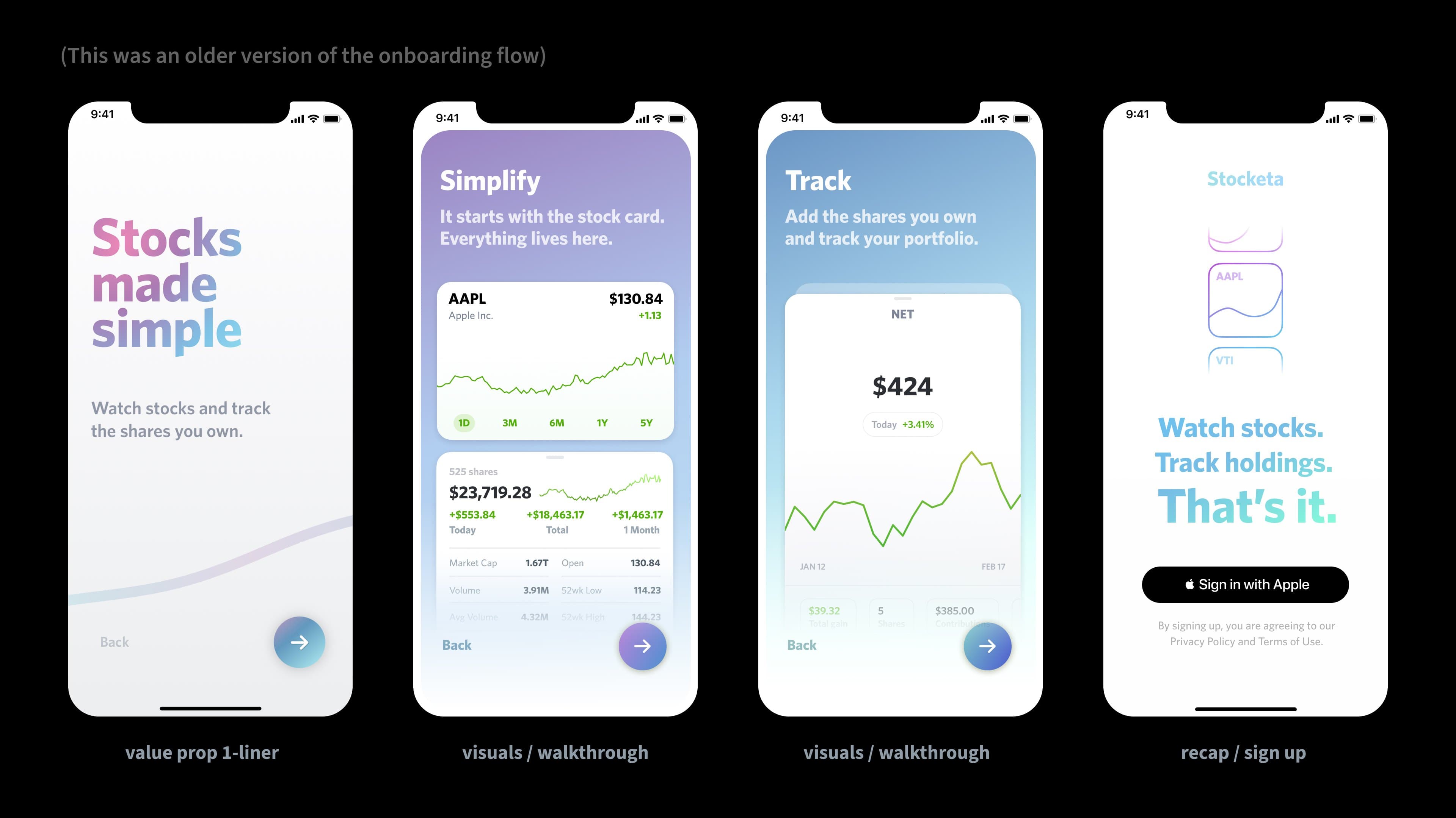
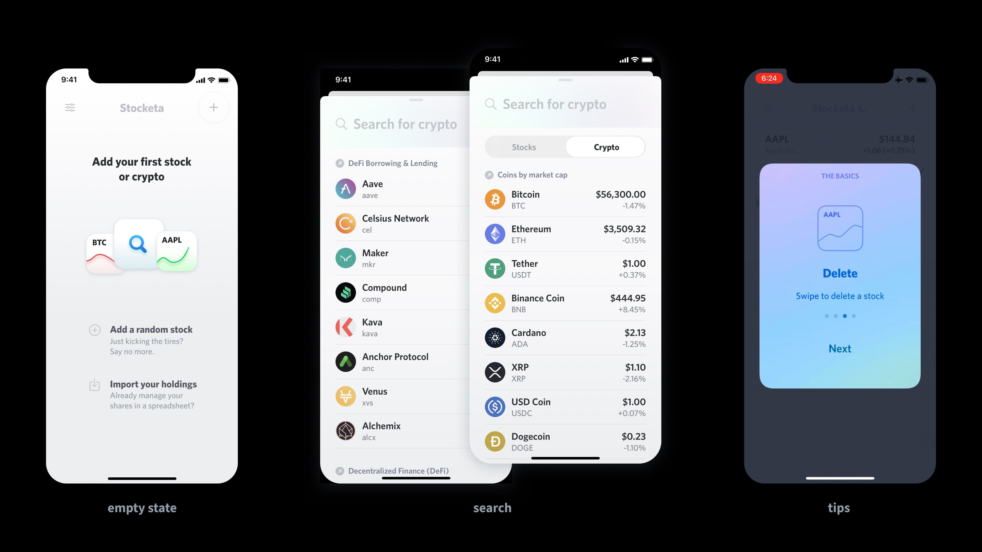
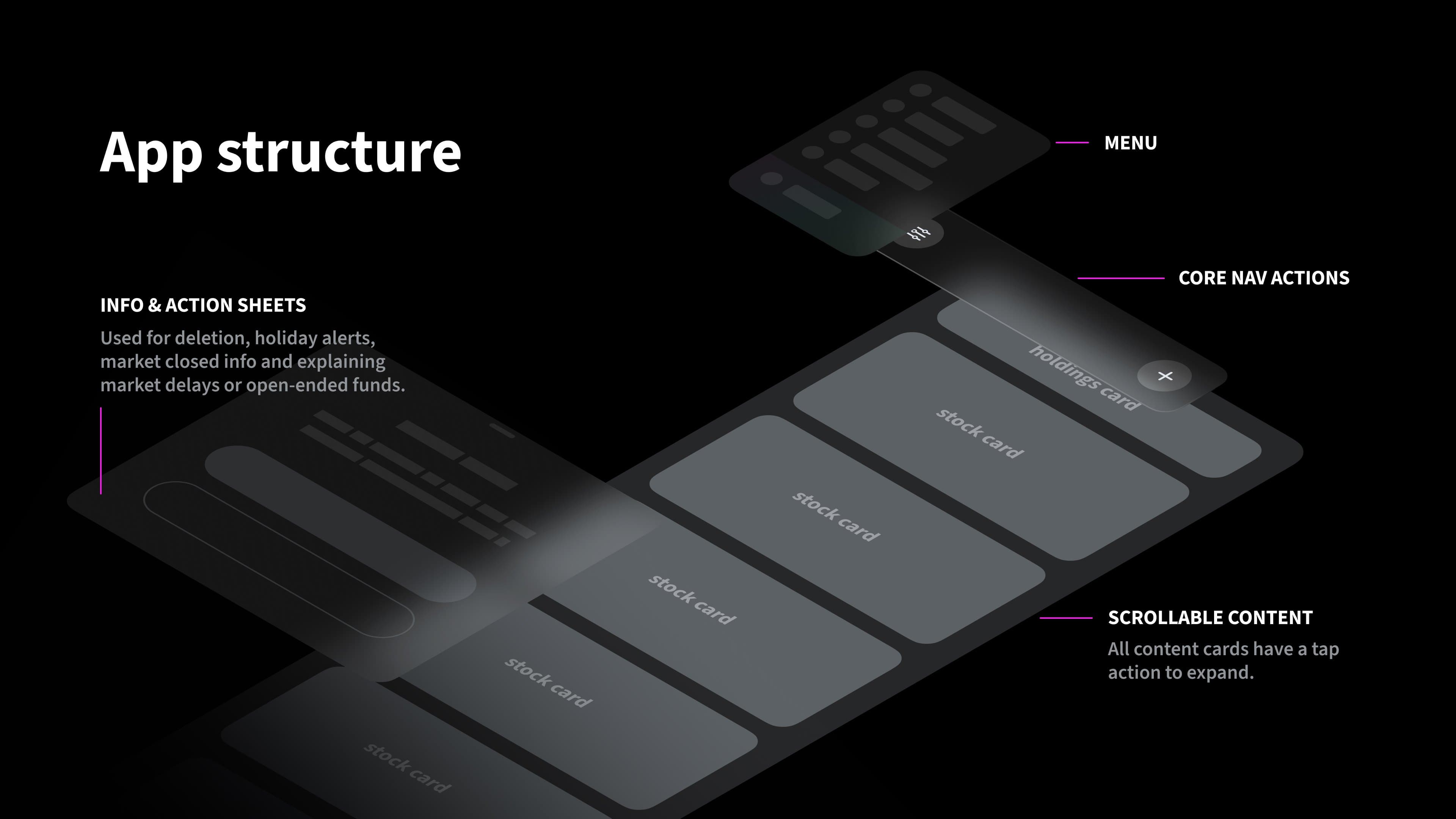
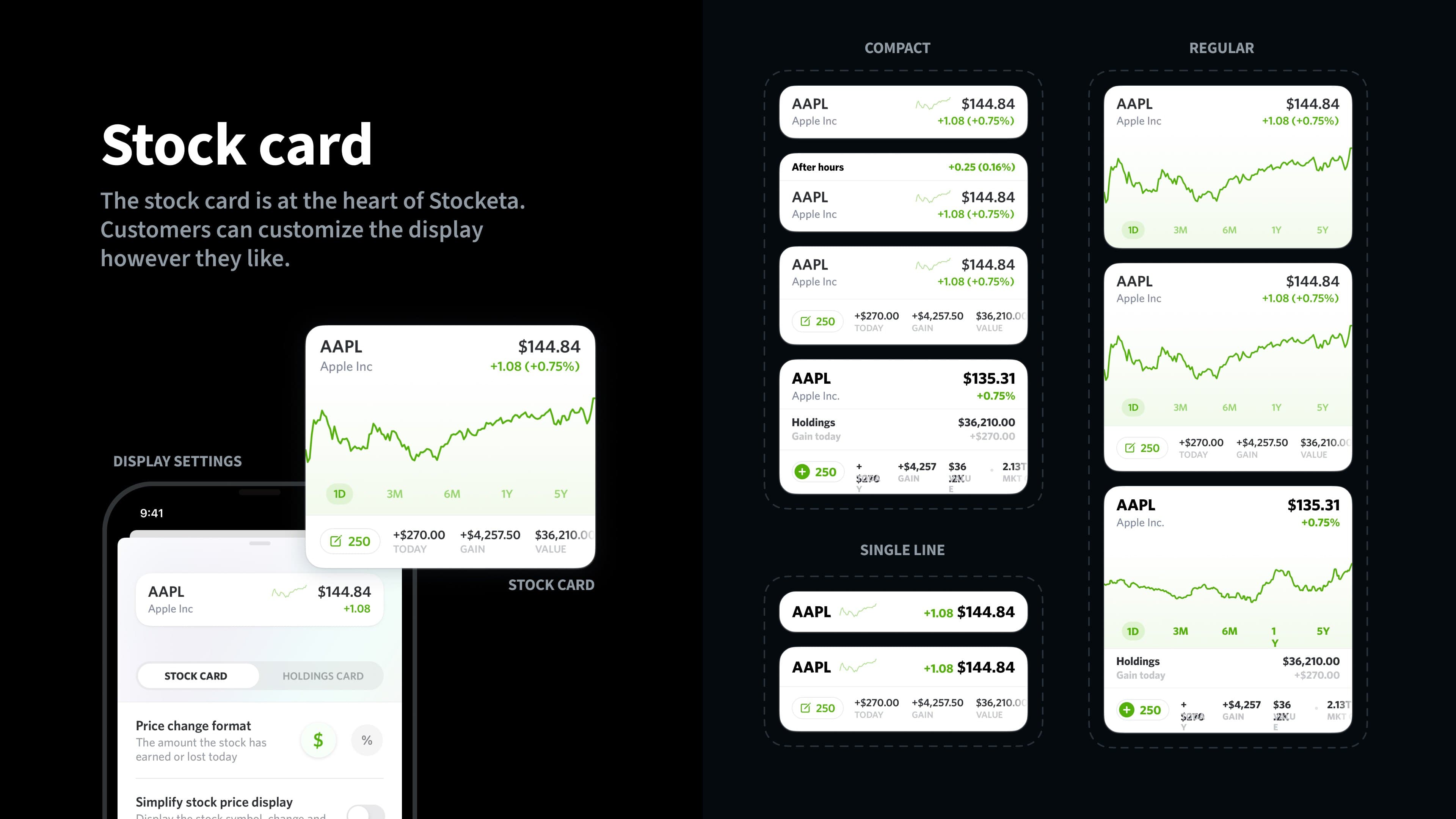
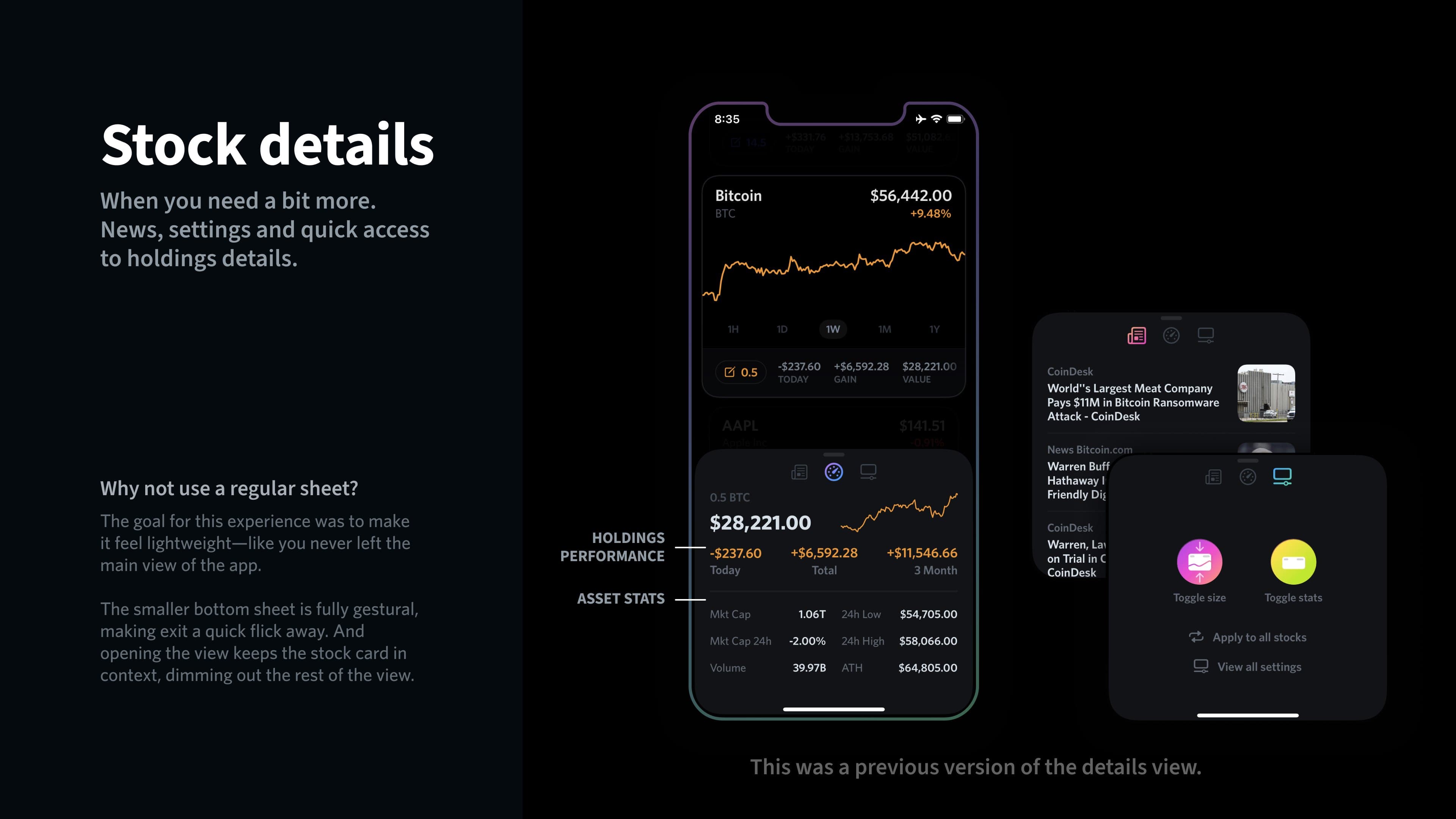
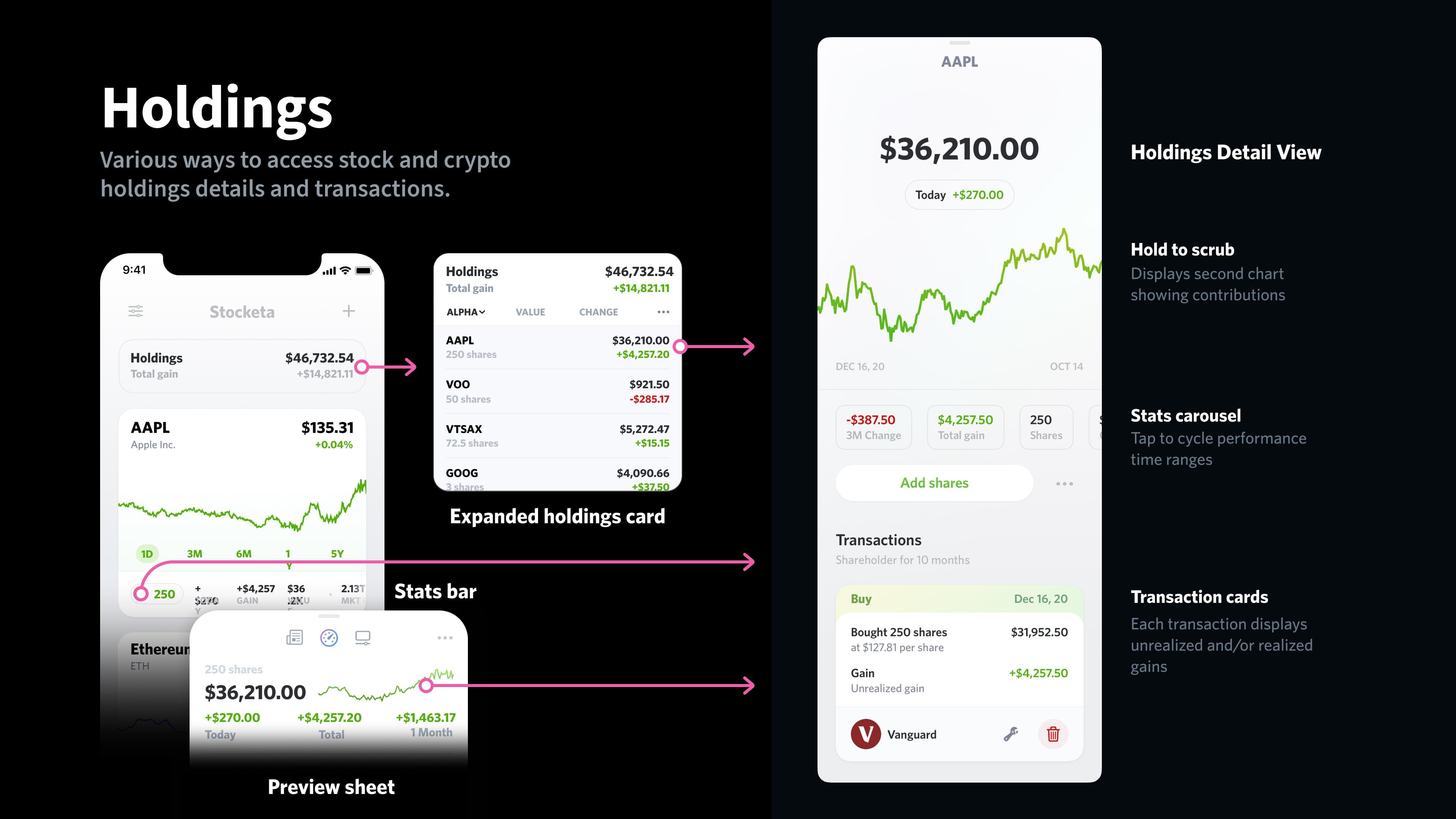

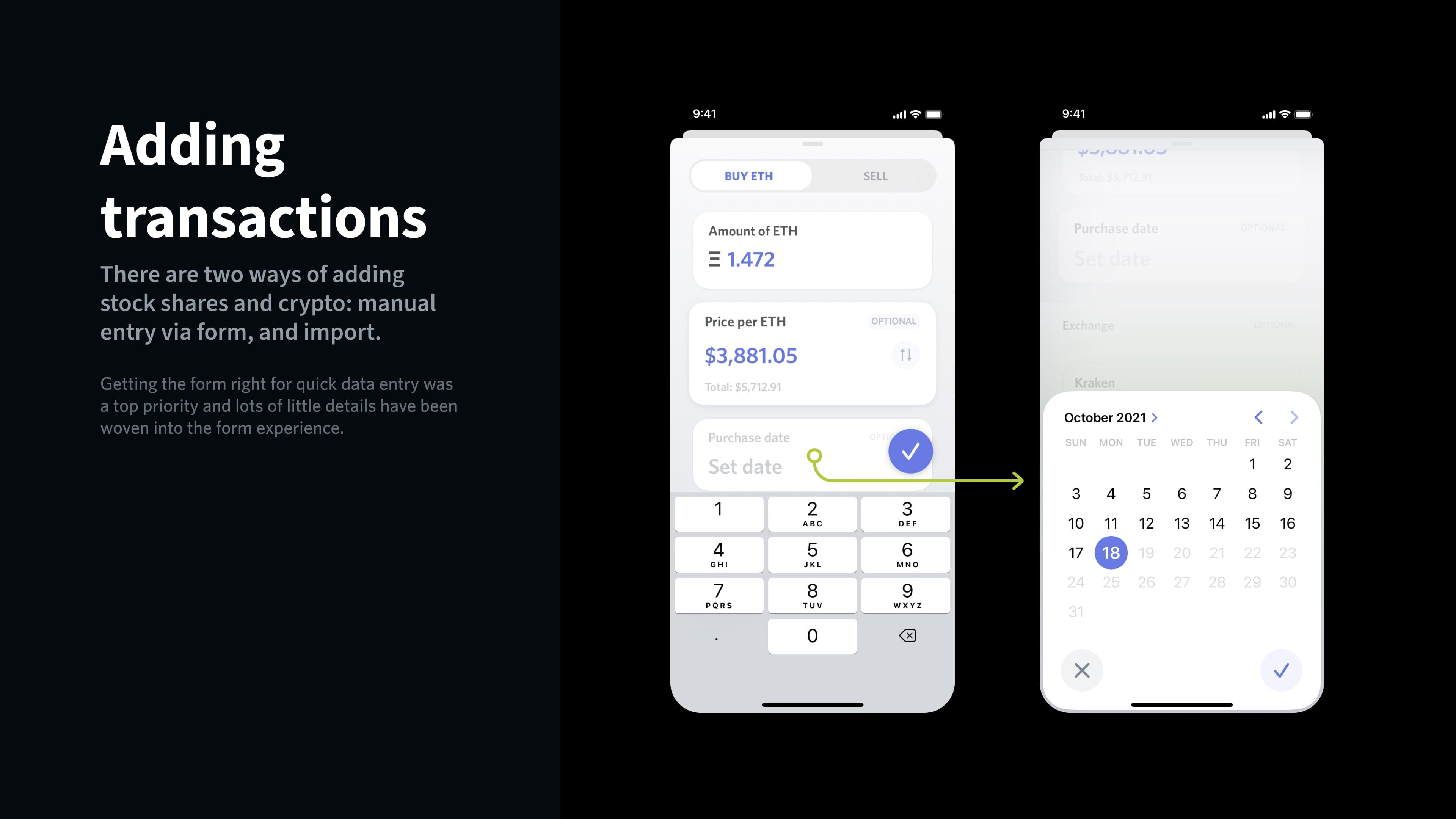
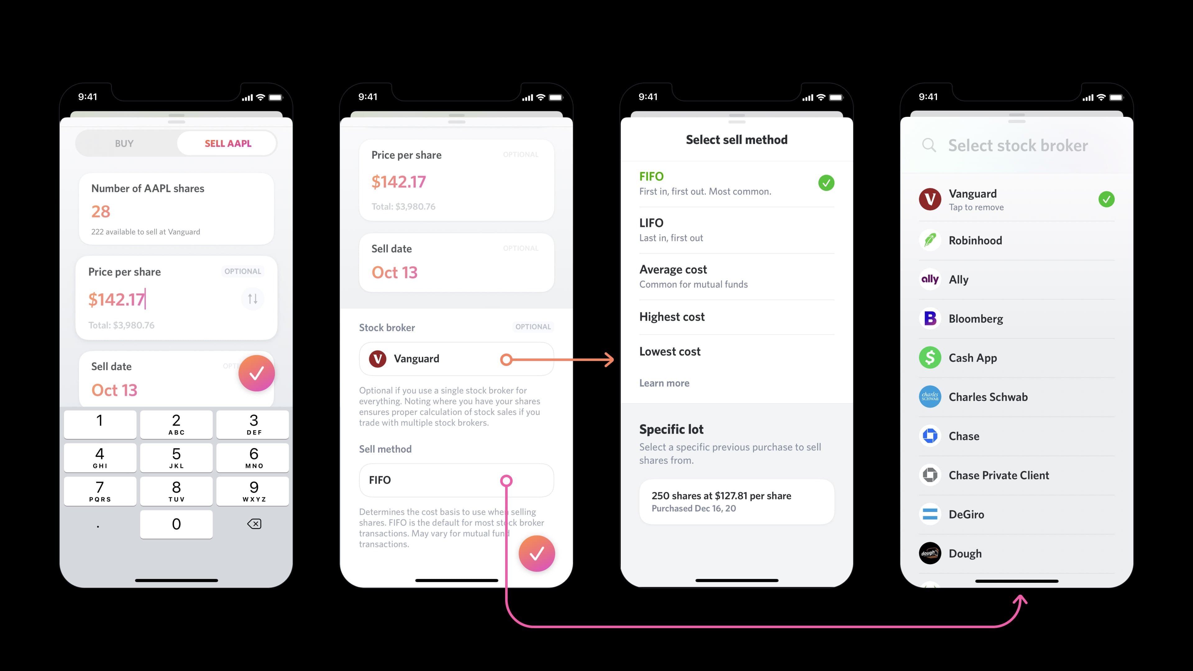
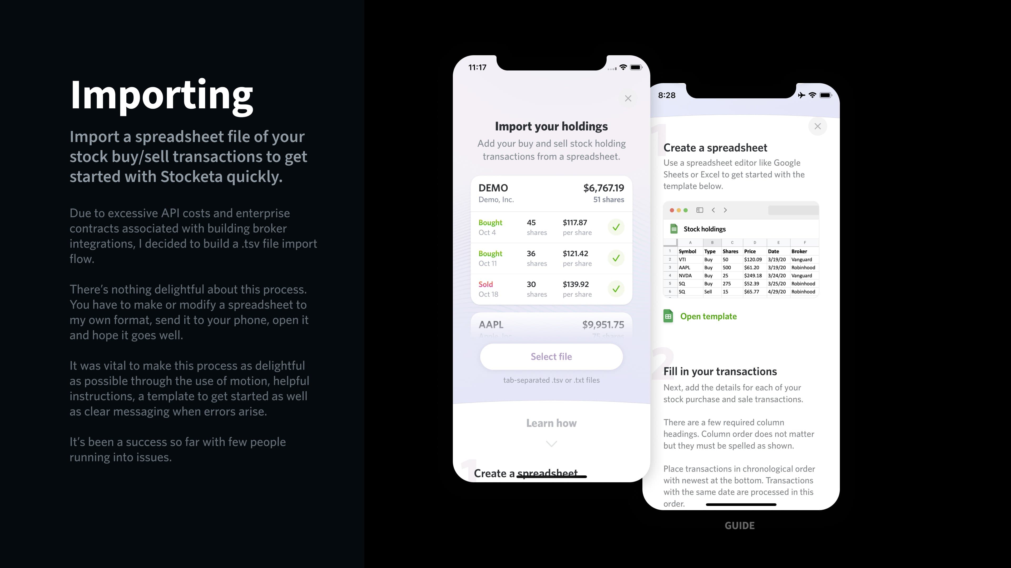
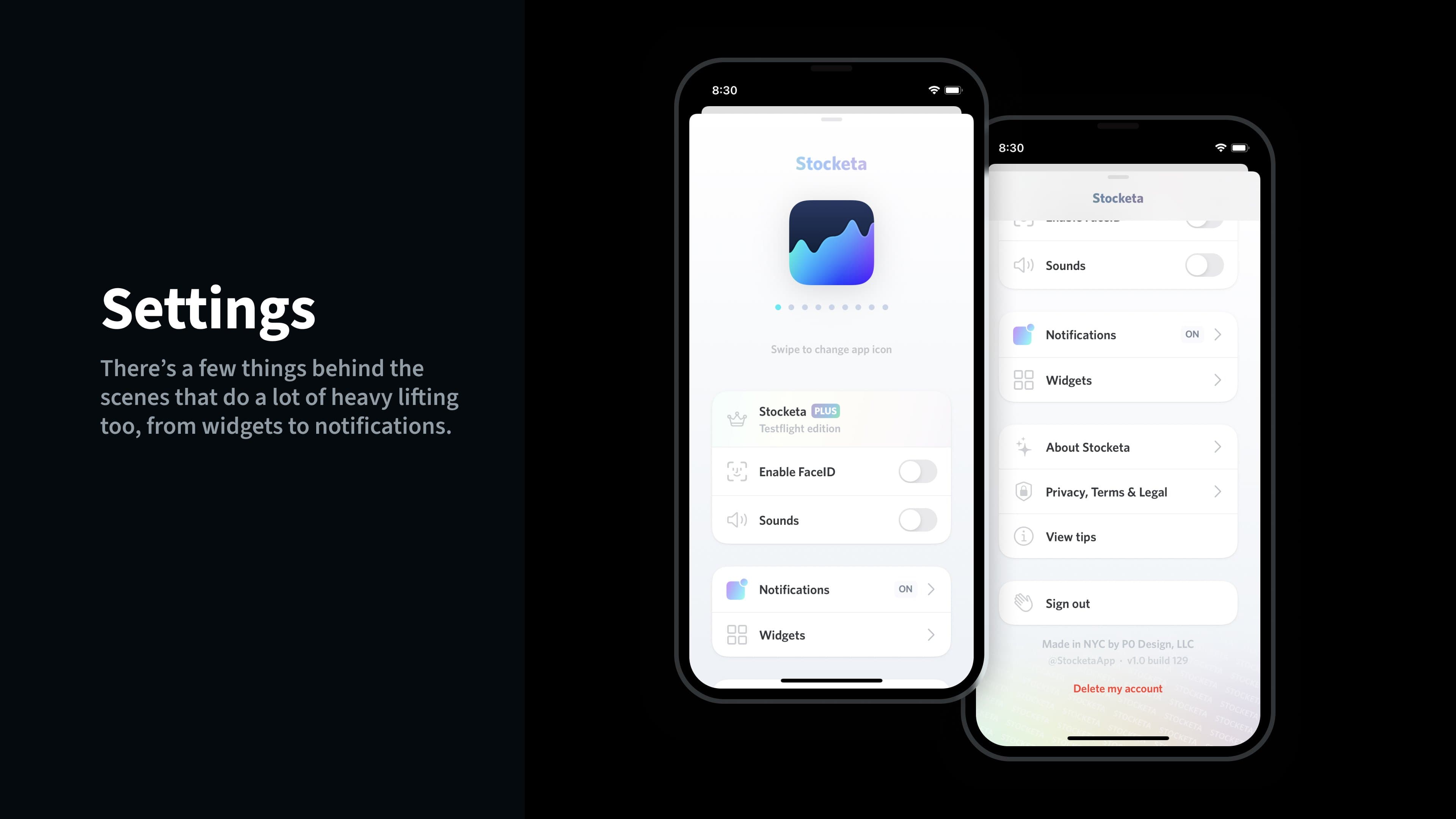
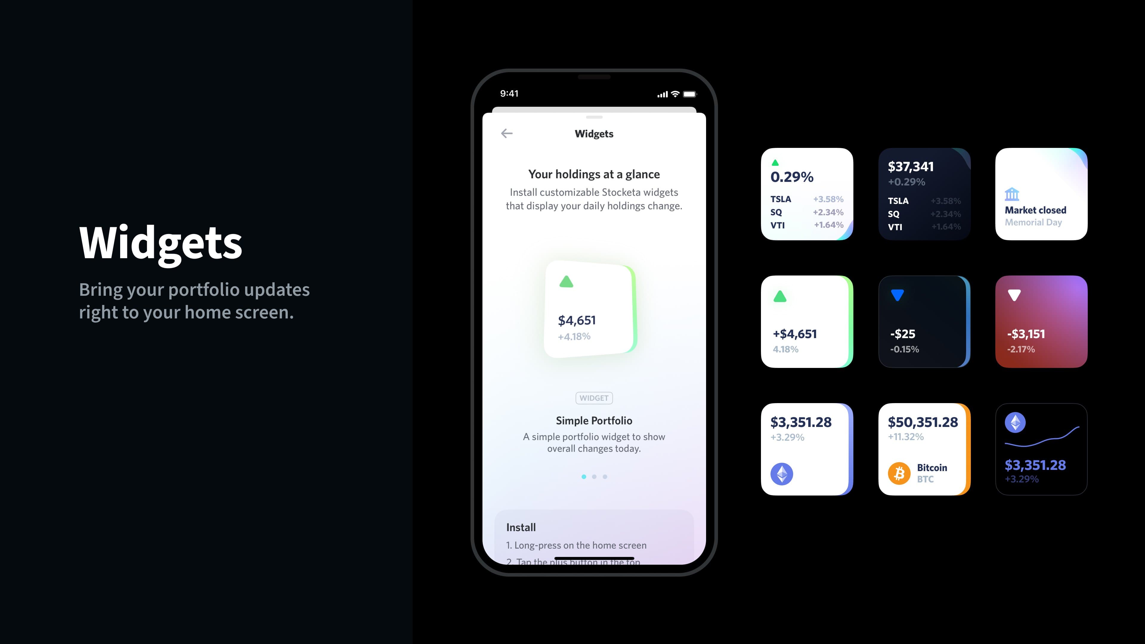
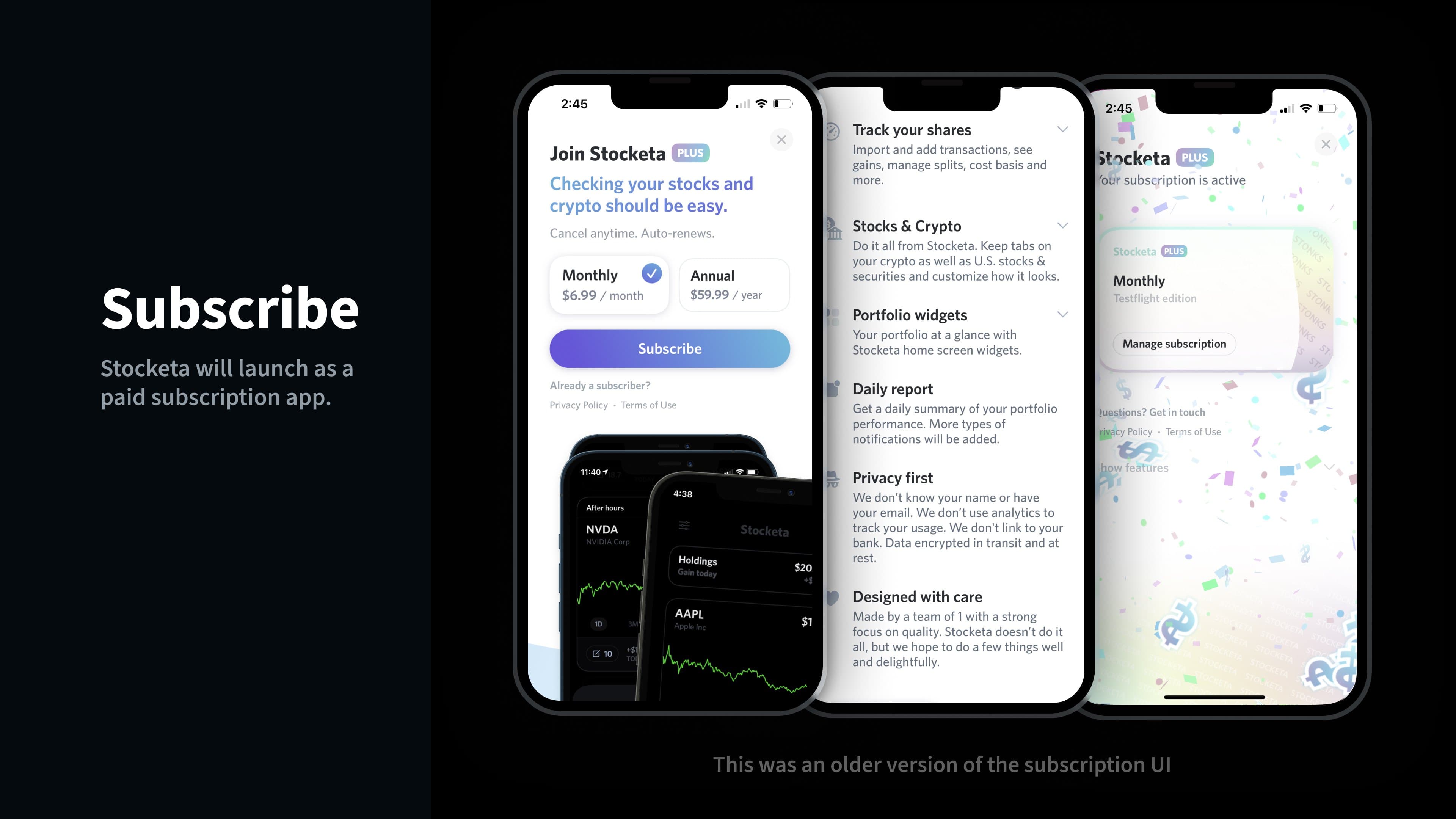
Slides touching on various parts of Stocketa as of late 2021. The design of many of these screens is now outdated, but it's a good look at a point in time.
A note about SwiftUI
I kept designing, building.. and then redesigning and rebuilding. One of the side effects of learning Swift and SwiftUI as I was building this was that I was constantly redoing specific pages and parts of the app as I went. I continually found better ways to build things, and similarly I would continually refine designs. About a year or so into building Stocketa I wrote about my experience with SwiftUI. Much of that still rings true.
SwiftUI has come a long way since iOS 13. It's more performant, there's more parity in available components and functionality compared with UIKit, and you get more control over things. And with iOS 17, you get some goodies like shaders, keyframes, scroll transitions, and more.
Xcode showing a SwiftUI preview.
There's still a gap between the types of things you can do with AppKit and UIKit, but SwiftUI is undeniably a powerful tool that's dramatically more approachable. And not just a coding tool; it's a great design tool. Designers can quickly lay things out, hook up interactions, and get a real feel for a design using a native tool.
Almost all of Stocketa's UI is built with SwiftUI. There were only a few occasions when I found it necessary to use UIKit to achieve some goal.1 None of this would have been possible, or drawn me to take a closer look into building iOS apps, if it hadn't been for SwiftUI.
What I built
I used the app daily and continued pouring time into every feature and detail to meet my high quality bar. While I initially planned for this to be a simple to build app that would not require a backend, or even any user accounts, that did not last for long. I quickly realized I needed my own backend to unlock a few things.
At first, this was so I didn't have to include the API key for my financial data provider inside the app for security reasons—I wouldn't want someone to find it and start running up my bill by abusing it. I created a backend proxy for the API with rate-limiting and throttling. Then, I wanted to have it be authenticated with user accounts, so I added Sign In With Apple along with a stock data caching system so that I only had to fetch stats for a stock once with a certain time period (depending on the particular stat that was either seconds, 24 hours, or weekly) regardless of however many user accounts needed that stock info. The main goal with that was to also reduce my costs associated with financial data API usage.
By this point I really started enjoying the speed at which I could update endpoints and business logic entirely on the backend. I started moving logic I had in the app to the backend. Stocketa was starting to come together.
Even though this was just a solo project, I used Linear to keep track of tasks, ideas, features, customer feedback, and milestones.
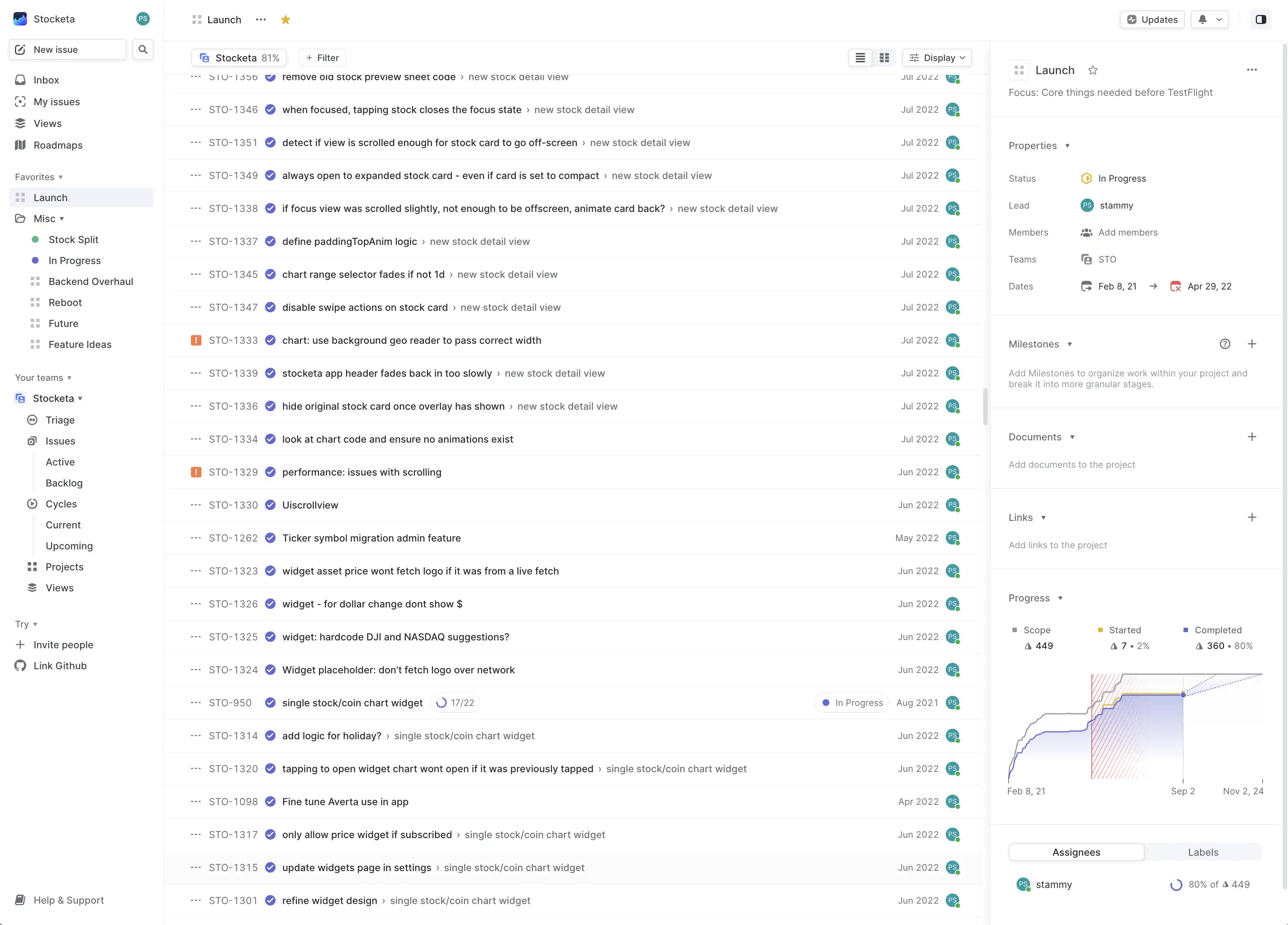
I had prioritized lists of things to build and bugs to fix. I was using—and loving—Linear for this. Here's a list of most of the things I built for Stocketa:

Onboarding
Instead of a typical onboarding carousel, I opted to push pages through as if you're flying down the z-index. I also wanted it to introduce core components of the app, like the stock card. Lots of details are baked in the onboarding including custom path animations and gyro-based gradients, among others.

Onboarding (Dark mode)
Same experience as above, but dark mode. One variation I made for dark mode was the opening "shimmer" effect over the Stocketa logo is done with a more colorful gradient instead of a regular white gradient.

Importing shares
While you can manually add individual buy and sell transactions, the Stocketa import flow made this quicker via a tsv file that you can create via a spreadsheet. It also writes back to the tsv file to confirm import status so you can import again later when you add new shares on your desktop, synced via iCloud.

Buying shares
Stocketa allows users to manually add stock transactions. While this could have been a boring form with default iOS components, I wanted to make it feel like it was made for stocks. The form places the most focus on the essentials: quantity, price and, optionally, date.
If you don't know the exact price you purchased a stock for, or want to add it later, Stocketa shows accurate placeholder text for the stock price that day—it changes to the correct historical price when you change the date.
It has the ability to input per-share or per-transaction price, as well as log what broker was used. That's helpful so Stocketa can let you know how many shares are available to sell with that broker, and keep track of broker-specific cost basis.

Selling shares
Similar to above, this flow shows off adjusting the cost basis method. Stocketa supported all the basics like FIFO, LIFO, Average cost (default for mutual funds), Highest cost, Lowest cost, as well as specific lot if you're doing something a bit more advanced.

Subscription upgrade page
A different take on the traditional upgrade to a paid account page. This page also has a few small design details: parallax hero text, parallax description text that unblurs and fades in as you scroll, motion-based feature cards (not shown in this simulator video: shadows and position of cards in the back would shift around), and some small little fireworks when you reach the bottom.
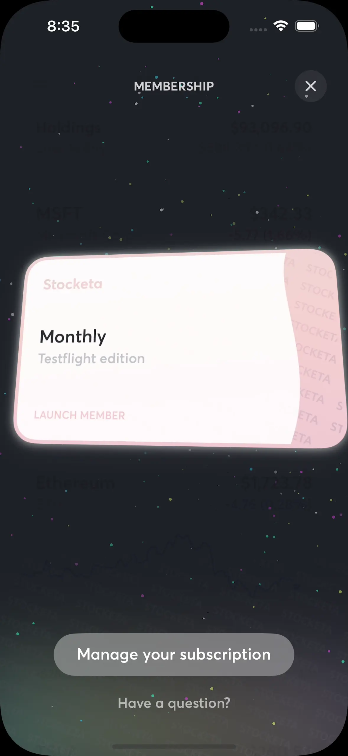
Subscription membership card
For accounts with active subscriptions, I wanted a quirky, fun way to display account status in the form of a sort of membership card you could interact with. The background had an animated starfield-like effect that would speed up and get faster when you were interacting or holding the card down. There's also a small shimmer effect on the thank you text on the back of the card.

Stock card display settings
While the focus of Stocketa is about giving casual investors access to common actions they may need on a stock without navigating to a detail view (such as chart scrubbing or stats), I wanted this to be customizable. I have several stock card form factors, settings, and some neat custom micro-animations when toggling them.

Stock transaction details
Stocketa keeps track of individual transactions, their cost basis, cost basis method, and even stock splits. This makes it powerful in providing per-transaction, realized and unrealized gain/loss details.
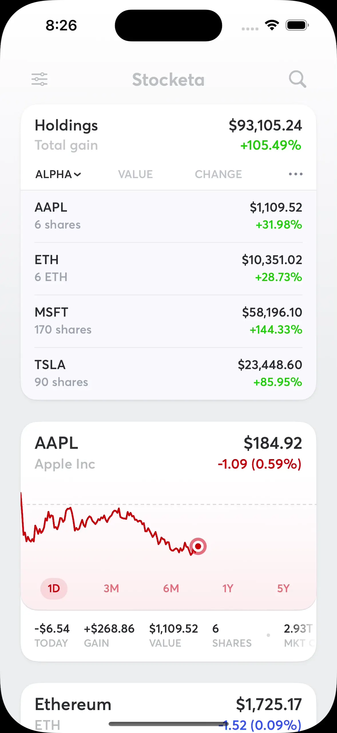
Holdings card
The holdings card sits at the top of the main stock scroll view showing aggregate details, based on your settings. Longer term I had planned to evolve this with sparkline sharts for each stock, as well as the aggregate portfolio, as well as move away from the expanded card form factor which felt limiting.

Tips card
I didn't want the onboarding flow to be too long or required, opting to get people into the app sooner. But I wanted to help guide people around the core interactions at their own pace. I found this to be a great spot to use custom path animations for each page.

Settings: Overview
While settings sheets are nothing special, I put a bit more attention into Stocketa's. A few things of note: custom header on scroll, app icon selection carousel at top that scales on scroll, footer gradient with Stocketa "foil" that you can keep pulling up, and some push views with custom headers.
Settings: Change app icon
These days it's almost expected to be able to change an app's app icon to best fit your phone aesthetic. Most apps do this with a boring page listing out small icon thumbnails. I wanted to make this a core element to the settings page. Just swipe to preview and set an alternate app icon.

Settings: Widgets
I wanted to make it clear that Stocketa had widgets so I built this page to show them off and share installation instructions. I also replicated the same widget transform animation that iOS uses for widget setup.
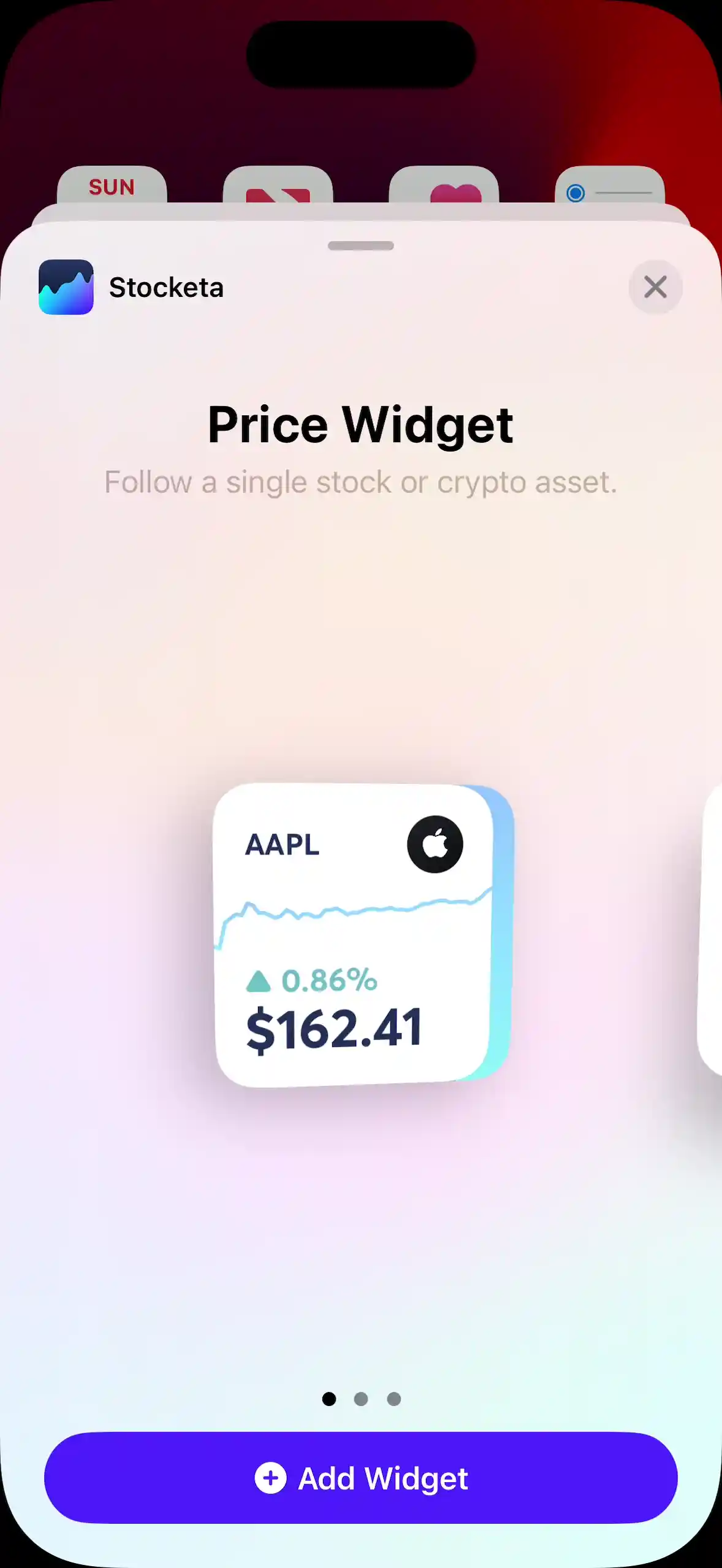
Widget setup
Showing off how setting up an iOS widget for Stocketa worked. There were three widget types: individual stock, portfolio, and simple portfolio. They all had accent colors using a large gradient that would change based on stock or portfolio performance.

Search: Quick inline prices
I found it helpful when searching for a stock to see the price at a glance to help me figure out if it was what I was looking for. While it would be costly for me to provide prices inline for every search result, I did it for the first match as you typed.

Stock splits
One of the most complex, but necessary, parts of the app was keeping track of whether your transactions were post or pre-split, including multiple splits. Stocketa provided full control to manually or automatically apply splits as needed.

Search categories
To make it easier to find top stocks, I had the search empty state be a list of categories you could navigate through. This also featured a header using matchedGeometryEffect. The hard part was actually getting and organizing the content for these pages, including stock icons. That was a mix of building a scraping engine, along with some manual icon creation for a few securities.

Face ID grace period
Adding Face ID is a requirement for any app that keeps track of your financial assets. Beyond the basic functionality, I added a way to customize the grace period before Face ID would lock again. A longer grace period was handy if you were switching apps to check your stock purchases while manually logging them. This one was fun to build with custom gestures along an arc.

Market holiday sheets
For accounts holding stocks (not just crypto), Stocketa needed a way to indicate when the market was closed due to a holiday. This also entailed some server-side code to do the same for widgets.

Feedback sheet
I wanted to make it easier to receive app feedback and support requests, while also surfacing known issues and upcoming features I was working on to reduce support requests. I also added a toggle that people could flip if they had account-specific questions that would embed a token allowing me to find their account as I didn't store any other account identifiers for privacy.

Sorting stocks
This was done via a custom UIKit collection view. I originally wanted to do this directly in the main stock list view but it's easier to see them in a more compact list when you need to drag things around. Also, doing this in the main view would have been tricky with all the gestures already used by the stock cards (swipe, tap, long-press).

Toasts
Little iOS style alerts used for things like reaching limits when unsubscribed, or attempting to add a stock you've already added.

Account deletion
An App Store update in 2021 required that all apps that create accounts also have the ability to fully delete them in-app. I took that as a challenge to make it easy and delightful. Not shown here is how the background and the thank you text gradient are motion-based depending on how you're holding and moving your phone.
I ran a small TestFlight alpha with close friends, then increasingly I added more people. At one point I was up to around 1,000 people. That was the most I wanted to allow. I received lots of feedback from overall great first impressions (below), to general feature requests, and of course lots of bug reports.
Already the app is filling a need for me in its personal approach to tracking investments: no pushing for sales, no integrations with brokers and no unnecessary permissions. Brilliant.
Simply amazed at the SwiftUI work you’ve poured into this app. So beautiful. The onboarding alone is a masterclass in attention to detail. Bravo.
love it, this feels so polished and slick already... really great use of SwiftUI
Just got the invite, added my stocks... the animations are beautiful, design is clean and precise... it’s all around beautiful. Congrats!
F**k, man. This app is incredible. You’re building all of this on your own?
Dude. This app is f**king beautiful. Really great job. Just imported shares - super easy.
This NUX is insane. The particles when you add a stock. Gives me the happy brain chemicals..
I had thousands on a waiting list but there were API and hosting costs associated with the increased usage that I didn't want to bear yet, as well as a huge increase in support and customer feedback that took a lot of time to manage. You start to hear the same types of feedback, and it just becomes a chore to manage that many emails. That good news was that something was resonating and people cared enough to go through the work to send in bug reports and feature requests.
The website
At some point early in feature development I took a break to focus on the website. At first I wanted a simple landing page to build interest, and collect emails for a waitlist so I could keep people in the loop. And I didn't want to spend that much time on it.
Video: Initial Stocketa teaser homepage.
There was nothing fancy or particularly special about this initial page. It was just something quick I wanted to get out the door. And now, a while later, there's a lot I hate about this early design. The background texture was too strong, the headline alignment feels odd with the phone.. but I digress.
In that initial design I did start playing with some wave-related elements—a loose reference to stock market charts going up and down. And then to add to that, I built a few mini stock cards gently hovering in place (thanks to offset-path CSS along with 2 keyframe animations) in the background. Each stock card had an SVG line chart—loosely based on that stock's actual performance around the time—that would animate on page load. I ended up keeping a version of these mini stock cards on the latest version of the website, and then on an onboarding screen inside the app.
The original inspiration for these random floating stock cards was from my now out-of-date work page where I highlighted projects with some large cards, each with their own intro animation based on the project. One of them was for my work on Twitter Video, where video clip thumbnails would fan out from the phone on hover (shown below).
The floating mini stock cards on the Stocketa homepage were inspired by the hover state animation on this project card from my old portfolio page.
Homepage design v1.0
Video: The first full version of Stocketa.com in early 2021, currently archived here. The App Store QR code was meant to be displayed on scroll but in this version I didn't have that hooked up as the app wasn't live.
In early 2021 I ended up getting around to designing and building out the first complete homepage for Stocketa. I had enough functionality and features built that it felt worthy of investing some time into showcasing them on the site.
Lots of app websites at the time (and still now) had the typical hero section on their homepage: some app screenshot in a phone frame off to one side, with accompanying header and subtitle text adjacent. Nothing wrong with that, but I wanted something a bit more engaging. I wasn't entirely interested in optimizing for conversion, and cramming a lot in above the page fold.
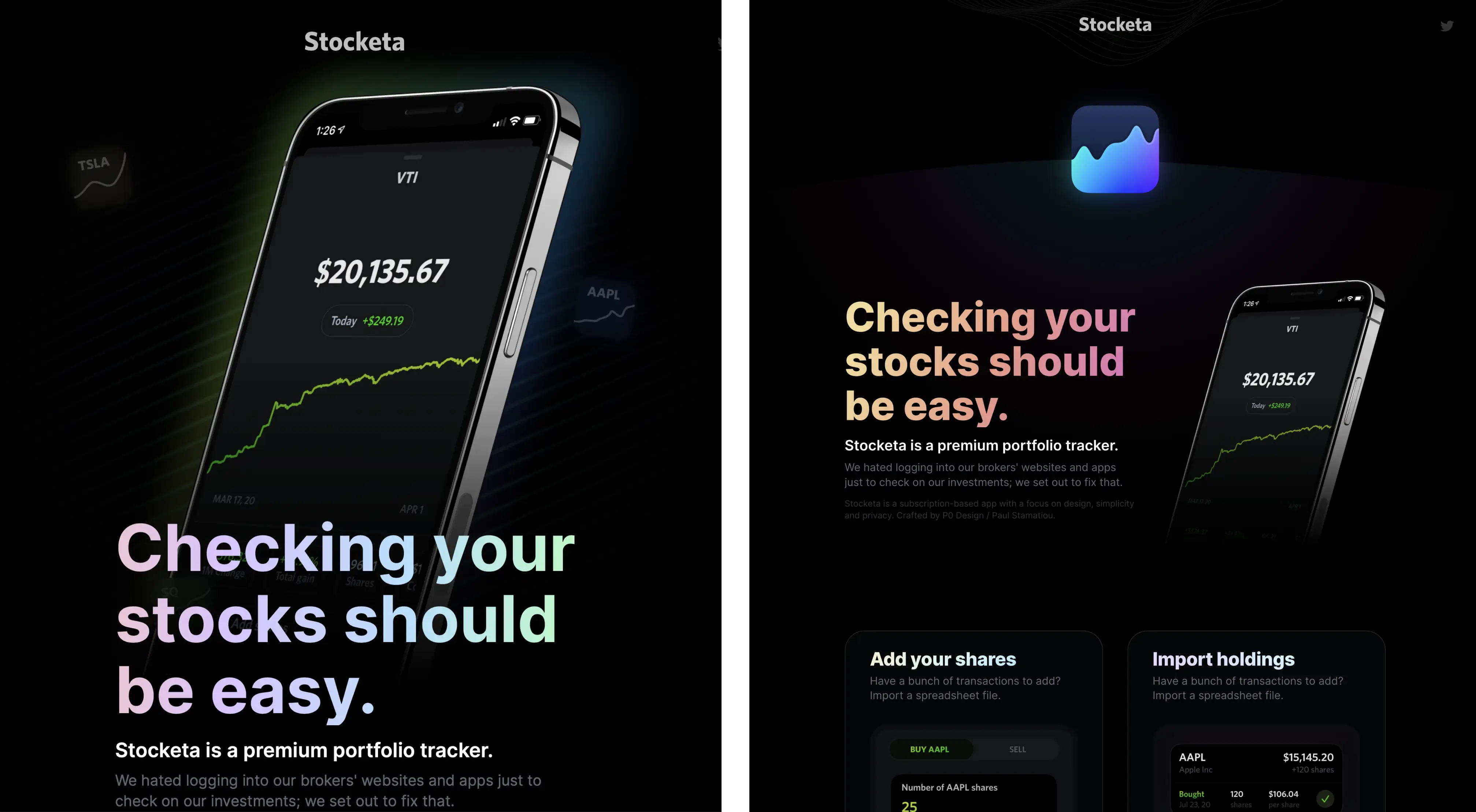
Initial design explorations in figma.
I thought it would be nice to try to do something where the 3D phone frame was angled and then began to change position on scroll while a brief teaser video of the app functionality played. Apple had done something similar in recent years with product pages, such as the first-generation AirPods Pro. They used over 100 frames of the AirPods that would progress as you scrolled:
Example of a technique used by Apple.
There's a lot of ways to achieve an effect like this. One route route is using Lottie and essentially converting each frame of your video or animation to a base64-encoded string in a json file for the Lottie web player to manage. It's not a flawless solution, however, and can incur some large file sizes depending on what you're doing. It's best for vector micro-animations, not large devices with complex visual content. I also didn't want to incur the cost of that large initial json download blocking the very first thing you see on the site.
Instead I opted to have javascript display a sequence of frames composited to canvas along with an offscreenCanvas for performance. I used Rotato to import my short Stocketa screencast, create a 3D phone video, and then create a PNG sequence of frames. I wasn't super pleased with the quality—the phone frame didn't look super realistic and had some rough pixelated edges—but it was good enough compared to doing it all by hand with other design tools.
Scroll-based Stocketa 3D phone, paired with subtle parallax for header elements and the floating stock cards. There were some other minor scroll effects like the gradient glow behind the phone spreading.
I then exported optimized transparent webp, and jpg files (with accompanying alpha masks created in Sketch to save bandwidth) and had the javascript detect which file type to use for the animation. While I was pleased with how this effect turned out, it ended up becoming a rather huge annoyance when I wanted to update the content later—it's a pain to generate, optimize, and update the image sequence each time.
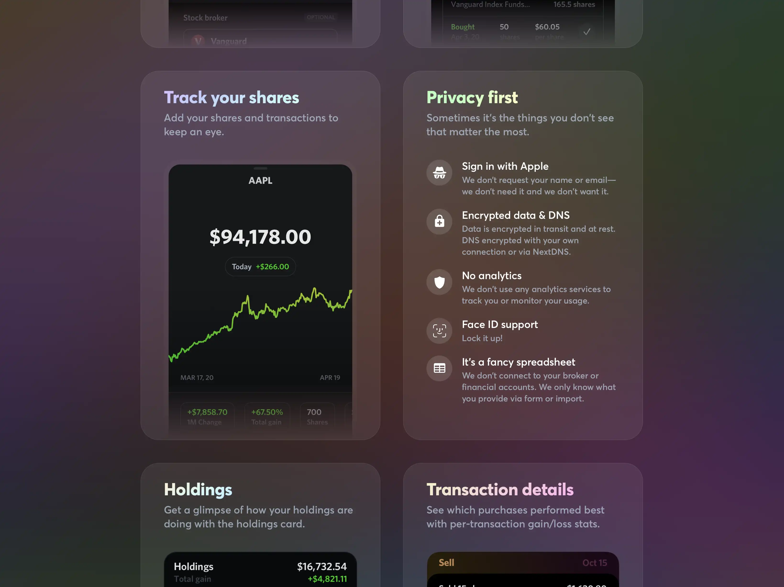
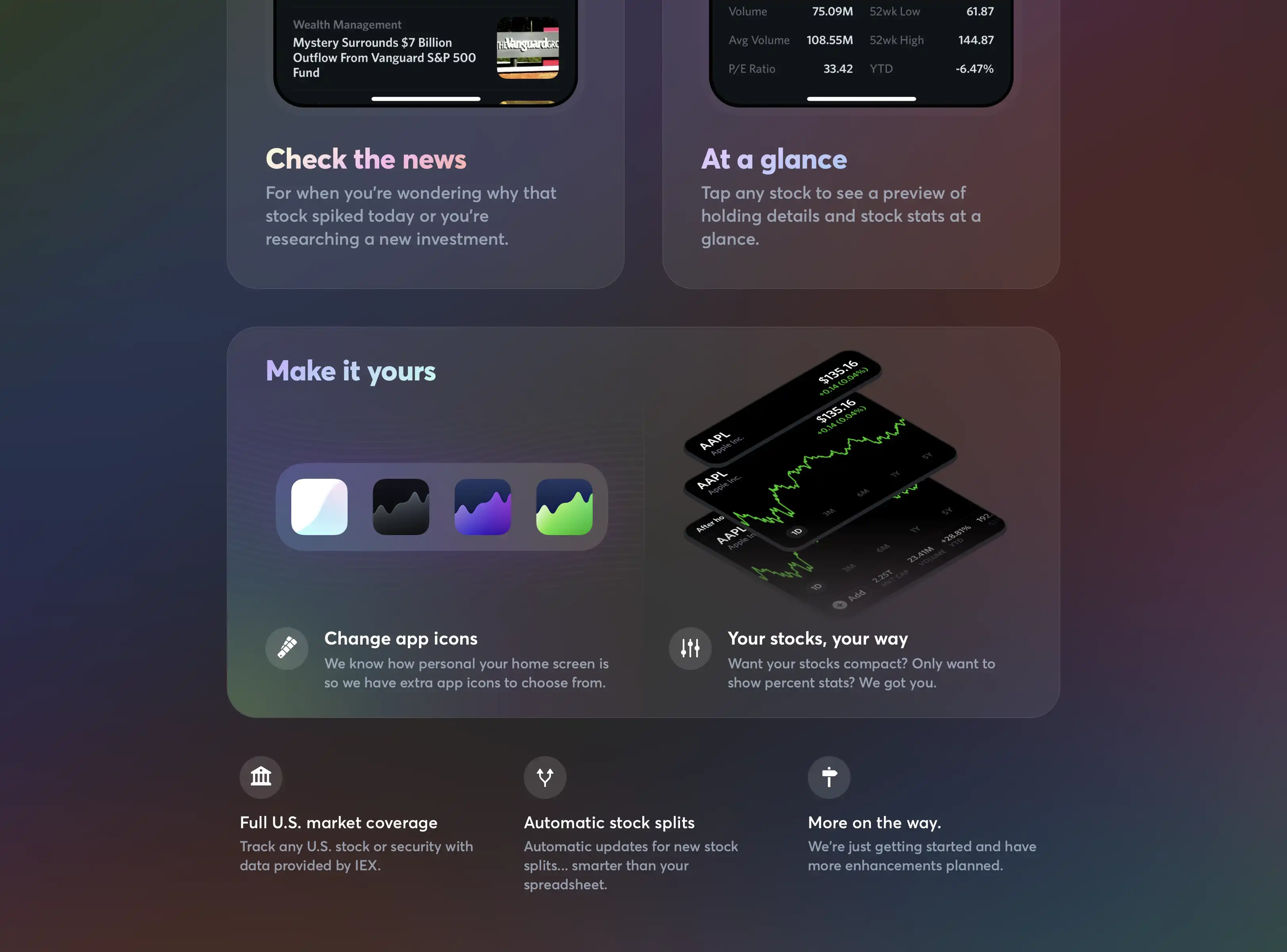
Other bits of the website: cards for various features.
And finally, as for the rest of the content on this site I went with a basic feature card approach, sometimes called a "bento box" layout; particularly when varying card sizes are used. This is a layout that I've grown to like a bit less over the years as it has become very common.
Homepage design v2.0
Video: New Stocketa site
A year later, it was time for another redesign. Stocketa had more functionality, and a lot more refinements. I had more to share, and I had grown tired of the 3D phone frame interaction. It was neat but it was just there for show; it wasn't the best way to show off parts of the app as it scrolled off screen. It was also a pain to update the frame sequences. I essentially just wanted to take screenshots of the real app from the iOS simulator and upload them.
Separately, I didn't want a super long page with a lot of repetitive modules and screenshots. I wanted a skimmable feature list. I began to wonder if I could get away with just a single phone frame on the site that showed everything.
I eventually landed on a two pane approach: the device frame was always in view, fixed on the right side, while the scrollable left side contained the feature list. The trade-off with this design was that it would require hovering over each feature item to be able to update the screenshot shown in the device frame. I figured an interesting compromise to that would be having the phones stack up and away on scroll. Almost like the old Apple Time Machine backup UI.
I built several versions of this and found that it didn't feel great. There wasn't much scroll distance so if you scrolled at a normal or fast pace, you'd see a bunch of phones flicker by you as the animations tried to keep up. It was too busy and hectic, not to mention a lot of state management to deal with jumping between your current scroll-based position screenshot to a hover-based screenshot if you hovered over a feature list item. I ended up simplifying a bit and only having the scroll-based UI manage just a few states: the intro phone frame, the first feature screenshot, and then a final animation at the bottom of the page.
The website's mobile layout uses a carousel of screenshots in the header.
After sorting out the core interactions, I had to figure out how to deal with mobile and tablet interactions. The fix two-pane layout made this a bit of a challenge. I ended up turning the header into a carousel of device frames you could scroll through.
And then finally, I added a few small bits of polish ✨:
- Hero title text gradient changes based on scroll
- The icon accent color and background circle color change based on scroll
- When hovering over any feature list item, there is a subtle background color change created by an overlaid gradient. SVG-created noise/grain is also overlaid on top of the background.
- When hovering over any feature list item, or when you're reached the end of the page, there's a subtle icon particle emitter that floats up icons from the bottom. Each feature used a different icon for this.
Particle emitter effects: icons float up from the bottom, based on the feature list item being hovered on. There's also another very subtle emitter generating some tiny floating particles.
Overall I liked this design, but looking back at almost a year later, the gradient text and background colors feel a bit too much for my taste now.
API troubles
Eventually it became clear that the quality of financial data Stocketa relied on was not cutting it. The first provider I used, IEX, would sometimes have charts outdated, inaccurate prices (especially for less frequently traded assets on the IEX exchange), and lacked data for OTC markets (they required you sign a pricey license directly with OTC), as well as significantly limited data for Nasdaq-listed stocks (even basic things like pre-market and after-hours data). The last straw was when IEX dropped mutual fund data entirely, all without any advance notice.
I later used another provider that allowed commercial use that didn't charge too much ($100/month) but I had even more problems with their data and reliability. Endpoints were even returning old and incorrect data, and even once alerted to issues, their team would not only ignore the bugs but claim they didn't exist. I couldn't ship Stocketa with unreliable financial data to people that would be paying me for a quality app.
I also could not get certain types of data with paid APIs. I had to build a scraping engine on my backend that would visit a few sites to get the data I needed for less updated data like dividend yield, earnings dates, and even for OEF data (other providers would be more than a day delayed for this at times).
Needless to say, this was all frustrating. It was a hassle, hard to maintain, and unreliable. At the same time, my backend continued getting more involved to deal with more and more of the intricacies of dealing with stocks. Things like dealing with companies merging or stock tickers renaming.
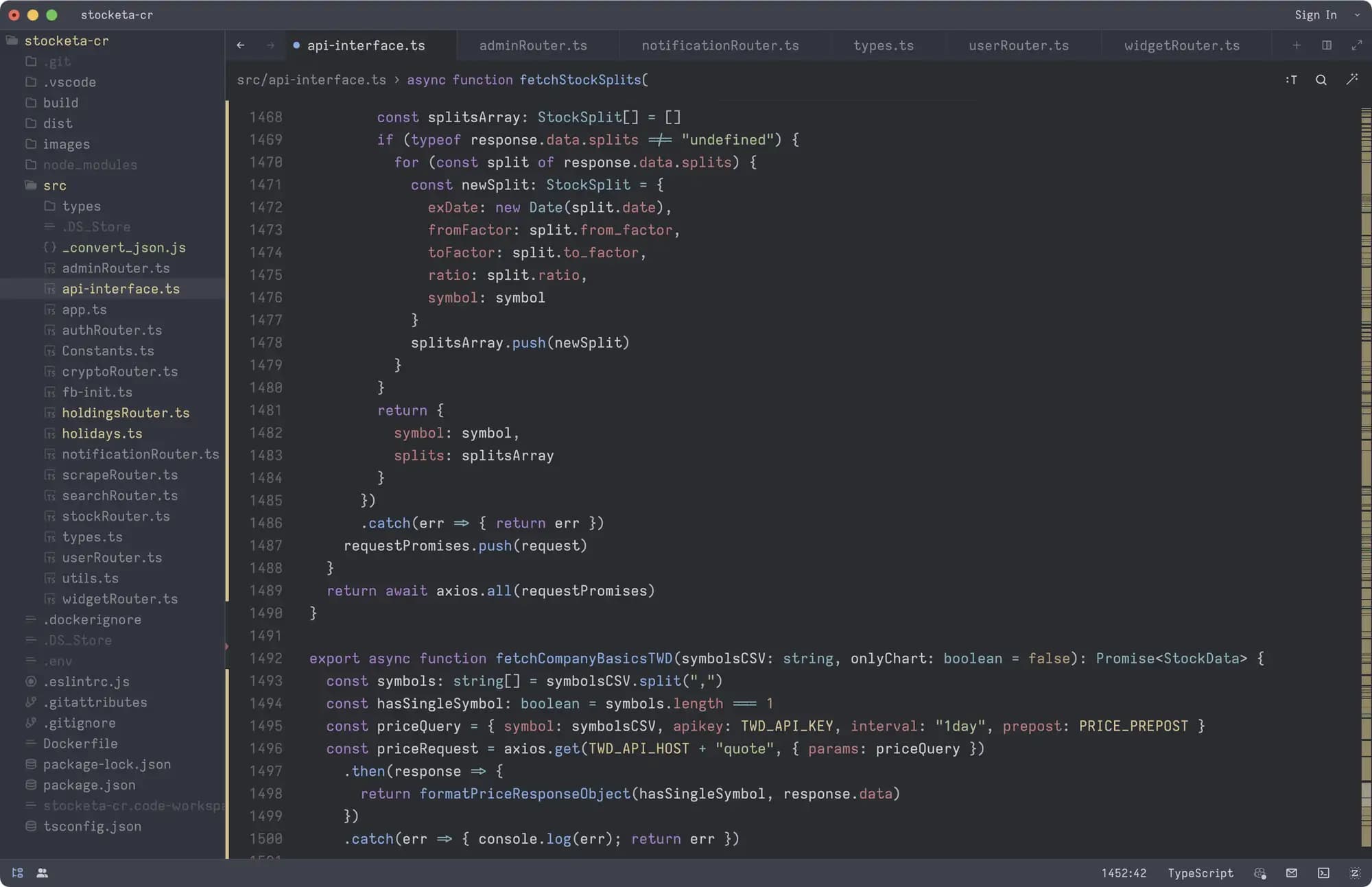
~13k LOC node/express backend (shown in Zed but I now prefer Cursor) for Cloud Run. It manages auth, caching, news, core business logic, cleaning up data, notifications, widgets, working with multiple API, and a bit of scraping. This was my first time doing anything of this size with node and typescript.
Starting out I thought getting access to a stock market data API would be the easy part. I quickly learned about the world of market data feeds, SIPs (Securities Information Processor), and vendor agreements.
Quality market data exists, it's just not made for indie app developers. It's very expensive. Several leading U.S. market data providers have commercial use data pricing starting at $2,000 per month. And that's not for everything, if you need things like index data or options data, there's more charges ahead.
I spoke with one of these providers last year, trying to get them to understand how small app developers need affordable commercial use data. They presented a startup-focused plan that they were pitching for $499/month in addition to a per-MAU fee. Even that I would still consider very expensive for my needs, and it seems like that may have fallen by the wayside and is no longer promoted on their website.
I could spend months developing Stocketa, incurring that monthly API cost until I went live (or risk getting shutdown if I tried to use a cheaper non-commercial plan during the TestFlight phase) then not make enough money to cover costs on the App Store and have to shut it down shortly after anyways.
Overall, it feels like no one in this cares to cater to the developer and startup crowd, or they believe there's not much money for them to pursue there. This was the same case with Plaid when I briefly looked into getting access to their investments API to automatically sync holdings data. They required some sort of minimum length contract.
Why I stopped working on Stocketa
When I started this project, I really began to wonder why where weren't any great indie apps focused on stocks like this. Just simple, well-designed apps to help the casual investor keep track of their investments. Well I think I was starting to get my answer: getting quality financial data, even just for the United States, is a nightmare. You can only get it if you have a lot of money to invest in your project. And good luck if you really want a great API with comprehensive international data.
I can't help but draw parallels to what happened recently with the Twitter and Reddit APIs. The risk of running your project or business solely on top of another company's API, no matter how reliable you think they may be, is extremely high.
Stocketa was always meant to be a side project—never a real business. For it to be a real business, I would need to keep adding functionality and introducing more ways to make money. I couldn't just have a simple and elegant little app tracking your stocks. It would have to do more, like dipping into financial advice services, or offering stock trading. That's a hyper-competitive space lined with massive companies. That would mean a busier, cluttered app. The exact reason why I started Stocketa was because of all those cluttered apps.
I decided to stop working on Stocketa for a few reasons:
-
Data: As mentioned above, all the expenses and challenges associated with acquiring reliable, affordable, and high-quality financial data that would make it feasible to release this as a reasonably priced subscription-based app.
-
Support: The associated investment in customer support. Based on how people were using my TestFlight, it was going to be a significant investment to keep up with support, emails, maintenance, and ongoing feature development. However, part of this was likely due to complexity incurred from having to fix or skirt around unreliable data. There were lots of things I wanted to keep improving and refining with the app and that wouldn't end any time soon.
If I were to release and charge for Stocketa, I would feel especially on the hook to resolve issues in a timely manner and that's not something I can accomodate now because of the next point.
-
Time: And most importantly, I've found something more worthy of my complete focus and attention: Rewind AI. I sunk a lot of nights and weekends into Stocketa over the years. It consumed every spare moment, even taking over my occasional time writing blog posts here when I had something to share. That was something I really missed. Now, I would much rather be focusing my creative thinking time on how I can improve and grow Rewind.
I originally started working on Stocketa with one goal: to learn Swift and SwiftUI my way with a project that was interesting to me. At the time that was scratching my own itch of keeping track of my investments. While it turned into a much larger and unshipped project, I learned a ton about native iOS development and was able to push myself creatively.
These days I'm happiest investing my design, product and development time into Rewind AI, where my SwiftUI knowledge learned with Stocketa has been tremendously helpful.
1 I only had to go down to UIKit a few times. One time for things like custom text fields for more control over interactions, styling, text input, and formatting. Another to use a CollectionView for drag-to-reorder stocks. A third time for creating particle emitters in a few places, like confetti effects, as well as one area where I have some twinkling stars in a night illustration when the stock market is closed. And one last time to get more control over gestures. I needed to get a location when a long press begins and SwiftUI LongPressGesture() didn't provide that, so I used UILongPressGestureRecognizer instead.