In mid-2011, Twitter rolled out the ability to natively tweet photos. 2013 brought media-forward timelines with inline photos. 2014 ushered in multi-photo tweets and animated GIF support. We've just announced Twitter Video to help you capture the moment and tweet video from within the iOS and Android apps.
I'm proud of the level of fit and finish we were able to capture in this release. It's the result of a huge collaboration between design, product and engineering organizations including folks in distributed offices (mainly our Seattle office). Hats off to my product and engineering counterparts Joy Ding and Jeff Currier.
Take a look at what WIRED said about Twitter Video.
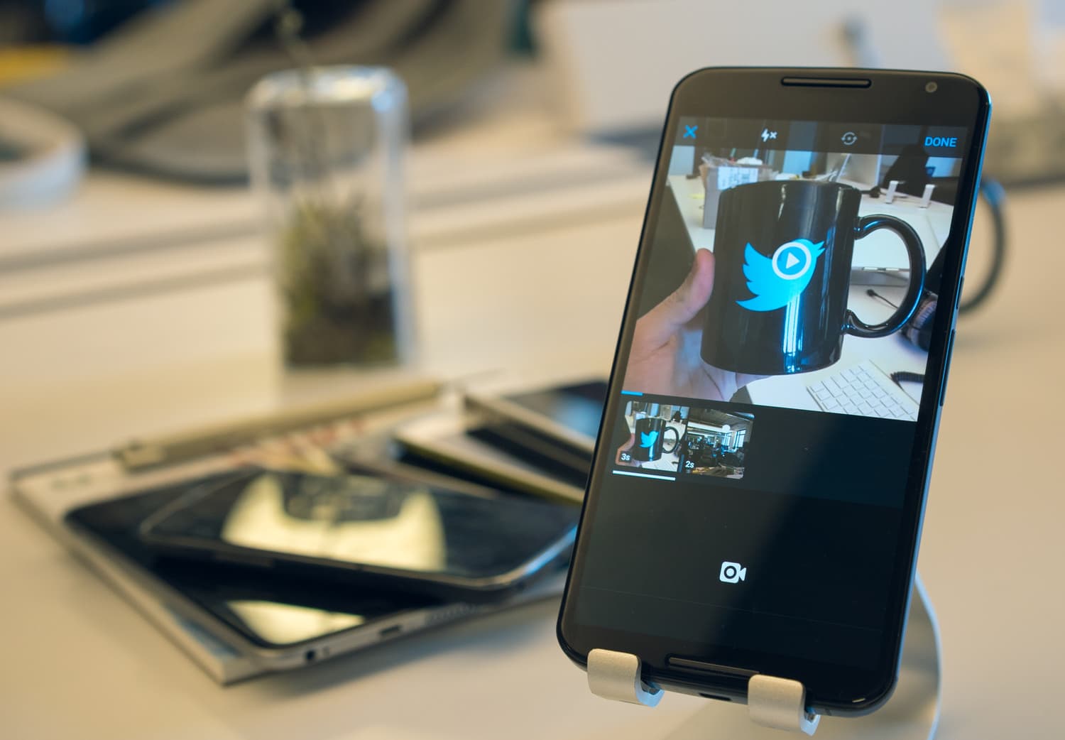
Twitter Video on my Nexus 6 on an M2 stand, with a pile of test devices behind.
“And of course one thing's for sure: putting a real prototype in front of your team is the best form of communication.”
In this article, I will provide a sneak peek into my design process for Twitter Video. This is not yet another boring sketches and mockups iteration article. Why is that? Because we truly embraced prototyping.
You may recall my article Provide meaning with motion where I made a case for why designers need to start thinking about motion and prototyping. Around that time I begun heavily embracing Framer.js and then Framer Studio for interactive mobile prototyping. The timing could not have been more perfect. Little did I know at the time how crucial this would prove to my process.
But this did not stop with JavaScript prototypes. As I'll mention below in more detail I also paired with our new iOS prototyping team to rapidly explore concepts built with native iOS code.
What is Twitter Video?
The teams I work on — photos and videos — are under the umbrella of what we call the expression team along with other teams like direct messages and the tweet composer. We strive to build experiences and the tools people need to express themselves.
For a platform that is public, real-time, conversational and widely distributed, we needed native video support to let people capture the moment and share the world around them.
This was our lens through which to frame the problem.
We started with the ability to share up to 30 seconds of video — long enough to convey a significant message but short enough to be viewed quickly. We wanted to be extremely careful about weighing down the experience with extra pro-user functionality. Even though we support longer videos, we don't necessarily want to make people feel like they need to fill it up. As such, we landed on a simple interface for capturing multiple video segments without the pressure of filling up a progress bar.
Taking the product for a spin, it is quite impressive how well it communicates what you can do with it, on one screen. And it’s more impressive still that this is all down with basically only two buttons: Record and send.
WIRED
Twitter for iOS
Part of the launched iOS video capture experience, as recorded on my iPhone 6+.
Iterations
How prototyping changed the game. 750+ Sketch mockups, 54 Framer prototypes
While there were multitudinous sketches, visual design changes and prototypes along the way, I'll show a few of the main directions. After understanding what the problem was and having a hunch of how it could be solved, I began to sketch as many different directions as I could, pick the best ones and then test them out in a prototype. The design team at Google Ventures talks about something like this called the "Understand, Diverge, Decide, Prototype and Validate" sprint.
After getting to a good place with each iteration in Sketch, I would then turn to Framer Studio. There I would be forced to intimately think about every interaction and animation. This was the quickest way to expose the some issues with each design. My most recent designs would end up living in Framer Studio as I changed things on the fly. Sketch was a stepping-off point.

One of the later iterations built in Framer Studio. Lots of quick and dirty code :)
My prototypes were generally fully interactive with gestures, scrolling, keeping track of state and more. However, since I couldn't easily access the computer or device camera (though you can import a JavaScript library that will let you access the native camera in Chrome...) the images and videos used were faked out.
While I love preaching about prototyping, I also clearly recognize when it's useful and when it's a waste of time. Prototyping takes a non-trivial amount of time and can very often be an unrelated technical challenge when you start needing to think about storing state and array manipulation. So I only went to prototyping if I needed to answer some big questions about how it might feel; things I couldn't figure out in "my mind's eye" as one of our designers says. I would get the prototypes functional enough to get the point across but wouldn't spend an extra day or two trying to get every bit of functionality coded.
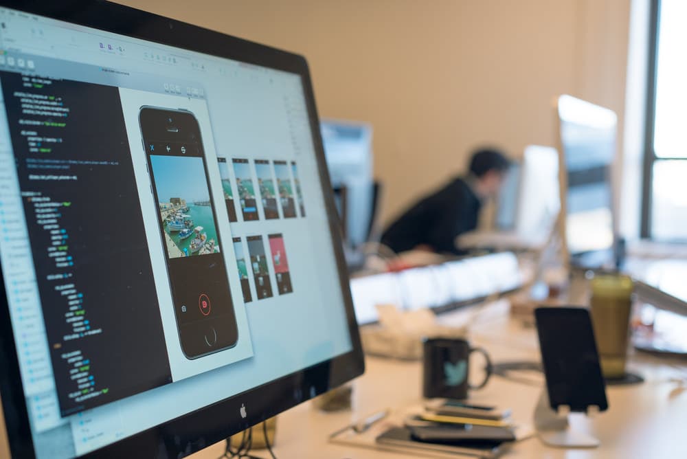
Who are you prototyping for? Prototypes are partly for me to get a sense for what something could feel like and validate the interactions of the concept. However, they are very much also for communicating intended designs with all stakeholders. I would often show early prototypes to my manager Brendan Donohoe for his thoughts along with others at design critiques, in addition to emailing screencasts to the video team.
A prototype is worth a thousand meetings.
As for why I made Framer my prototyping tool of choice: I have a background in front-end web development so I feel completely at home with JavaScript. I didn't want to run into the limits of other tools in the middle of building a prototype; you can build almost anything with CSS/HTML/JS.
Iteration #1
Work up until this point was exploratory and "blue sky" as we like to say. Nothing was out of the question. Items pondered included: navigation, recording progress indication, how mode switching in the camera could work, thinking about what functionality the video camera needed for the short term and long term extensibility as well as thinking about what editing functionality for the recorded video segments.
One thing we did know early on was that consuming portrait videos is not a great experience. They would either be too tall for timelines or tweet detail views without the user taking action to make them full-screen, or worse we would have to make the video much smaller and pillarbox it. As such we wanted to discourage it but not disallow portrait videos on Twitter. Videos recorded with capture experience would be square, but people would still be able to import any aspect ratio video they already had on their camera roll.
My first designs had a two page flow: record video on the first and playback, rearrange and delete video segments on the second page. Seemed like a logical way to map things out by separating concerns. The recording mode had a simple blue progress bar line with a hold-to-record recording mechanic. The edit page also had this notion of mini-filmstrips for video segments over 5 seconds long. That way you could see which segments were longer at a glance without resorting to parsing through timestamps.
Framer Studio
In the first prototype I began toying with the idea of having a quick undo functionality, or even the ability to hold it down to rewind and delete.
At this point I was using placeholder icons while our stellar icon designer Jeremy Reiss was making some in our signature Twitter style.
What's a design crit?
Design critiques are informal, regular gatherings where designers show off what they're working on, at any stage of the project and get advice on solving any design or research problems. With such a large design team we have crits split up by team so you get the most relevant feedback from peers that have a working knowledge of your part of Twitter.
This is not a buttoned-up presentation and it's not where you go to seek "approval" to ship. It's a relaxed, creative environment where you can benefit from the knowledge and expertise of your teammates.
Concerns
At this point I had gone through a design critique or two. A few suggestions emerged. One was that placing a delete "X" icon on the segment was a bit risky with the size of that tap target. It also required unnecessary logic for undoing deletion since you could too easily delete a segment.
The other suggestion was to space out the video segments as they did not look like distinct elements you could interact with and it looked too much like single filmstrip.
My PM, EM and I also chewed over the usefulness of seeing the recorded video segments as part of the next step after recording. Was that too much of a pro-user feature and most people would just want to quickly record a single clip and post it?
Fixes
My next prototype addressed these issues with a drag-to-delete instead of the delete "X" and I made the next page of the flow be just a preview with the option to capture your edit intent on either the recording page or the preview page. This way we would bias towards quick capturing and not editing.
Framer Studio
I began to want to enforce the notion that going into edit mode would not feel like a new page or loading a new modal. It was just animating some new elements onto the same screen.
I would begin to tell user stories about how you could capture a segment, easily toggle into edit mode, delete a segment, then continue recording quickly without waiting for a page to load.
Concerns
This was starting to feel good. I presented this at another design crit and got some feedback to explore other solutions to the segment deletion behavior. It felt a bit odd to have the trash can appear on the segment you were dragging and didn't make it too clear about when it would delete and at what point you could release and not have it delete. There was also a concern about the discoverability of this gesture.
Fixes
I explored a new deletion direction where you would drag the segment to a trash can that appeared on screen the second you held a segment. You would know that you were in the "delete zone" when the trash can opened up and the background overlay turned red. I also started introducing NUX tooltips, one of which informed people they could rearrange segments or drag them up to delete. I went with an iOS prototype this time.
Framer Studio
It was around this time that Framer began to support videos in prototypes, so I incorporated some video clips from my Japan trip.
Many items were still a bit exaggerated and too bouncy in these earlier prototypes.
Iteration #2
All along the way I had been providing regular design updates to the team and soliciting feedback. I also wanted to get a strong sense for what would be technically possible. For example, the prototype I had where the segments would float on the screen without loading a new modal seemed challenging from an engineering perspective at first glance.
After a few weeks of pairing with engineering we had a rough but functional recording and editing experience on iOS.
The first real iOS build
It was refreshing to actually get to play with a real thing! JavaScript prototypes only get you so far.
Concerns
Now that we had something real, we began playing with it. We presented this progress to our CEO, Dick Costolo.
One thing became clear — there was no good sense of feedback while using it. The culprit was the progress bar. With a 30 second time limit, that thing moves very slowly and it doesn't reinforce that you're recording. It also had the side effect of encouraging users to fill it up or worse, make them feel like they needed to fill it up.
The other reason that made the progress bar not the ideal solution was technical: The camera would take a while to actually start recording. We needed to communicate to the user that something was happening but we weren't quite recording yet. This was mainly an Android problem. The camera takes a while to begin recording on Android. Like a second. A second feels like forever when you want to record something.
It also didn't help that when you pushed the record button, the circle around it shrank. It was later changed so it would grow and be visible even with your thumb on top of it.
Fixes
I spent a while exploring alternatives to the progress bar. I probably had some ~40 iterations from animating graphics and other visual representations to timers. During this exploration I would share mocks and simple prototype videos with the team. My engineering manager Jeff would show them around to folks in the Seattle office candidly and send over feedback too.
One variation included some kind of animating graphic while the camera was getting ready to record, then an incrementing timer and pulsing recording red dot. During the last 5 seconds, a red line would grow across the screen to provide a sense of urgency and indicate that you were running out of time.
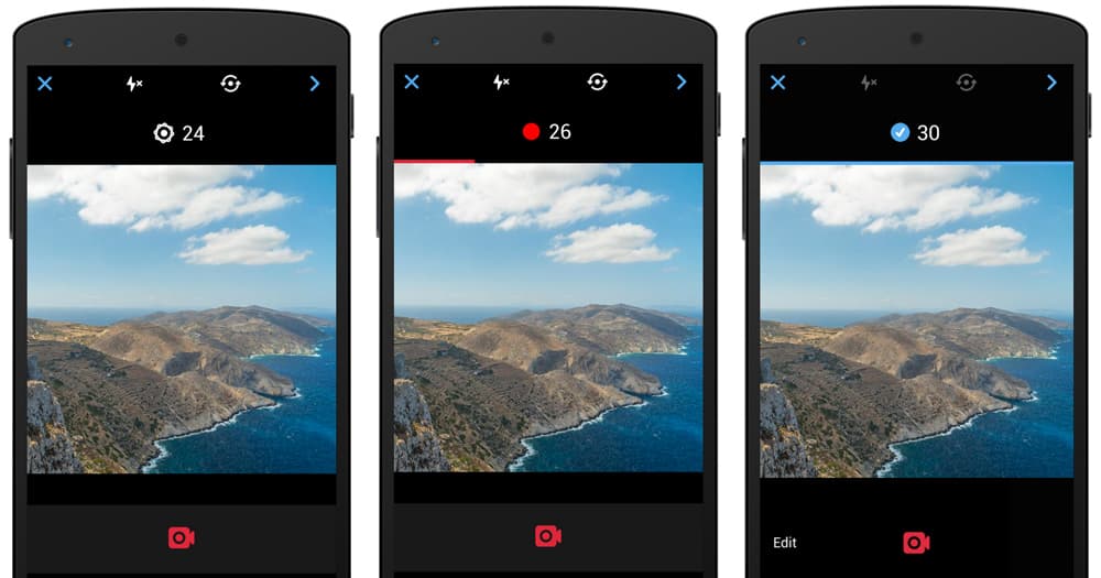
I avoided displaying a check mark when you hit the time limit as I didn't want to encourage recording for the entire duration.
As we were designing and building this feature we were always talking about the original mission: helping people capture the moment. The conversation became "What if the moment you really want isn't until the end of those 30 seconds?" We tossed around the idea potentially allowing people to exceed 30 seconds of recording. We could let people record infinitely and then trim down later or only retain the last 30 seconds.
In the end this was getting complex and feature creepy. 30 seconds was in fact a very long time by competitive standards and we were getting carried away here. Simplify.
Framer Studio
While still a two page flow (capture, then preview/edit), the removal of the progress bar made it feel more responsive compared to the previous very slow progress bar.
But it still wasn't quite right.
Concerns
Getting rid of the progress bar had solved some of our previous concerns but after tinkering with this prototype and subsequent real iOS builds, the team and I started sensing some new issues. After recording a few video segments, you didn't really feel like you had accomplished much, other than just increment a number. We wanted more visual feedback. The timer itself wasn't delightful.
You know what's delightful? Seeing the segment you just recorded plop on the same screen as you're recording it. We questioned our original posit of simplifying the interface by hiding the video segments behind a user editing intent. Now we had a reason to surface them. If you recall from iteration #1, I wanted segments to load as if they were on the same page, with no new modal transition when the user tapped an edit button.
We noodled on this idea for a while. The top concern was that seeing the video segment thumbnails on the same page as the camera viewfinder might feel too busy and distract from the main task, recording. People might spend more time fiddling with playback and editing tools and then we would see lower conversion in successful video tweets.
At design crit we discussed the merits of being able to toggle playback and recording on the same view. I suggested that having a second page largely for previewing the video you just recorded was superfluous and if you wanted to see it you could just tap a segment. This would remove the need for the second page.
It was going to be very risky to have the team start building this unproven UI. The eng cost was pretty high. Prototyping to the rescue.
Fixes
Around this time I began working very closely with Avi Cieplinski and David Hart from the Twitter iOS prototyping team. I can't overstate how much these two sped up our pace of design exploration, validation and execution. They're not just engineers or design-minded engineers; I consider them designers. That's extremely hard to come by. They not only know animation curves, springs, gestures and computer vision but wrote their own animation framework internally.
With their help, a "what if" on one day turned into a working native iOS prototype the next. I would come to them with some ideas about how I was approaching an interaction problem, they would explore on their own and rapidly try many approaches in builds.
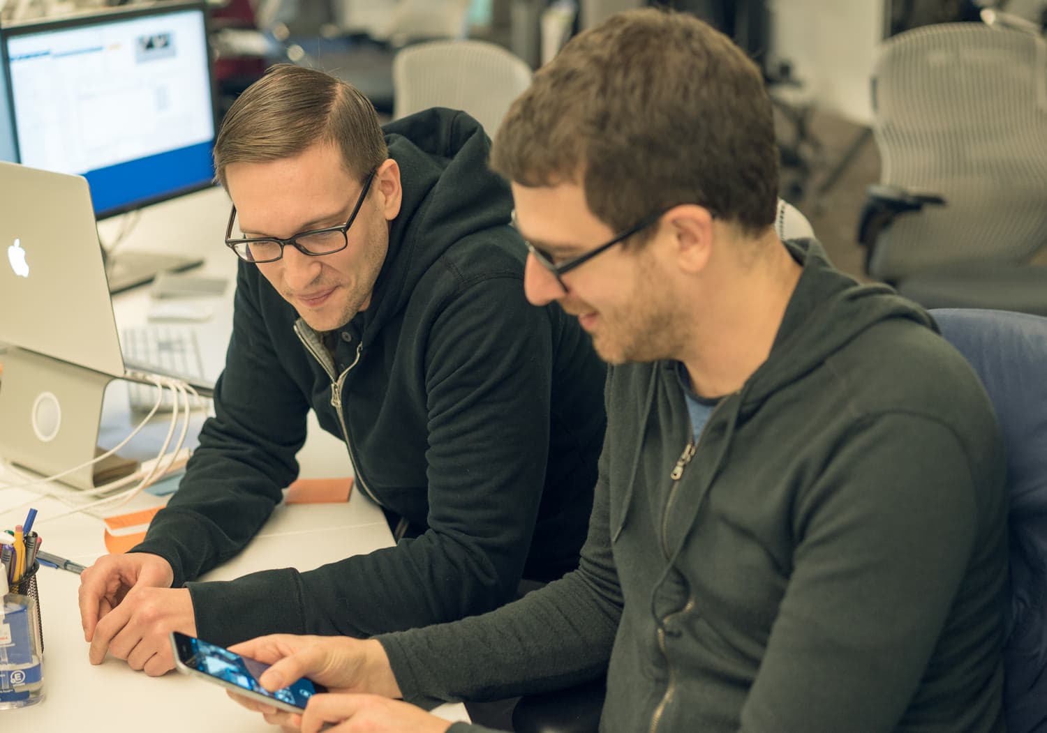
Avi and I were discussing my latest timer iteration and how to merge segments on to the screen. We tossed around the idea of the first frame of each segment showing up the second you press down, so you get the instant gratification of something popping on your screen and showing your recording status.
The next day I swung by Avi's desk to see him take it one step further: autoplaying, looping individual segments as you recorded them.
iOS prototype
A bit buggy in the video (ignore the blue playback progress overlays), but an impressive proof of concept in my mind.
From prototypes to native builds
One thing I quickly learned was the large disconnect between working in Framer Studio and then working with engineers to get the exact same built. Framer has its own animations and springs that are unrelated to the capabilities of our iOS and Android apps. So while I would often specify a spring tension, velocity and friction in Framer, those values could not simply port over. I had to find the equivalents in iOS and Android.

Fortunately on the iOS side Avi and Dave were able to provide more insight about these curves and values, especially with the custom animation framework they wrote. More on this below.
Android was another challenge and I began reading up on Android animation interpolators to get a better sense of what to specify for animations.
Iteration #3
Seeing Avi's prototype had me hooked. I realized that the autoplaying, looping video segments was a stretch (performance! I doubt it would work well on all devices and definitely not Android) but the instant feedback of seeing what I had just recorded was scintillating.
Avi put this build on my phone and I went around showing people and getting feedback. At this point, I had bought some time from our engineering team to explore this new concept before anyone officially started working on a new direction. I needed to validate it and make sure it solved all of our concerns and thought through the UX issues.
Jeff Currier was similarly enthralled by this prototype. For days after seeing it, he kept mentioning how he thought this was a better solution. I began to move forward and do the UX due diligence:
-
Figure out a better placement for the timer as this was going to have to work on an iPhone 4.
-
Think through how playback would work and all the associated logic.
-
Come up with a way to display recording progress if we couldn't get the frame from the new segment fast enough. This would definitely be the case on Android.
Framer Studio
In this prototype, I had the concept of a placeholder that would automatically come on screen when you begin recording. Even if we couldn't display the first frame immediately, there would be something instantly happening on the screen to let you know it was working.
I placed the pulsing recording dot in there, to let you know it was recording that segment. The usual pattern would be to pair the recording dot with the timer pill, which I had placed on top of the video.
Research & usability testing
Now we wanted to uncover any challenges people might encounter with the video capture experience. Dave Dearman from our lovely research team brought people in to the Twitter office to show them a Twitter video capture prototype, see how they use it and ask questions.
Before any usability testing could take place, we needed to come up with questions to ask participants. In particular, they needed to provide answers that would actually inform and provide a way to frame their interactions with our app. Joy and I brainstormed questions with Dave. The goal was to get their feedback on the experience and also understand the challenges they encountered while going through our flow of posting media to Twitter.
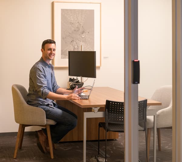

The only problem? We were not even close to having the real video capture UI built yet.
Enter the iOS prototyping team again. Avi and David built a completely faked out app. People weren't able to tell the difference. I provided real assets and mocks for other screens that would be displayed in the usability study and we prepped Dave on how to guide people through this.
Dave Dearman started by asking each research participant more about themselves and their interests, as well as how they're sharing media on other services to see how Twitter fits into their whole media sharing flow and when they think of using Twitter to share and why. He was spectacular at getting folks to open up and provide candid feedback by saying things like "I didn't build this, you won't hurt my feelings" when showing the app.
Some parts of the prototype were not functional so Dave would ask questions like "Let's imagine you want to delete one of the clips. Without touching the app, can you walk me through how you would delete a clip?"
Watching usability studies is eye-opening, especially when your own designs are the subject. I was in our Seattle office watching Dave's livestream in San Francisco while taking copious notes and writing down quotes.
Things learned
- When seeing multiple segments and asked what happens when they tap done, some participants thought it would only add the highlighted segment. The design was that every segment you recorded was part of a single composition.
- By showing a mini-filmstrip for the longer segments, people were a bit confused and thought they could trim or split the segments. They became frustrated when they realized that wasn't the case. Dick had also pointed this out in a prior meeting.
- Everyone understood how to open the camera, switch to video mode, understood how the hold-to-record UI worked (the tooltip that appears when you don't hold down long enough was handy) and that the timer turning red meant they were almost out of time.
- When asked how long they thought our time limit would be, before we even let them use the feature, a few people guessed 30 seconds.
- The prototype didn't have reordering or deletion of segments built in either but when asked how that might work, most said something to the effect of dragging it out of the segments bar. One person drew a parallel to how you kill apps in the iOS app switcher.
Fixes
We needed to make each video segment feel like it was part of larger whole. At this point I had been displaying playback progress as a blue overlay on top of each segment. Despite video segments autoplaying from one to the next, having the progress only on one segment unfortunately reinforced the notion that you had to select a segment to post.
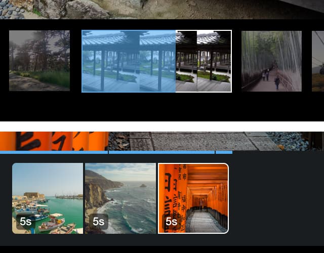
I moved to a global playback progress bar that showed the progress of the entire video composition. If you had 4 segments of equal length and you tapped the second segment, the progress bar would begin at 25% width. Avi and Dave also had the suggestion of adding little tick marks on this line to give an idea of what segment you were in, while still providing global playback progress.
Twitter for iOS
The playback experience that we launched. Hidden pro tip: you can scrub left and right anywhere on the video to control global playback position.
We also tried to solve this segments-feel-too-individual composition issue by simply bringing them closer and rounding the corners of only the first and last segments. David Hart made a great prototype of this (and later ended up writing the production code for it) where the rounded corners would animate as you moved segments around or lifted them up. When you split up the composition upon lifting a segment, we round the corners of every new portion.

The last notable piece of the usability fixes was removing my mini-filmstrips for longer video segments. As much as I thought this was a nifty and elegant solution to seeing clip length and provided more clarity into what you shot at a glance, people just found it confusing. We removed this and placed small timestamp badges that fade in when you enter playback mode.
Fit & finish
The details are not the details. They make the design.
Charles Eames
I was happy with this design direction and the usability sessions did not find any blockers.
At this point, the new design was entirely a prototype. What was currently in real Twitter builds was the older design with the timer with a second page for previewing and editing the video. The usability sessions helped validate the concept to everyone on the team and smooth out most of the issues we had with it.
Jeff, Joy and I worked with the team to do some eng costing — walking through the design in detail to get a sense for how much time it would take to develop — and then show the new design and schedule to Dick and the operating committee to get their thoughts. They liked it and we kept pushing forward with this direction.
Through this involved design-prototype-validate iteration process we pushed the envelope on what we could ship in the first release — no more MVPs. We would say that if absolutely necessary, we could cut scope, but never sacrifice quality to meet deadlines.
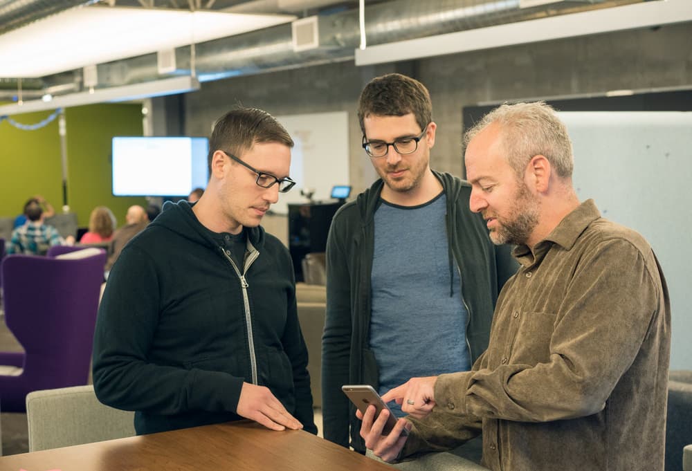
Dave, Avi and our VP of Design Mike Davidson talking gesture physics. Design crit in the back.
As we began adapting the builds to use this new single-page UI, we would constantly test on various devices. It was here that I quickly noticed we couldn't use the same video segment thumbnail sizes. Keeping one size that would fit on the iPhone 4 looked absurd on the iPhone 6+ for example. I spec'd out three sizes that I felt looked good on various devices and we would adaptively use the right size based on the device (50dp, 70dp and 90dp segments).
Pairing with engineering
It irks me when designers talk about making specs and handing them over to engineering. The process of "making specs" implies that there is no conversation with your engineering counterparts when developing. While I have a technical background, I'm nowhere near the caliber of the engineers at Twitter, so I use this as an opportunity work closely with them to learn more about our iOS and Android codebases, how things are built and determine what's feasible.
I would only know what's possible by asking simple things like "how do you do an EaseIn or EaseOut" and "is it possible to specify the factor of it, like to get a quadratic?" For these small tasks I found this easier to do on my own, tinker with a few values and find what looked best before reporting back. That's much faster than putting the burden on engineering to provide you with various builds using different values for you to test, especially when working with engineers in our distributed offices.
For larger changes, I would try to include the whole team into the designs along the way. That was hard; designers have a natural tendency to not want to show work until it's completely baked. However, the absolute last thing you want is to go off to your design cave for a few weeks and shock your team with designs that can't actually be built for one technical reason or another.
I would try to get as specific as possible when detailing animations in JIRA tickets. For example, early on I was asking how we could do a subtle bounce effect on Android. I learned that we didn't have any custom animation framework for this like we did on iOS, but Gordon Luk showed me some basic Android interpolators, like OvershootInterpolator, that were a step in the right direction.
We also have the ability in our iOS builds to set up parameters that can be adjusted on the fly, thanks again to Avi and Dave's work on their animation framework. For example, when it came time to make the shutter ring spring-based on iOS, Dave showed Gary Morrison how to implement it with the framework and then parameterize it using his custom parameterization framework.
I then pulled and built his code and was able adjust spring values like Magnification, NaturalFrequency and DampingRatio inside the app as I was playing with it. After finding the subtle bounce I was looking for, I committed the changes to the iOS repository myself.
I began finding lots of design issues in the iOS and Android codebase I could fix. I started by looking for any place in the app where values changed instantly or where they animated linearly. From wrapping an opacity change in a UIView animateWithDuration animation block and specifying the easing curve to spending a late night pair coding with Yoshi to refactor some code so I could adaptively change the recording dot size on iOS depending on the device (like we change the video segment thumbnail size).
Reason 8384 I love having @Stammy as a designer: Cut his polish bugs in triage & he'll learn Android dev to fix them pic.twitter.com/acNJuup4Lv
— joy to the world ⛄️ (@yjoyding) January 16, 2015

My to-do list became a bunch of tickets to verify.
By the time we launched, I had done about 10 commits that were merged to master. I gained a new appreciation for the engineering process, the rigor applied with code reviews and sympathizing with engineers over the pain of waiting for each build to compile.
At this point in the project my daily routine shifted from Sketch and Framer Studio work to testing several new builds each day, providing detailed feedback along with relentlessly filing new design issues and bugs.
New builds would come from different engineers working on different tickets from Chris finishing up some iOS import work on his implemention of the zooming animations to verifying Pablo's implementation of the video segment timestamp badges.
Dogfood
One of our big milestones was when we were able to give employees access to Twitter Video. When you ask thousands of people to starting using your feature, you will find bugs... including some absolutely crazy bugs. Things like "tap the mode switcher 20 times and the screen goes black" and "app crashes when I use one finger to start recording and another finger to start dragging a previously recorded segment."
As we got closer to launch Joy, Jeff and I would have daily meetings to triage the remaining tasks, new bugs and prioritize accordingly.
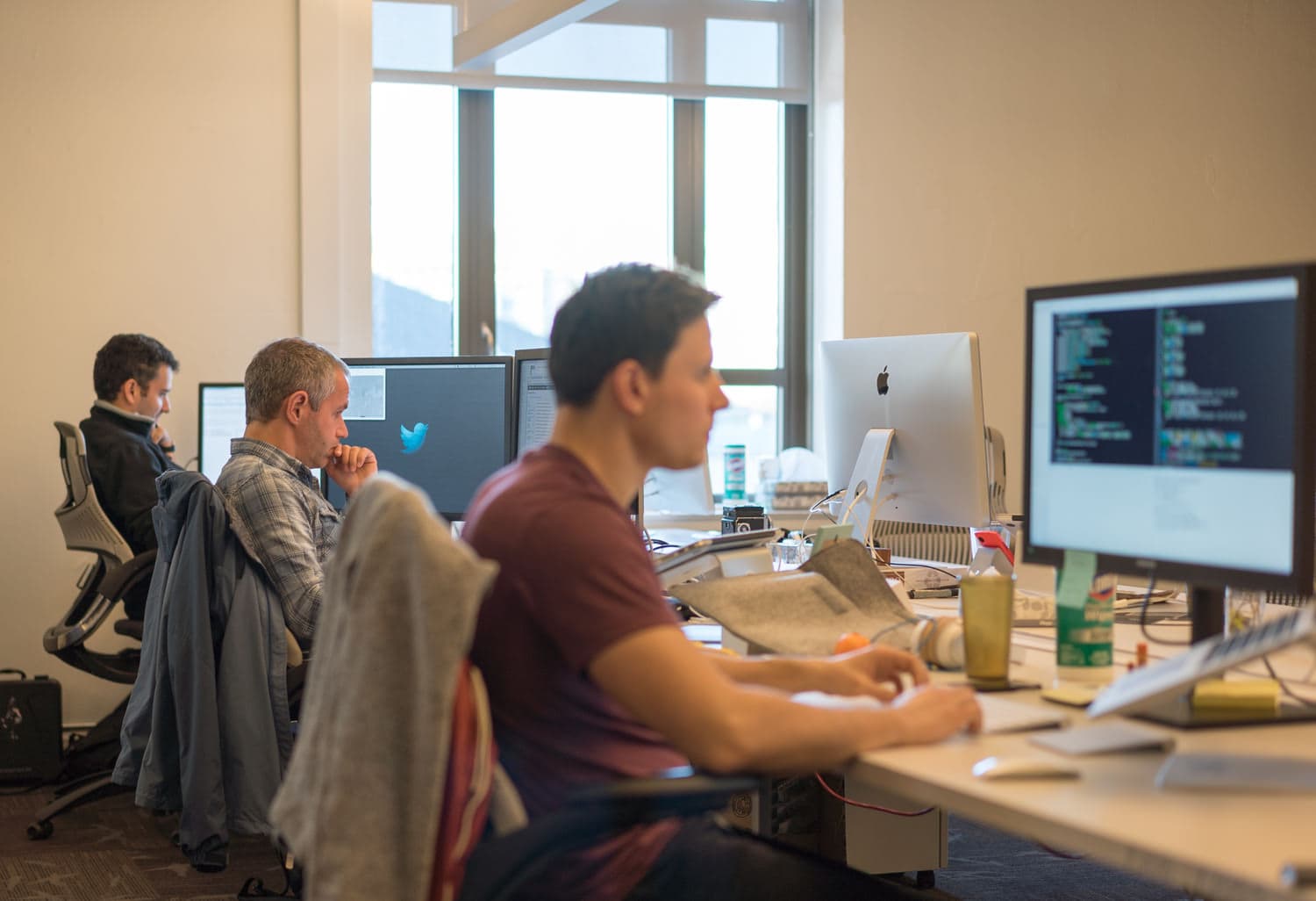
We got into the habit adding a verify tag on JIRA that I would run through every morning and not consider the ticket completed until I had checked it in the latest nightly build. This would often involve taking screenshots and measuring things or taking screencasts to help file bugs (I would very often record screencasts simply to step through animations). We also worked closely with QA to find issues on a variety of devices.
It's hard to illustrate how vital this intense engineer pairing, build testing and ticket tracking part of the process was to seeing the designs come to life as intended.
The End
Designing and building Twitter Video would not have been possible without incorporating prototyping into my design process from the very beginning and working very closely with our talented engineering team along the way. It's been amazing to see people everywhere start using and enjoy something you worked on. That's definitely one reason why I love working at Twitter.
While this blog post only discussed the design and iteration of the video capture experience, I was also working on other items like the iOS and Android import trimming pages, NUX tooltips, as well as working with other designers like Jon Bell on the media uploader UX.
[Framer Studio] iOS trimmer
Even something as simple a trimmer requires a bevy of design and product decisions to be made. For example, we only preselect 20 seconds instead of 30 to encourage shorter videos. We selected from the end of the video due to data we had showing that most people start recording too early and want to retain the latter portion.
When you hit the 30 second limit, the gripper pauses a tiny bit before continuing to move and moving the entire selection with it. Though we have thought about having it do something like hit the wall and only budge when you try it again. And there's more to consider like animations around zooming into the filmstrip.
Twitter is hiring!
So this is what I do at Twitter. There are many more challenges like this on the design team. If visual design, rapid iteration with prototyping and working very closely with engineers sounds interesting to you, take a look at our career listings.
