I know what you're thinking. Paul writing about an AOL product is the equivalent of pigs flying or renting a studio in San Francisco for under 1000/month. There are a number of reasons you might not approve of AOL's tactics but for now I'll put that behind me and post my thoughts about AOL's attempt to break their 1990's stigma with cutting-edge personalized web services, collectively dubbed myAOL. First off, you can login to myAOL with your AOL Instant Messenger account info, so chances are you can start using it immediately.

At first glance, I wrote off myAOL as another startpage service (competitors: Google IG, Netvibes, Pageflakes, Webwag, Yourminis and 42 more). Frank Gruber, myAOL Product Manager and huge tech blogger himself, assured me there was more to it, so I took his challenge.
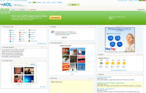
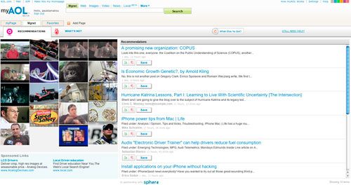
myAOL is divided into three main sections: myPage, Mgnet and Favorites. myPage is the personalized homepage portion of myAOL, Mgnet (pronounced "Magnet") is an unrivaled visual content discovery and recommendations engine. Finally, Favorites is your typical feed reader and bookmarking service with a feature called Mix & Share that lets you share a public page of your bookmarked posts (think Google Reader's Shared Items).
If you've ever used a customizable startpage before, you know how to use myPage. You can add content modules for things that interest you by browsing their comprehensive modules gallery. On the downside, myPage has a big advertisement block that you can't do anything about. You can also create additional pages on myAOL.
Mgnet is by far the most interesting and promising of the three myAOL services. It initially shows you with a page of images relating to different categories of news (motorsports, food, pets, et cetera), which you select to teach Mgnet your interests. After that, Mgnet will present you with relevant news that you can rate with a thumbs up or thumbs down.


Over time Mgnet will fetch you exactly the type of content you indulge in, or at least that is the idea behind it. If ever you should get tired of looking at your own personalized news you can jump over to the "What's Hot" section for general, popular news items. Mgnet is filled with animations, an engaging graphic-over-textual content presentation system and is backed by an exemplary concept.

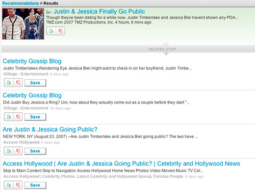
As always, there is room for improvement. I feel the interface is lacking in terms of content density. A lot of space is consumed but not much content being displayed in that space. For example, clicking on a headline image loads related stories in a framed pane where I can only see about 5 stories. The thumbs up/down and save icons take up considerable space and I think the interface could be tweaked to show more. But then again, AOL's user base isn't known for being overly tech-savvy, so maybe this is better? If I were to use Mgnet daily, I would like a list-style view similar to GMail with a truncated content preview.
Here's what I think of myAOL overall: Personalized pages is a saturated market and myAOL wouldn't survive if they didn't bundle in some other interesting services. myPage and Favorites don't offer much innovation from their competition but I love where Mgnet is headed and think AOL should devote more time into building it out. All three services could benefit from some UI tweaks as the lack of adequate content density turns me away from considering things like Favorites a viable feed reader. When a user has hundreds of feeds to read, it would be nice if that user could view more than 5 headlines at a time.
Do you have any experience with the recently launched myAOL? What are your thoughts?