About this website
How I designed and built this site
I have been running this blog since 2005. I got started with WordPress but eventually migrated to a static site generator called Jekyll in 2010.

I became interested in having my website use a static site generator for a few reasons. First, I did not like dealing with a dynamic website that relied on a typical LAMP stack. Having a database meant that MySQL database backups was mission critical.. and testing them too. Losing an entire blog because of a corrupt database is no fun.
Then, to be performant I would have worry about setting up some kind of static page caching so that my site would remain up when any articles ever received slightly more traffic than expected. There was also the need to constantly install software updates for security issues: both on the server and the CMS. And even with all that done, if a post received a ton of web traffic, the server would still not be able to serve up the site for every visitor as it was just running regular VPS server.
And finally, I plan to keep my site online for decades to come. Keeping my articles in static files makes that easy. And if I ever want to move to another static site generator, porting the files over to another templating system won't be as much of a headache as dealing with a database migration.
By going with a static site generator, many of these hosting woes are eliminated. I hosted my website directly on Amazon S3 via a CloudFront CDN distribution for over 6 years. Eventually I migrated to hosting it with Netlify, which has its own CDN but makes deploys super easy (just push to git) and has lots of built-in configuration and optimization capabilities.
Hosting this way means I don't have to worry about scaling issues—one of my articles exceeded 500,000 visitors in a few days—so I can just focus on writing high-quality articles.

Jekyll
My static site generator
Jekyll is built with Ruby and relies on a myriad of Ruby gems. It came to prominence as a Markdown markup editor. However, I don't use Jekyll with Markdown. I strongly prefer just writing my articles in HTML markup so I can have more control over layout.
If I was building my site today, I would be considering a faster, newer static site generator like Hugo for a few reasons. First off, Jekyll is slow, especially when you have over 1,000 posts like I do. Depending on the machine I use to generate the site, it can take anywhere from 7 seconds to 90 seconds to compile. Hugo claims this can be done 100x faster.
Second, Jekyll relying on a Ruby environment is a hassle. Getting a new environment setup on a new machine is always a pain, with some gem always being reluctant to install and leading to Googling about 5 different issues before it's resolved.
Dev environment
Most of my development needs revolve around this website: writing, designing, building and modifying photosets and articles. My development flow would typically just involve Google Chrome, Visual Studio Code editor and iTerm2 terminal.
I used to run a more advanced setup where I had a server running code-server so I can log in and write and deploy an article from an browser. Eventually I decided I didn't want the added complexity. With my move to Netlify, it's easy enough to be able to do a git push to deploy, or trigger a staging deploy locally.
Backups
Always back up your website.
Blog repo (posts, templates, CSS, JS...)
I have been using a private GitHub repo for this for years. It's under 1GB since I don't store media inside of this repository. In addition to the repo, I have a simple bash script that runs git archive -o and then generates a dated zip file. This file then gets uploaded to an S3 bucket. Once that happens it is also automatically copied to a Google Cloud Storage bucket and downloaded to my Synology NAS to have a local copy.
Media (exported photo and video variants)
All media displayed on my website is hosted separately from the rest of the served files on its own CloudFront distribution. I have that distribution configured with S3 cross-region replication, which means that the S3 bucket is always synchronized with another bucket in another AWS region. Once configured this only works for subsequent file uploads/updates, so I had to use the AWS cli tool to sync everything the first time.
I also have these assets copied to a Google Cloud Storage bucket (Nearline) bucket using their easy-to-use storage transfer service.
Finally, I also have a script that uses the AWS cli tool to archive all the media assets (~25GB) and store in a dated zip file that gets sent to an S3 bucket (that automatically gets copied to a Google Cloud Storage bucket and backed up by my NAS).
What I want my site to do
And how I built it
When I started this website I just wanted some place where I could post guides and my thoughts on tech news. Over time I began to evolve my publishing to focus more on things that I could uniquely comment on—not just post the same news and reviews that everyone else was publishing. A way to differentiate myself and my site.
This also aligned with my life after college where I had less free time and was either working on startups non-stop or when I transitioned to my full-time job at Twitter. I shifted to publishing less frequently and only when there was something I was personally very interested in and experienced enough with that I could go very in-depth on the topic.
It was also around this time that I became more actively interested in publishing my photography. Not just putting individual photos up, but sets to tell a story of a trip or journey to more intimately share an experience.
became enthralled about this when I was planning for my 2013 trip to Japan. I came back with thousands of photos and spent months figuring out a way to best share the story of the trip on this site. I designed and developed the first version of my photoset collections then.
Since that first real collection I have redesigned my photosets many times. For me it's less about showcasing that one great shot and more about telling a story. As such, I really don't buy into the current trends about having full-bleed large photos with fancy and complex parallax scrolling interactions and all that. The text in between the photos can be important too. Along with where I stayed, the path I took, what I ate and so on. However, I do think it's a balance—too much metadata can be overwhelming. I used to be interested in sharing camera EXIF data on every shot, weather for each day of the trip, ambient audio clips and more. I eventually simplified to focus on what helps tell my story the most.
I have been very pleased with how the photoset portion of my site has evolved and I often find myself loading up photosets when telling stories to share with friends.
That being said, the photosets and the blog are a labor of love. Some of my posts take months of spare time on nights and weekends—either from editing photos to writing to designing and building new site functionality along the way. I do it for myself because there's really no way to justify the investment otherwise.
Principles
How I think about publishing.
Fast: I'd like for my site to feel fast for most visitors and should always consider the impact on website performance with things I publish or features I add. This one is always the hardest when wanting to show lots and lots of photography, but I try to stay the course otherwise with many variant sizes, a focus on asset optimization, CDN usage, alternative formats (WebP/WebM) and lazy loading.
Content first: When trying to share an experience, viewpoint or guide, the prominence of media or text may play an outsized role. I need to have ways to call out important items, provide a strong hierarchy and otherwise setting the content up for success before considering other factors. This is one of the reasons I disabled full-content in my RSS feed and newsletter. Articles and photosets are best viewed on the website as I have intended.
Share my personality: If you were to talk to me in person about a hobby or interest of mine, I would naturally talk your ear off.. I love to geek out on things. I want my published works to mimic my personality... even if it ends up being way too verbose. I'm a bit of a perfectionist, I spent too much time sweating minute details—that's me. I'm not trying to be yet another tech blog. People value my website because it's something different and I should continue to create with that in mind.
Be pragmatic: There's always a desire to dramatically redesign parts of my site, chase design trends or just build new things I've learned about just because. But I try to always heavily consider if they really add value, be it clarity, simplicity or usability.. or if it just looks cool or does a quirky animation.
How it's built
What I wrote, what I use and how it all comes together
I use two sets of Jekyll collections: posts and photosets. For the more complex photoset collections, such as Africa and New Zealand, I set a shared category in Jekyll that I would use to list out the related photosets.
My site also utilizes two tools to help create posts. I use a JavaScript task runner called Grunt and a Ruby Rakefile to automate some things.
I primarily use grunt to combine and minify JavaScript files with terser, optimize CSS files and generate initial variants of my images. At this point grunt is pretty old and there are more popular build tools (Gulp.js comes to mind) but I've had no reason to migrate yet.
My Rakefile mainly gets used to help me generate the HTML markup for images, given a directory of images. It's not smart: it just makes a basic two-column grid that I have to then manually adjust as I build out the photoset. However, it does use an EXIF gem to input the aspect ratio of each photo into the markup so I can use in JavaScript later to help with the layout.
Custom JavaScript
I have a single CoffeeScript file I use to control various aspects of my blog and photosets. I have been meaning to migrate it to ES6 JS but haven’t gotten around to it.
Photoset “seen” status: I use window.localStorage to keep track of what photosets you have seen already and display a small “seen” badge on the photosets on large photoset collection pages. I could have done this simply by styling the :visited selector but wanted to try something different.

Footnotes: I use a tiny bit of JS to bind mouseover and mouseout on footnote links (a[rel=‘footnote’]) and position them. If you want a turnkey solution that does something similar, there are several libraries out there that can do a lot more, such as Bigfoot.

Reading progress indicator: I’ve had this on my site for probably 8 years by now but I have a little line that loads at the top of the viewport on long articles and increases in length the further you scroll, to help communicate how far along you are. This became more important with my long form articles and the trend of browsers (esp on mobile) not displaying the scroll position at all times.

-
Video management: This is a larger chunk of JS to take care of things related to video loading, autoplaying when a video is scrolled into view, pausing when out of view and introducing a global mute FAB (floating action button) in the corner of photosets.
In addition, I manage some custom video UI chrome on my newer photoset videos. One issue I had was that despite me having several video variant sizes and formats (WebM where supported) and loading the appropriate one to save bandwidth, it would still take time to load enough to begin playing. As such, I wanted something visually present on the video so people would know it’s not just a photo and continue scrolling. I could have ignored this and just display the standard browser video player controls but I felt that distracted from the photoset and felt too busy.
And finally, some of my photosets have introduced a new format: a small compilation of portrait orientation videos, often from my phone on a trip. I found myself wanting to show more behind the scenes and casual footage captured on trips. Basically, I wanted my own Instagram Stories in each photoset. I opted to have it be one video file but with the ability to skip 5 seconds at a time instead of building a complex custom system for managing multiple clips or using some kind of manually-created data structure to manage timings to skip between clips.
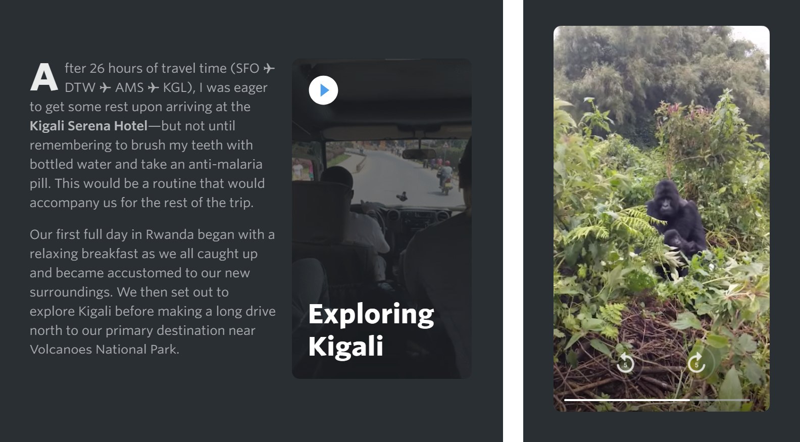
Photo management: I will expand on this in much more detail below but I have quite a bit of JS to manage things related to my photos in articles and photosets. For example: managing image layout, selecting which image size to load and which image format (if WebP is supported).
JS libraries
I also use several JavaScript libraries—some as-is, some modified myself—along with my custom JS to accomplish a few tasks and add functionality where needed:
Lozad.js, along with the Intersection Observer polyfill, is how I manage performant image lazy loading for images on my site. While Chrome is bringing native image lazy loading soon, I tend to wait until adoption is pretty solid across browsers so I'll be using this solution for a while longer.
PhotoSwipe.js: This is the library that my photoset viewer (when you click on a photo to expand it full-screen) is based on. I did several modifications to get it to my liking, mainly visually. I also modified it for a while to support video as well as link to the next photoset once the end is reached but it needs more work. I initially liked Photoswipe due to it's extensibility and native zoom support.
tilt.js: A performant and lightweight library to help with creating the parallax hover tilt effects I use on things like photoset collection index pages and photoset footers for photosets in collections. It's a bit gimmicky... I'm not sure I will keep it there forever in favor of a more compact layout.
tocbot.js: My new table of contents sidebar is based on this script. I just add a class and id to headings and it makes a table of contents. I modified the design and interactions of it to fit my needs. For smaller viewports on mobile I hide this table of contents via CSS mediaqueries and have one shown in the content at the top of the post.
-
readingtime.js: I decided to add a little line about the estimated reading time of the article inside the table of contents sidebar using this script. It lets you specify the words per minute used to calculate the reading time along with many other facets.
However, I want to modify it to count the number of images in an article and increase the time accordingly, given how much I use photography in my posts. For example, I read somewhere that Medium.com adds 12 seconds to the estimated reading time per image used in the article.

Working with photos and videos
How I generate, host and display media
Photos are a core part of all of my articles and the focus of my photosets. When I was starting this website I would spend a bit more time taking high-quality photos of hardware and products that I was reviewing. I wanted to stand out from other websites that used the manufacturer's stock photography.. I wanted to personalize it and put the item in the context of everyday, regular life.
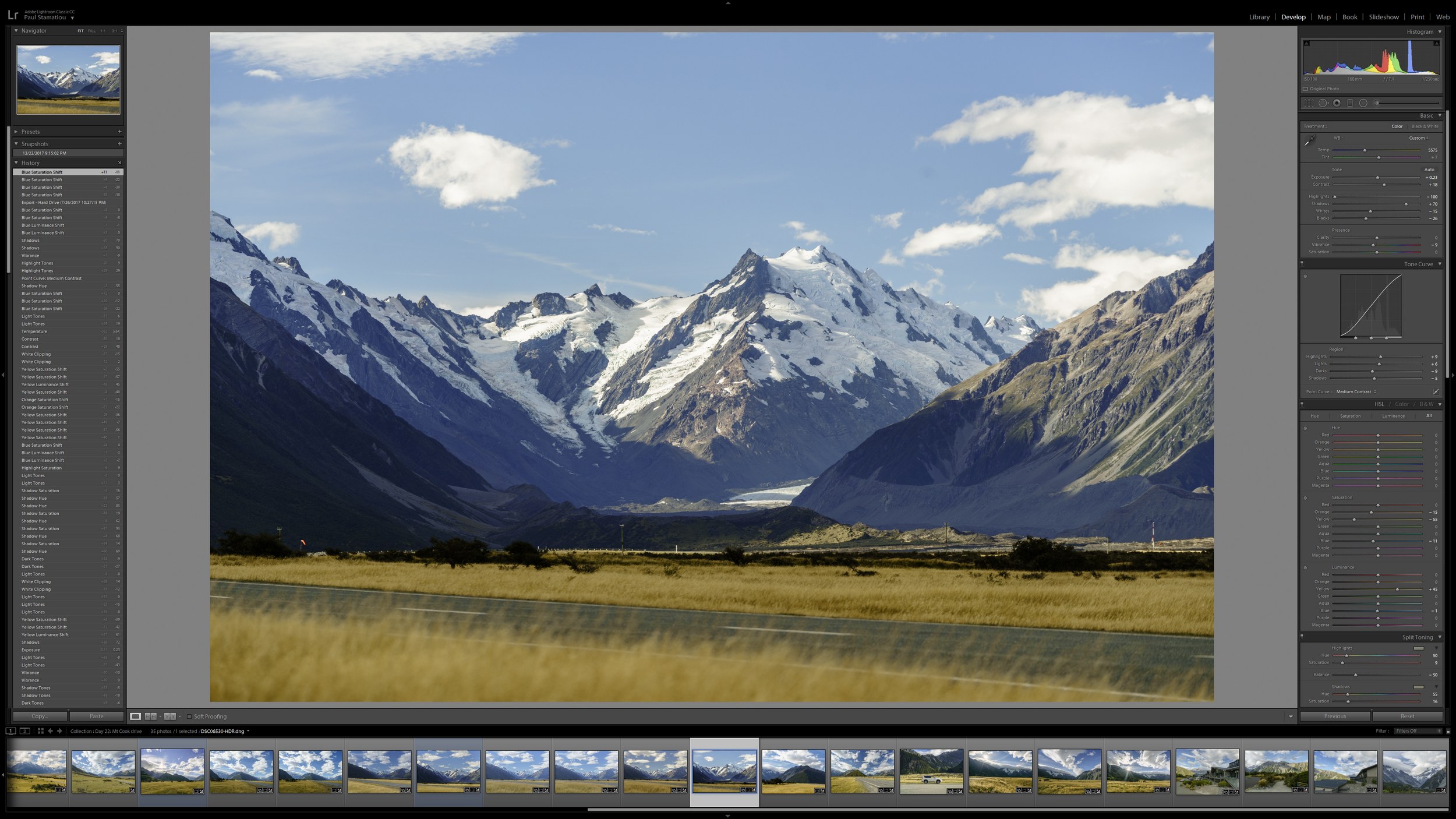
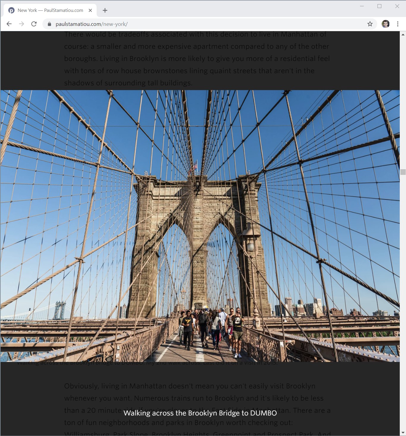
Photo: Mount Cook, New Zealand
The extra attention paid off and people began to appreciate the extra effort there. Ever since then, photography has been a large part of everything I do on my website. When it comes to articles I often feel like half the work is just taking the photos (usually takes a few sessions to capture shots I'm happy with), culling, tweaking, exporting, generating assets, uploading and adding the HTML markup to the article.
Basically, I come home from a trip with a few hundred gigabytes of RAW photos—and increasingly more and more 4K video clips—that start working on in Lightroom (and backup on my NAS). This culling and editing process is so ridiculously time consuming that it can take months of spare time whenever I can find an hour here or there on nights and weekends.
I talk a lot about my general post-processing style in my article Building a Lightroom PC, but I don't use any filters or presets. I only tend use a shortcut key to copy and paste LR Develop settings when there are groups of shots with similar lighting.
In this section I'll talk a bit about the process after I have finished exporting my shots from Lightroom.
Hosting
As I mentioned in the backups section above, I keep my media assets separate from the git repository for blog-related HTML/etc files. Instead of being served from the AWS CloudFront distribution powered paulstamatiou.com, they are hosted on a subdomain (turbo.paulstamatiou.com). That subdomain simply points to a separate CloudFront distribution: so my media assets are stored in a different S3 bucket.
I do this for a few reasons. The first and most prominent reason: I just prefer to keep my blog repository relatively light and fast with media stored elsewhere. This is especially the case as I keep hearing about how git can become slow when tracking large, compressed files in a repo.
Second, at the time I started doing this there was a performance benefit to this strategy of "domain sharding" where you load resources from different domains/origins to try to bypass a browser limit on the number of concurrent requests that can be made. Today, however, this benefit does not seem to be relevant anymore with modern browsers and HTTP/2 proliferation. I made sure to enable HTTP/2 on my CloudFront distributions.
And finally, I like having media on a separate domain so that should anything ever happen, such as me accidentally deleting the bucket where everything is stored, I can easily switch image providers by simply changing the DNS for the subdomain DNS to point to my backup bucket or another provider (Google Cloud Storage) where I replicate the same directory structure.
Photoset layout
Early versions of my the photos section of this site featured rudimentary photo grids with equally-sized photos that led to photo detail pages with just 1 shot and some metadata. Pretty basic. I wanted to share more about my travels and other experiences with photos.. lots of photos.
I explored various layouts and responsive ways to show more of my photography in a set. Many years ago I saw this codepen example of a flexible photo layout. Using the HTML along with retrieve width/height info about each photo in a row, it calculated the required size and position coordinates to absolutely position each photo such that each row maintained same height at given the current viewport width.
I liked the premise and based my initial photo layouts on it. Over the years I've modified this code a bit. For example, I have my Rakefile script that generates the photo markup add in each image's aspect ratio as a data attribute. This way the JS can calculate the layout more quickly instead of trying to get the image dimensions via JS when they load.
Getting the general photo layout functional was important but only a small part of the capability I needed for my photosets. But the vast majority of time was spent designing and redesigning the photoblog and photosets.
Responsive image creation
When building and iterating on my photosets over the years it became clear that I needed and wanted to balance loading speed while not compromising too much on image quality and resolution. If you have a big computer display, I want you to be able to keep your browser wide and see huge photos.
I spend a ton of time when out shooting and when pixel peeping in Lightroom, trying select the sharpest shots and I want a way to showcase that work. This website isn't Instagram; I don't need to only show small images. I want them to be immersive. I feel like it's far too easy to post a good photo on mobile apps like that where everything is so small.. where you can't readily spot the missed focus or blurry subjects as easily.
It was obvious I was needed a responsive images solution so that you would not load too large of a photo or wait too long for it, regardless of your browsing device and viewport size.
One thing I was sure of: I didn't want to use one of those dynamic image and video transformation services that resize media on-the-fly, such as Fastly, Cloudinary and Imgix. These services can offer comprehensive solutions for anything related to responsive images. The main benefit is that you only have to store each piece of media once and you are able to have the service generate and serve up any variation for you.
I have tinkered with services like this in the past and didn't feel great about them. They work best on very high traffic websites where images are already generated and cached. I've found that they introduce a non-trivial delay for infrequently requested photos. This is a real issue for me and any potential gains in serving up the perfectly sized and compressed media is lost waiting for the service to generate and serve the asset.
But the main issue for me is that they also introduce dependencies and lock-in risk. As someone that plans to maintain this website for many years, I don't take the decision to build around such a third-party provider lightly. One that may change their APIs, increase their prices or simply shutdown in the future. The last thing I want is to have to rewrite all the image URLS for thousands of photos because I have ot migrate to another solution.
So I decided to go with an extremely low-tech, manual solution: I generate and host my own media size variants. This originally meant JPGs but I also started doing WebP variants for newer photosets a few years ago. For each image in a photoset, I now store 16 variants (half in JPG, half in WebP): 500px-wide, 750, 1000, 1280, 1500, 2000, 2500, 3000.
Yea, it’s probably overkill. I have been thinking about removing a few sizes. For videos, I tend to store just 2-3 sizes in both WebM and MP4.
Why all the focus on using WebP and WebM formats? I find that they're good ways to generate efficient, lossy compressed media: I can save between 10-30% on file size for the same quality as an equivalent JPG. I'd love to use it everywhere but Safari lacks WebP support (Chrome, Firefox and Edge support it though.
I typically generate these media assets like this:
Export original photos and videos from Lightroom or Premiere Pro. For videos I generate both high-bitrate and web-quality H.264 MP4 videos at each size I want ( typically just 2 or 3 sizes).
I start with a grunt plugin called responsive_images that takes a directory of images and generates all the variant sizes I want, at their max quality.
I take those high-quality image size variants and run them through XnConvert to compress to more reasonable file sizes and also generate the WebP files. It can also handle bulk renaming for me, but sometimes I want to tweak things with a Windows utility called Bulk Rename.
For videos, I use the high-bitrate MP4 variants along with the
ffmpegcommand line to generate the WebM variants. Then I generate JPG and WebP poster frames for each video.Then I upload them all to my S3 bucket with the appropriate headers.
This is an unnecessarily tedious process and I plan to automate it as mentioned below.
Resolution switching
Managing how the browser will know what photo/video variant size and format to load is the next piece of the puzzle. When I started tinkering with this in ~2013 there was a lot of talk about <picture>, srcset, polyfills and more—browser support for any type of responsive images solution just wasn't there.
Instead of taking a gamble on a polyfill solution that might need to be rebuilt as solutions became more mature, I decided to go with a simple (albeit hacky) solution that was guaranteed to not have issues. I use JS to do my own resolution switching: I rewrite image URLs depending on the width of the browser and the size each image is being displayed at (varies depending on how many images are displayed in the same row). It also takes into account if the browser and photoset support WebP/WebM files and loads them accordingly.
When doing this I have my JS aware of what image sizes are available to use: my newer photosets have more sizes available compared to my older ones. As such, I have some metadata in each photoset that gets added to JSON embedded in the page that the JS can read.
I also didn't bother to take "Retina"/dpr into account. I always try to have images a bit larger than necessary in their space, but definitely not double the resolution. While I have no doubt that doing that will make images look even better on such high pixel density displays, I'm not sure it's worth the extra variants required. Doing so in a performant manner would mean saving a separate set of higher-compression image variants. This is because it has been shown that you can save a significantly lower quality photo meant for @2x display and it won't be perceptively different.
But yea... overall this is very hacky. It's in dire need of a modern solution. I talk about what I want to do in the section at the end of this page.
Lazy loading
And finally, I enable lazy loading for every photo. For this task I use a modern library utilizing the Intersection Observer API called lozad.js.
I have it configured such that is starts loading the images as soon as they are within 1000px of scroll distance from the current viewport. I do this so that hopefully on a decent Internet connection you won't see them loading at all. They will just be there already.
I absolutely hate the current web design trend of making it obvious when images load and animating/fading them in. The whole goal for me is to avoid drawing attention to the fact that it's loading.
However, in situations where there's no avoiding that the images will take a while to load, I have considered using some placeholders that look more like the image that will load. Either a low-res blurred out image, dominant color/gradient placeholder or SVG placeholder... but honestly they all sounded like too much complexity for little gain.
SVG icons and animation
Working with SVGs in my photosets
I love SVGs. They're lightweight, easy to modify, animate and of course, they always feel crisp and high-res. I often incorporate SVG icons like Material Design icons from Google or sometimes I'll draw my own in Figma and then optimize them with svgo (such as I did with these security key icons).
But I most frequently get asked about how I create the animating maps on some of my photoset pages:

They're actually fairly simple: an SVG map using CSS animations to scale and fade in and then a CSS stroke-dashoffset animation to animate an SVG path to indicate the path traveled.
The hard part is getting the SVGs all together. First, there's the country map. Sometimes I will find that from a free provider allowing personal use like Simplemaps. When I use a map like that it still requires a good bit of cleanup to optimize markup (sometimes I need to reduce precision if the map is too large for my needs) and also get the colors to my liking.
However, other times I can't find a good map. In that case I will draw my own on my iPad Pro with Apple Pencil using the Concepts app and tracing screenshots of Google Maps. And other times a free map I found won't have enough detail—for example it may have an inaccurate border or lack a lake that was a relevant to a part of my photoset. In those cases I will manually draw in the needed features in the SVG.
As for the path that animates to show my path traveled, I will also draw that in or create it in Figma. I will either reference a road traveled on Google Maps and trace it or check my logged GPS data points (if I logged any).
Why even bother with a map like this? Can't you use Mapbox to do this more easily?
I first started using maps in my early photosets to help convey a general sense of where I was, how I got there and where I went to provide some context for the journey.
These early photosets merely added maps that I had marked up in Photoshop with rudimentary paths and exported as an image. I wanted to refine and evolve that. I wanted something simpler that could communicate just enough context about the location without over doing it or requiring any interaction.
I initially explored stuff on the extreme: more immersive and interactive maps powered by something like Mapbox or my own hosted maps solution with an OpenStreetMap tile server. I also became more interested in logging GPS data on trips so I could geotag photos.
I thought maybe I would go back and figure out a way to automate attaching this GPS location data as a data attribute on the markup in each photo. The dream was that maybe I could do something crazy like have a small fixed map that would animate my path traveled as the page was scrolled; reacting to the GPS data of each photo being scrolled by. I had been inspired by similar scrolling-based map uses done by the New York Times with this part of Snow Fall I had numerous ideas like that I dreamed of incorporating into my photosets.
The more I thought about it, however, the more I thought that stuff like that was gimmick and actually distracted from the story and photos. I didn't want to dilute that experience with unnecessary metadata like that. Maps aren't that vital to my photosets.
And of course, by building some interactive map I was moving further away from my goal of making my site easy to maintain years from now. It would be yet another thing that could break easily, require regular maintance should Mapbox/etc change APIs, have a monthly cost and something at risk of no longer being supported in the future.
It's for those reasons that I went with a comparatively simple animated SVG map. It requires more work to get going up front for each photoset, but then I don't really have to worry about it.
Can I have your theme?
Why I don't open source or sell my site design
I don't plan to open source, sell or otherwise offer my website design. My website is all custom designed and developed myself, along with some JS libraries I'll mention below. It has been my hobby with many, many devoted nights and weekends spent tinkering and redesigning it for more than a decade now.
I prefer to keep it my own for a few reasons. As a designer, I view the website itself as well as the way I present my articles and photosets as a portfolio piece of sorts. As such I prefer not seeing any clones of it elsewhere online. I encourage treating it as inspiration and taking your own spin at it. That's why I'm going into detail here about how I built certain parts of my site so you can learn, tweak and tinker with your own version.
And finally, I used to have a theme and dealing with support issues was a nightmare. It meant I could no longer build things in my typical hacky for-my-needs ways and had to maintain a separate fork for public distribution. It was a hassle I don't wish to replicate.
Email server
About my self-hosted newsletter service with Amazon SES
In addition to my AWS Lightsail server used for hosting my code-server instance for developing on the go, I have another Lightsail server where I have installed a newsletter application called Sendy.
I used Mailchimp for many years to manage my newsletter.. if you can call it that. I would only send out emails when I had new posts, but eventually switching to sending them manually as there was no point to send the entire article in an email given how long they are and how they often take advantage of my site design and typography so it's best viewed in a browser. My infrequent Mailchimp use made it very expensive: about $150+ to send one email to a few thousand folks.
While Sendy doesn't have all the advanced features of Mailchimp, I like that it uses Amazon SES to send the emails, making it remarkably cheap: about 10 cents for every 1,000 emails.
I also wrote a bash script to also backup the database for Sendy and archive it on Tarsnap. I could have used Amazon's own managed database for the Lightsail server but I didn't think it was worth $15/month for something I could automate myself.
Sign up for my newsletter to get notified about new posts and updates. I still need to design that default signup page..
What's next?
Things I may consider doing next if I had more time..
This site is constantly evolving. I'm always finding things to experiment with, redesign, optimize or just explore with new ways of doing things here.
Simplify media creation
This is the one part of my publishing flow that still takes a lot of manual work. I still need to use Lightroom and Premiere Pro to edit and post-process the photos and videos—especially the latter when dealing with tons of 4K clips I need to put together—on my desktop PC. While it's possible to edit large 61-megapixel RAW photos and videos on an iPad Pro, that's an act of extreme patience.
But there is lots of room to optimize what happens after I have the exported original-size assets. For photos, I need to generate all the variant size in JPG, then convert those original quality variants to good-for-the-web quality JPGs and WebP images. I need to rename them all. I need to upload to the proper CloudFront directory, attach the correct Content-Type (for WebP as sometimes it defaults to octet-stream) and Cache-Control headers and set the ACL to public. Then the same needs to happen for video variants and WebM creation. The only part of this flow that I have somewhat automated is a Rakefile that generates markup for the photos given a directory of images.
I'll start with a script that can take a directory of original assets and generate everything. In the long term, I'd like to make it mobile friendly with some kind of self-hosted page where I can drag/upload assets (even on my iPad Pro) there they get added to a directory and then have that variant generation script run.
Modernize how I do responsive images
I started doing my photosets many years ago when it wasn't clear what would happen with things like <picture>, srcset and sizes. I was unsure what would be the best long-term solution so I went with the easiest: just resolution switching with JS. But nowadays that feels hacky (okay, it felt hacky back then too).
The simplest way I’ve found (so far) to distill/explain `srcset` and `sizes`: pic.twitter.com/I6YW0AqKfM
— Harry Roberts (@csswizardry) March 1, 2017
I have been worried about using solutions like srcset due to the sheer extra markup required when using so many variant sizes, so I will also have to consider using fewer variants and maybe a Jekyll include file to simplify markup creation. But doing that for thousands of photos will likely increase Jekyll build times considerably.. so it's a catch-22 for now.
Rethink layout markup and CSS
One of the core parts of my articles and photosets is the ability for media to be wider than the text. When I did a complete redesign of my site in 2013, I decided to do this by having the text wrapped in a <section> tag that imposed a smaller width at larger responsive breakpoints. At the time I didn't want to just style <p> tags with a width as I would have to do the same for many other tags that may deserve the same treatment and it felt like it would be a lot of CSS to maintain.
The downside was that this approach of constantly opening and closing <section> tags as needed is very hacky. When I have lots of time, I want consider using something like CSS grid for this task.
Typography updates
I have a lot of cleaning up to do when it comes to typography hierarchy, inconsistent heading styles and more. On top of that I haven't spent much time evaluating typefaces and pairings for parts of my site. There's a lot of inspiration out there on sites like Typewolf and I want to spend more time evaluating figuring out what I want my site to feel like.
Redesign stuff and optimize CSS
The ever-present to-do list item. I have a few thoughts for how to improve and simplify my photoset and photoset collection index page layouts. Over the years I've also let my CSS get a bit hairy in places and it's really overdue for a thorough refactoring, especially with respect to media queries.