It was just meant to be a quick experiment. I started using a Nexus 4. I was going to go right back to my iPhone after a week. I was designing more and more Android interfaces at Twitter and realized I needed to more intimately grok Android UI paradigms.
A week in it started feeling normal; the larger form factor was no longer a nuisance. A month in I didn't miss anything about my iPhone. Two months in I sold my iPhone 5 and iPad Mini. It has now been three months since I made the switch. I'm loving Android. I only missed having a good camera so I just upgraded to a Google Edition Samsung Galaxy S4.

Obligatory hipster stuff and gadgets shot.
Apple Lock-in?
It only took that first week to realize I wasn't really locked into the Apple ecosystem and certainly not iCloud.
- Photo Stream? Nope, total garbage.. why should the user need know about a rolling 1,000 photo buffer. Dropbox and Google+ Auto Backup do this better. I can take a photo and it's already on my computer without opening iPhoto.
- Safari syncing? I use Chrome and browser sync is amazing.
- iTunes and iTunes Match? I no longer maintain an iTunes library and haven't for the last few years. I'm more than covered with music podcasts, Hype Machine, Rdio and Spotify.
- What about iCloud Calendar, Contacts & Mail? My calendars are hosted by Google and I don't use an iCloud email account. Contact syncing was a great feature, but I made do by exporting from the OS X Contacts app and importing to GMail Contacts.
- Find my Phone? I use Lookout for this and Google just released Android Device Manager.
- Reminders.app? I switched to the more feature-rich Wunderlist.
- Facetime? There's always the Facetime app on my Mac. There's also Google Hangouts but I don't think it's quite there yet. I do, however, miss iMessage. I ended up setting Facebook Messenger as my default SMS app (yes you can set default apps!).
"No other company has embedded itself this deeply into my life."
Most services I rely on daily are owned by Google. My world revolves around GMail and Google search. I could start listing Android features I adore, but this succinctly states why Android makes sense for me:

Gabor is a friend and previous investor in Notifo that happens to have been the founding PM of Google Now.
The list of Apple products I use daily largely amounts to OS X and Apple hardware. People identify themselves as Mac users and Windows users... zoom out a bit and you'll find another Venn diagram where Google almost entirely encompasses all of these users.
How I fell in love
It started with the larger and wider screen. I read a lot on my phone, particularly in Chrome. Responsive sites look fantastic. The Android back button makes this browsing experience even more pleasurable when going back and forth between pages on news sites.
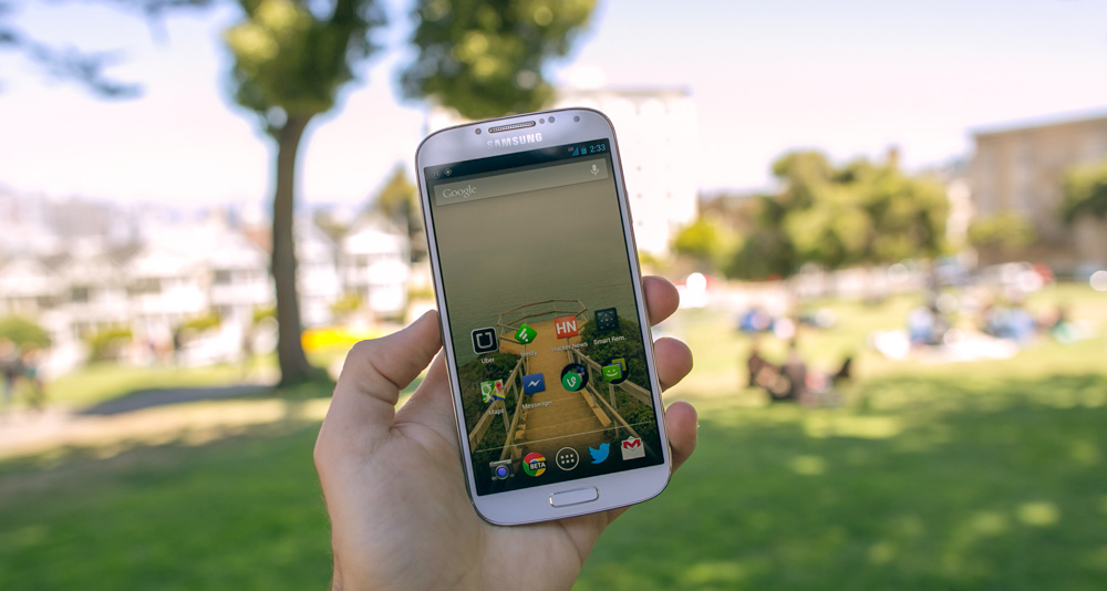
Obligatory bokeh product shot. (Google Edition Samsung Galaxy S4 in Alamo Square Park)
Then I got used to the Google Calendar widget I placed on my home screen. Then it was the glorious Gmail app. It's much better on Android and more frequently updated. Switching between multiple GMail accounts on Android is quicker, you can customize which messages you receive notifications for, assign different sounds for individual labels and more.
But when it comes down to it my love of Android lies heavily with the way Android handles notifications. These aren't your useless "read-only" iOS notifications that just launch the app. I've thought about notifications a lot while I was working on the notifications team; how to keep the user in control and make it clear what each notification is actually saying.
Android just knocks it out of the park here.
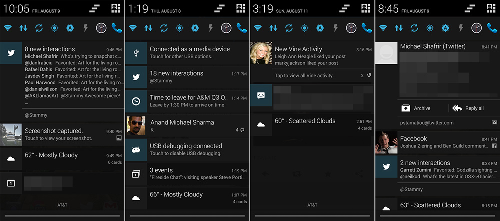
Always cloudy in SF.
The first thing I do every morning is a simple down swipe from the top to reveal the drawer. Notifications can be individually or bulk dismissed; iOS only does it at the app level. Depending on the app, notifications may be expanded with a simple down swipe to reveal additional information and inline actions. For example Gmail app email notifications have inline actions like Archive and Reply.
They can also digest notifications together when multiple come from the same app. If you don't open the notification drawer, you'll see app icons in the top status bar. Also, it's common for apps to scroll notifications line-by-line in that status bar when they come in. This bar can also be used for brief status messages. Anything longer can be pushed to the drawer as an "ongoing notification" type: things like uploading/downloading or playing music. That way you know where to go to easily open up that app again.
Basically, it's your entire phone command center. You can get a lot done there without opening up every app. If you have multiple devices, Google announced user notifications at I/O this year, allowing developers to let users dismiss notifications from all of their devices after they have been interacted with on one device.
That being said, there is one stark difference with Android notifications: they don't light up the screen nor do they display on the lock screen. Android devices have a small indicator LED (with sound and vibration depending on your settings) for this purpose like the good ol' Blackberry days.
Not your cup of tea? You can do just about anything with Android...
There really is an app for that
I set out to write an article about how I feel Android provides unique affordances that create a unique cohesive mobile experience (more on that below) rather than talking openness, features and apps. However, the more time I spent living with Android it became obvious that being able to do anything and suit a variety of needs is a pillar of the Android experience.
Mainly I'm talking about a less restrictive canvas for developers. You can access the file-system, the hardware, use intents to pass data to other apps and services, and much more.
Don't like the lack of lock screen notifications? Install DashClock (example) or NiLS. Want to customize the LED color or each type of notification? Light Flow is just the ticket. I predict many more lock screen notification apps will emerge soon; Android 4.3 brings needed notification APIs (current lock screen solutions hackily register as an accessibility service). For example, you can bring Moto X style notifications that light up your screen when notifications arrive with ActiveNotifications.
You can display all Android notifications on your desktop so you never have to pull your phone out. You can send scheduled messages via SMS, Facebook, Twitter or Gmail. Get caller ID and block calls with a myriad of apps like Truecaller. Use Shush to automatically unmute your phone after a set duration. You can radically personalize the OS with launcher alternatives like GO Launcher EX, Nova Launcher and Everything.me.
Want a picture emailed of the person trying to unlock your phone emailed to you? Lookout Security & Antivirus does that. Don't want to use Dropbox to sync your photos? Roll your own with BitTorrent Sync or the powerful FolderSync. Learn to type faster by changing your keyboard to SwiftKey or Swype. Send text messages from your desktop using your own phone number with MightyText. Set different power profiles when you really need to conserve battery life with JuiceDefender.
You can use Farebot to read your NFC public transit card to display recent trips and value left. Don't like texting while driving? Use Drive Agent to automatically respond to messages when driving. Want to automate repetitive tasks? Use NFC Task Launcher to automatically change your settings based on location. Want to easily switch to playing music over bluetooth speakers without diving into settings? You don't need an app for that, it's built into Android. Welcome to the world of "tap-and-bluetooth-pair" with NFC-enabled bluetooth audio receivers.
And of course, you can tether your fast LTE connection (30 down/20 up in SF with AT&T) right out of the box. You can do anything with Android. And if you find out that app you just purchased doesn't quite do what you want, you can return it.

Don't like your paid app? Google Play lets you get a refund within the first 15 minutes.
The smallest things annoyed me in iOS, like not being able to delete the Newsstand app. I can do whatever I want in Android, including disabling default apps I don't use like Google Play Magazines.
This is the part where you start talking about horrible battery life, right Stammy?? Not anymore. This is not 2010 where you need a task killer (since 2.2 Froyo brought dalvik). I won't talk about battery life much since you can find anyone that either has great or horrible battery life on any device, but I've been able to squeeze more life out of my Android devices.

441ppi.. it's just ridiculous. App developers, make sure you create xxhdpi 3x assets :)
One fluid experience
I was trying to find out why Android felt so remarkably different to use, beyond aesthetics. I found there are a few pieces that help contribute to this magical user experience: the global back button, intents and Google Now.
Each app has its own interactions, design and purpose as it should. Android helps coalesce each of these siloed experiences together into something a bit more fluid. The back button allows you to navigate through your history of pages, apps and menus. Didn't mean to do that? No worries, no cognitive load required, no need to parse how that new app implements its navigation or drawer. Just hit back.
Remember the first time you discovered those shortcuts in Ikea? Felt pretty neat to save time navigating through a useless section when you knew exactly where you wanted to go. That's Android and the back button.

I rarely need use the app switcher in Android. That's something iOS users rely on to get around, especially if their home screen is filled with folders.
There's a similar design convention in Android called the "up" arrow often found on the top left corner of apps. It's used to "navigate within an app based on the hierarchical relationships between screens." Basically it lets you go up one level in the screen hierarchy regardless of how you entered the app (notification, intent, et cetera). Android establishes these navigation standards so the user doesn't have to think.
Next up we have intents. Android intents let apps to interact with each other and share data. In layman's terms, an intent is a message from an application along with a piece of data saying it wants to perform an action or has already completed one. The OS or other apps are able to listen to these intents and act on them. Apps tell the OS what they can do and with what kind of data by registering intent filters.
To the user, it appears as a modal dialog asking what app they would like to use to complete the intended action and if they would like that app to handle all such requests in the future. This is a very simplified explanation but it begins to show how the Android OS allows applications more visibility to the environment. They know what other apps are installed, what activities are currently going on and more.
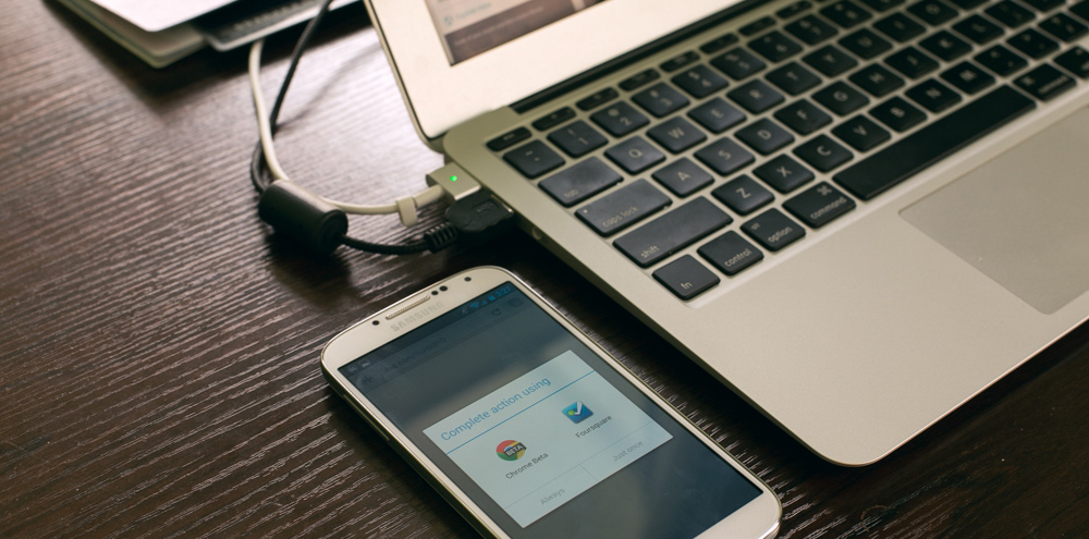
A simple intents example to open a Foursquare link in the Foursquare app.
Intents continue this feeling that using Android is one fluid experience. You're seamlessly going about your business completing a task. With iOS you are pausing what you were doing to open another app, find the image you just edited to post, or paste what you copied over from another app. Instead, it's all the same flow in Android.
One key component to this experience is that my identity follows me around. Given that the majority of the services I rely on are Google products, I'm already logged in or just need to select an account. This is a significant convenience that also extends to apps using Google for sign-in.
Chrome browser sync adds on to this singular experience by letting you access tabs you have browsed to on other devices. I also find this handy for my browsing history: I'll start typing a URL I know I have visited on one of my laptops and have it autocomplete on my phone.
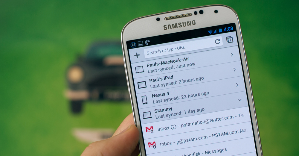
Chrome browser sync works flawlessly. I can easily fetch tabs open on other devices.
However, Google Now is what genuinely makes this experience magical. Google Now is responsive design. When you hear about responsive design you're primed to think websites that adjust with the width of the browser. But there are many other changes aside from browser width to which a design can respond. Location, time, calendar events, previous searches, nearby transportation, interests, voice, emails: Google Now responds to all of these. It responds to who you are. Step back a bit and you'll quickly realize why Google made Glass.
But it’s magic when the software generates a disproportionately meaningful output from that minimized input.
So how do you use Google Now? Well, you don't. You just go about your life and when it's appropriate, Google Now will send you a notification to something relevant. It reminds me when I should leave to make it in time for a meeting at another location. It notified me that a new episode of Top Gear was about to air since it knew I had previously watched the show on Google Play. I had previously searched traveling to Tokyo and Now displayed more information about Tokyo for me to explore at my leisure. Each such piece of information is displayed in a card. There are some 20+ cards with more on the way.

Google Now and Android notifications drawer showing a Google Now notification
Google Now also ties into voice search. I cannot overstate the usefulness of having voice search just a tap away on my home screen. I'll be the first to say that I hate talking to my phone. But when no one's around I just won't stop talking to it. It's uncannily accurate and it's good for a myriad of things beyond just search like calling someone, creating reminders and fetching directions.
I think people are delighted by walking into an airport and seeing a boarding pass from Google Now.
Sundar Pichai, SVP Android, Chrome & Apps
Delight. It's what designers strive to produce in the experiences they craft. Google Now has hit the nail on the head. I can't even count the number of times friends have pulled out their phone to show me the smart things Google Now did for them.
Using Android feels like one fluid experience.
Android design
"We made a conscious decision to embrace modern typographic design and avoid the excesses of skeuomorphism. But like skeuomorphism, flat design also has excesses. […] Tactile cues are important in touch interfaces, giving users a sense of what they can expect that’s touchable, and how it’s going to behave."
—Matias Duarte, Android head of design
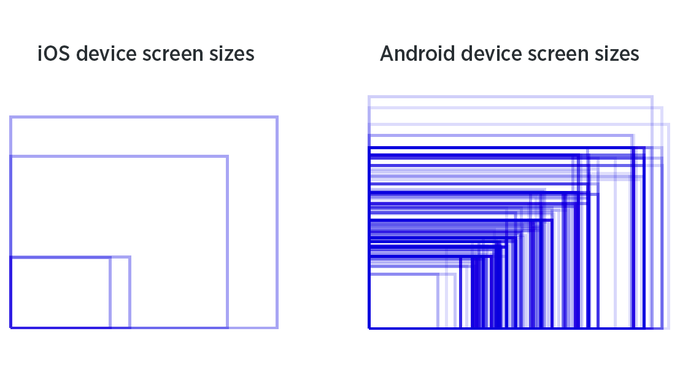
I tend to find purely flat design nauseating and a hindrance to usability. There's a sweet spot to be found and Android is close to it. The visual language is very no-frills, if a little basic at times. Like all Google products, Android appears to have been designed with form following function in mind. Take a look at this comparison of Android and iOS styles.
Responsive layouts are more popular among Android apps, but on the corollary they need to be:
Why responsive design really matters for Android #fragmentation #rwd pic.twitter.com/qtwYVIfmNO
— Paul Stamatiou (@Stammy) July 30, 2013
If you're interested in learning more about Android design, take a look at Android Design in Action and the Android design principles.
First impressions: Galaxy S4
After I knew I wanted to stick with Android, it was time to get a phone I could actually live with. The Nexus 4 was a great starter phone with but 8GB of storage, a lackluster camera and speaker that wasn't loud enough, I didn't want it to be my long-term device. I ended up going with the S4 over the HTC One. Both have pretty good cameras (for phones), so you can't go wrong.
Big device not for you? There's a growing range of smaller devices like Samsung Galaxy S4 Mini and HTC One Mini.
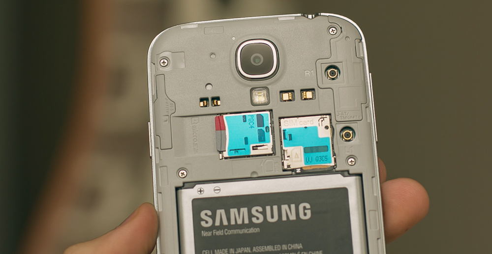
31mm f/2.2 13MP camera, microSDXC slot, SIM card slot and NFC-enabled battery
I wanted the ability to travel with an easily swappable second battery. Also, given that I take a lot of photos and the S4 only has 16GB of internal storage, I wanted to take advantage of the microSDXC slot. The HTC One also felt fat compared to the lithe S4.
I went with the $649 Google Play Edition Galaxy S4, which comes without any extra Samsung software or clunky TouchWiz UI add-ons. This also means you get Android software updates quickly (GPE S4 owners saw the 4.3 update just 9 days after the announcement).
Migrating my data from the S4 was a non-issue. I just logged into my Google account and my apps began installing along with preferences intact. Even things like Wi-Fi passwords were restored. Photos did not automatically transfer but I had them all on Dropbox so I was good to go.
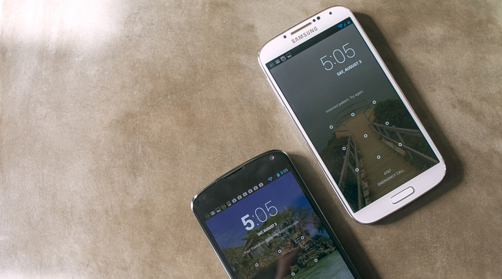
Slight lock screen differences between the Nexus 4 and the Google Play Edition S4.
The vibrate motor of the S4 was actually the first difference I noticed with the S4. It produced more pronounced and quicker vibrations, which I found to be an improvement with keyboard haptic feedback. The most confusing part was that the back button was now on the right side and the admittedly rarely-used dedicated task switcher button on the Nexus 4 was replaced with a menu button.
I've only had the S4 for three weeks, but one annoyance is actually the tiny bezel. I keep accidentally opening apps in my bottom row when I meant to activate a hardware button and vice versa.
The most unexpected S4 feature that ended up being useful is the IR port. I quickly installed the lovely Smart IR Remote app and was able to control my TV a minute later. I also set it up to control our Apple TV and projector.. it's a powerhouse.

I'm very happy with this device. The 5-inch screen doesn't feel overbearing compared to having lived with the Nexus 4 for a while. I'm still amazed by the clarity and sharpness, particularly when reading text or viewing photos.
And of course the only metric that matters for me: the camera opens fast and shots are taken quickly without hesitation. The only issue I have with the camera is that it struggles with dark parts of a composition. I'm not talking about low light shooting (though that is another concern) but rather when shooting I can't tap on a dark part of the photo and have the levels adjust accordingly to prevent washed out areas (something I could do on the iPhone 5). For that I need to resort to HDR mode.

Taken with the Galaxy S4. This image was actually a portrait photo. Top and bottom portions cropped.

Taken with the Galaxy S4

Taken with the Galaxy S4
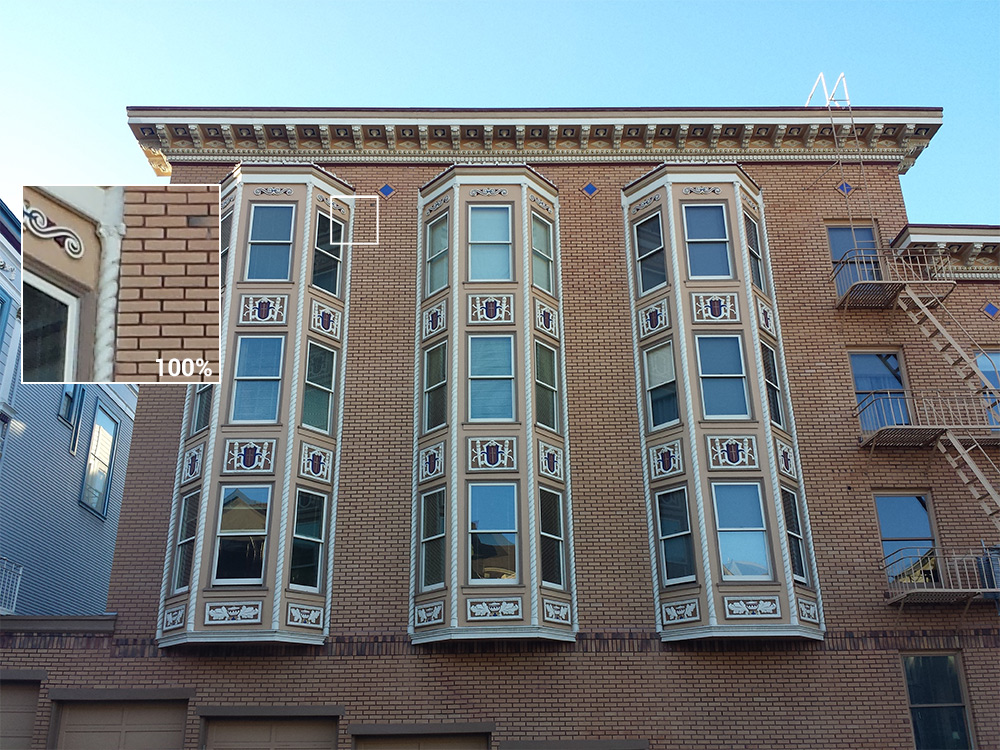
Taken with the Galaxy S4

Taken with the Galaxy S4

Difference between a camera phone and a DSLR: The S4 struggles to find detail in darker parts of the photo.
Future of Android
Just a year ago it was a valid excuse to avoid Android if there were certain types of apps needed that you could only find on iOS. I truly don't think that is the case any more. There are now many high-quality Android apps out for a variety of things just like on the App Store. Beautiful, polished Android apps now exist.
The Android community lacks a champion. An evangelist that doesn't obsess over hardware specs and has a broader appeal. Someone that vividly illustrates how Android can fit into the ebb and flow of your daily life as it has mine. And sure, even someone to encourage budding developers to take their next idea to Android. Where is the Marco Arment or John Gruber of Android? We'll get there.
Android is better. Come take a look.
Follow @Stammy on Twitter to learn more about Android. Thanks to Gabor Cselle, Chad Etzel and Anand Sharma for proofreading this post.
Sidebar: Chromecast first impressions
I'm a so-called cord cutter. I haven't had cable or satellite TV service since 2009. I don't mind paying a few bucks to watch an episode of Breaking Bad or $5-7 to rent a 1080p movie on Vudu. I've been an avid Vudu user since 2007; it's my killer app for movie rentals with a great selection. I probably watch anywhere from 2 to 5 Vudu movies a month. All that to say that the $35 Chromecast streaming media player dongle wasn't exactly a needed purchase. But at that price it was worth a look.
Currently, the Chromecast only works with Netflix, YouTube, Google Play Music and Google Play Movies/TV but there are talks of Vimeo, Pandora, Redbox Instant, HBO GO and Plex integrations. Unfortunately, it's a waiting game until developers add casting support to their apps once the SDK becomes available.
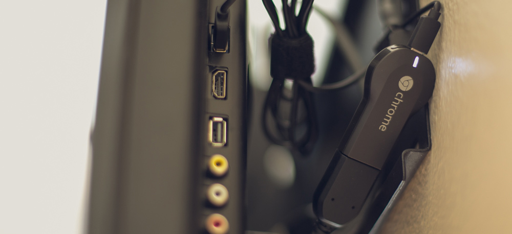
The Chromecast installed behind our older wall-mounted TV. Fortunately, this TV has USB to power the Chromecast.
Google has tried to play in this space before. There was Google TV and the desultorily Nexus Q. They're obviously thinking about a multi-device future. In fact, everything at Google I/O 2013 was about multiple devices. The Chromecast feels like the first turn in the right direction.I had no qualms about the casting experience with the Android Netflix app and the lockscreen remote integration was a nice surprise. However, given that I live in a 2 TV and one projector household with roommates, we already have the media situation solved with an Apple TV and Roku 3. Roku still has the best feature among all devices: I can search for a movie title and it will tell me which sources ("channels" as they call it) have it.
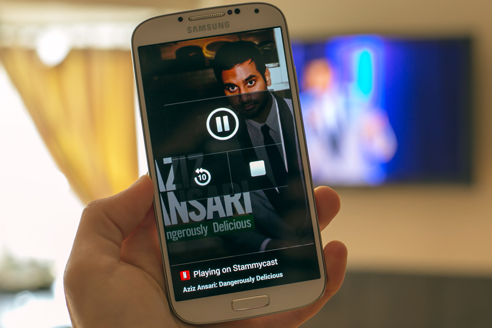
Netflix takes advantage of Android affordances by creating lock screen controls when you are casting.
My roommates and I mostly use the Chromecast to cast a Chrome tab to show to everyone rather than use Netflix or YouTube. While the Chromecast doesn't stream content directly from devices, you are able to get around this and cast local video files dragged into Chrome (mp4/m4v).
