Recently the social web browser company Flock rolled out a milestone release, version 0.9. While it's not a 1.0, the new release totes some awe-inspiring new features that put it on a different level than the last major release, Beta 1 (my review), almost a year ago. Over the last year there have been a few hurdles for Flock, including co-founders leaving the company and Firefox seemingly stepping on Flock's toes with a social networking feature in the works called The Coop.

Although, just for the record, after having talked with Will Pate of Flock last month about The Coop issue, he doesn't see it as a threat to Flock. If anything, it's better as Flock will expand upon and improve capabilities offered by The Coop. (Flock is based on Firefox.)
What's New
If you have used any earlier versions of Flock, it will become immediately apparent to you that some moderate changes were made to Flock's default theme and interface. While I think that some of the theme's design might be a little too ambitious, what with the heavy use of gradients and all, it definitely has some spark to it, if that's your thing. In general, the theme appears to be "too busy" in my opinion.
Features present in older versions such as integration with Flickr have become more streamlined in the sense that it's easier to get them working. I remember having to go through a wizard to setup my Flickr account in older versions. In 0.9 all I have to do is log into Flickr and Flock's advanced media features are automatically activated. The media bar now supports Truveo and YouTube, although I found browsing YouTube videos in the media bar a bit hard since they don't play inside the media bar and open up a new YouTube page or window pop-up.

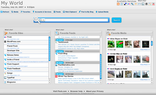
One of the newest features is called My World. Essentially it ties all of Flock's features - media integration, feeds, favorites - into a local, personal start page similar to a simplified version of Netvibes or Google Personalized Home.

The way favorites are managed has changed since the last version to the point where viewing bookmarks only consumes the sidebar area instead of the Safari-like whole page method. I find this to be a plus as I loathed the old way of managing favorites. I just want to be able to flip open a sidebar and see my last favorites.

Since Flock is Firefox-based, expanding it is as easy as installing Firefox add-ons. This used to be a huge problem with older versions of Flock and you had to "convert" Firefox add-ons/extensions to a Flock format. I tested this by installing Firebug for Firefox and it worked flawlessly, leading me to believe that the Flock team spent time on add-on compatibility.
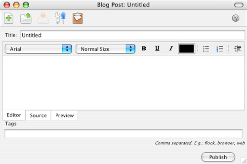
Older Flock features such as Flickr photo uploading and blog posting are still present and feature a slight design tweak for the better.

Other Social Features
In addition to the media integration with the media bar and the favorites bar which ties in with the favorites button to bookmark sites online and locally, I noticed an icon in the address bar to share a link. If you're on a page you'd like to send to a friend, click the icon of a letter and Flock will open your default email client (Gmail in my case) and put the URL in the subject and body of a new email.
Live search has always been a boon for Flock and the same goes for version 0.9. If you have ever messed with Inquisitor for Safari - it's the same principle. Search results appear as you type. Favorites and recently visited websites are included in live results by default.

The last thing I'd like to mention about version 0.9 is a newfound new user friendliness. Let me give you an example. If you visit a site that has a syndication feed that you have not already subscribed to, Flock will flash the RSS icon and show you how to subscribe to the site if you're interested. That's the type of thing that not-yet-tech-savvy people would come to appreciate. This of course can be disabled after the first time you see it.
Overall
Flock is very much so a social media browser, tying in your accounts to various "Web 2.0" and social services for use in one place. I can only imagine what Flock would be like if the media bar supported social networking sites like Facebook - you could be able to search for people in the bar. However, for the new Flock user the interface seems confusing - lots of icons, lots of menus, et cetera. On the upside though, Flock 0.9 seems speedier than what I can remember about the older versions.
Personally, I will remain with Firefox as I prefer the simple, bare bones layout with only my bookmarks and I have no problem with visiting Flickr to view photos instead of opening Flock's media bar - especially considering I am not exactly restricted in screen real estate. To put it in other words, maybe I'm just not the right target user? In example, I only bookmark interesting things on del.icio.us maybe once every two weeks.
Regardless, I'm still curious about what version 1.0 holds. What do you think?