Review: Yahoo! Mail Beta
After surfing across Lifehacker's post about how to easily get a Yahoo! Mail Beta account, I decided to take it for a spin. Following those directions was easy enough and I found myself with a new Y! Mail Beta account within 5 minutes. I wasn't quite sure what to expect. I had seen screenshots of the fancy interface, which was purported to mimic a desktop email client, floating around the internet months before. Hopefully Yahoo has their eyes set on the future with mail beta and plan on setting themselves apart from Google and their popular Gmail.
The first time around YMB, as I will be calling it from now on, takes a few seconds longer to load as it caches the required files to power the AJAX backend used. Now onto the good stuff...

First Impressions
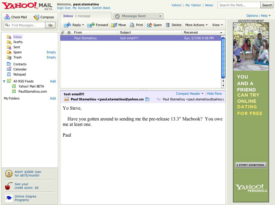
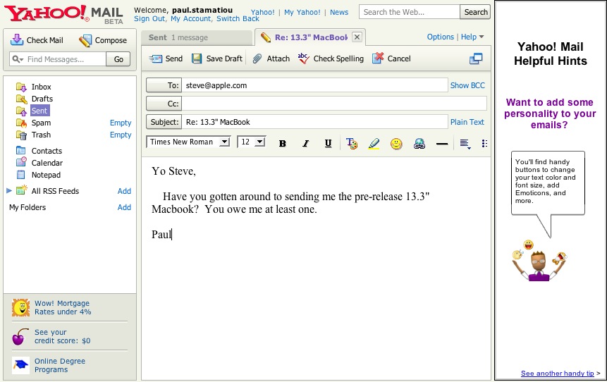
Despite the large ad on the right and the smaller text ads on the bottom left burning my retina, the interface is rather attractive. On the left there is a pane with all of the folders your traditional email client has, with the added benefit of a search box to scour through your emails. If you take a closer look, you'll spot that YMB has tabs, allowing users to compose an email in one tab while reading another email in the inbox as an example.
After about 15 minutes of playing with YMB, it became apparent that the speed was not too hot. Things take a while to load and if you load YMB for the first time, even if the stuff it needs has been cached, it takes longer than say Gmail does. But this is why it's still in beta, so I can't argue about that. Speaking of beta, when I loaded it on my mac I was greeted with a banner stating Caution: rough seas ahead. Your operating system is not officially supported.
 These few cons aside, YMB has some new features I've fallen in love with. Contacts are incredibly easy to manage and adding them is even easier. Unlike Gmail which happens to add just about anyone to your contacts even if you've only emailed them once, YMB puts the keys in your hand and lets you decide what to do. After sending an email, you are promptly shown a page asking if you would like to add that person's email and provide a name. The contacts tab provides a fast way to scroll through many contacts, even affording the ability to setup distribution lists, Yahoo's term for mailing list. This is essentially the same thing as Gmail's underused groups feature.

Interesting Features
The big feature that sets YMB apart from Gmail and other current generation webmail clients is drag and drop. Just like Outlook, Thunderbird or Mail, you can drag emails to different folders. It bears a close resemblance to Roundcube's next-gen interface. You are also allowed to drag multiple email messages at a time. There is a hover notification to let you know where you can and where you can't drop items.


RSS Reader
YMB expands upon Gmail's web clips concept by adding a simple RSS reader. I say simple because the user has very little control over how feeds are displayed. I was hoping I would be able to configure it so that only headlines were displayed, not full posts, but I wasn't able to do so. You do, however, have the ability to alter text size and font with the option of saving to Yahoo! My Web or posting to a Yahoo! 360 blog. This is a major improvement over web clips, but I can't foresee it replacing my FeedLounge account anytime soon.

Verdict
Yahoo! Mail Beta is a great work in progress when compared to the current, bland version of Yahoo! mail. However, there are several things that will prevent YMB from replacing your preferred email client or even your Gmail account. As I mentioned before, there are ads and plenty of them. Big ones, small ones, tall ones - they're all there. Logging in to the YMB homepage shows you a random advertisement for various Yahoo services. Yahoo can learn a thing or two about design from Google, whose Gmail advertisements are at least tasteful and unobtrusive. Even if you throw down an Andrew Jackson (that's a 20 bill for those of us in the states) every year to upgrade to the plus account, you only get rid of graphical ads leaving the text ads to annoy you. The free account can't even compete with Gmail in terms of storage... actually, the plus account is still some 700MB (at the time of this writing) less than Gmail's allotted storage.
As with all of Yahoo's ventures, they have found a way to clutter up the interface. There are superflous links to other Yahoo services in addition to a Yahoo search box. That makes two search boxes on one page - one too many. If absolutely necessary, why not have just one search box with a drop-down option to set the search scope? For the extent that I have tested the email search, it works pretty well. Your email search history is saved and can be easily cleared at any time. Each folder or action has an associated icon, which does wonders for usability and helps super users quickly locate things visually and click away.
I await a more worked-out version of YMB in the near future. The whole interface is far too slow to become my Gmail or Apple Mail replacement. To the best of my experience with YMB, it is not yet possible to setup the equivalent of a filter in Gmail. I have at least 20 filters in Gmail that help me sort out things everyday. Currently in YMB, you cannot have one email listed in two folders as you can sort emails with Gmail labels. Using YMB in its current state would become a nightmare when email starts flooding in. I encourage you to get your own YMB account by following these quick directions and letting me know what you think.