This is the last part in my three-part series about the design and development of a responsive and so-called Retina-friendly website. While I have covered my development process, media queries for responsive development, and various JS libraries I use, I'm going to talk about images in much more depth in this article. In particular, I'll show how to use HiDPI image assets as well as cover responsive images and some history around that.
Going HiDPI
So you want to do the easiest possible thing to get your website's header logo to look good on HiDPI devices and computers? Doing this in CSS is similar to loading an img twice as large as the height and width attributes of that tag.
From here on out I refer to all "retina" displays & related ilk with the device-agnostic HiDPI moniker. Oh and a fun tidbit: the iPhone 4/5 is no longer the highest DPI mobile device. The HTC One's 1920x1080 4.7-inch display gives it a lusty 468ppi.
I wanted icons and my large header avatar to be HiDPI display friendly. Load a background image that is twice as large as you want to display it and use background-size to constrain it to half of the image's width and height. Easy. But we don't want to load the HiDPI image all the time. There's no need to waste bandwidth for regular displays.1
That's where media queries come in again. Below is a Sass mixin to do just that, based on this post by 37signals, but modified to remove min--moz-device-pixel-ratio in favor of resolution as recommended by Mozilla. The W3C folks say the same thing about -webkit-device-pixel-ratio.
// 1.3 ratio because devices like Nexus 7, might as well give them @2x assets too
@mixin image-2x($image, $width: auto, $height: $width) {
  @media only screen and (-webkit-min-device-pixel-ratio: 1.3),
         only screen and (-o-min-device-pixel-ratio: 13/10),
         only screen and (min-resolution: 120dpi) {
    background-image: url($image);
    @if $width != auto {
      // bg-size() is a mixin I use for properly prefixing background-size
      // for webkit, moz, o, ms
      @include bg-size($width, $height);
    }
  }
}

// Usage. stammy.png is 133px x 133px. stammy@2x.png is 266px x 266px
// background: url('https://turbo.paulstamatiou.com/assets/stammy.png') no-repeat 0 0;
// @include image-2x('https://turbo.paulstamatiou.com/assets/stammy@2x.png', 133px, 133px);
What about icons?
That mixin only works for individual images so if you have more than a few items to show you'll probably want to avoid that many HTTP requests. For example, the 18 icons I use throughout the site. I could have created my own icon webfont with a nice tool like Font Custom, but decided against it for a few reasons.
While an icon webfont would be retina-friendly right out of the gate, browsers render fonts differently and it may not look the same everywhere. Notably, icons from webfonts may appear blurry or have color fringing. And if you wanted a gradient on that icon (but why?!), you will need to resort to the typical gradient(), background-clip:text;, and text-fill-color: transparent; mayhem.2
However, if you are really interested in getting icon fonts working and don't mind the labor of hinting them for the sizes you'll be using them at, then you can get some pretty impressive results like this.3
But I already know how to make PNG sprites so I went that route. Here's how I hooked up two of them:
.home, .rss {
  background: url('icon-sprite.png') no-repeat 0 0;
  width: 24px;
  height: 24px;

  // Instead of saving multiple versions of the icon for different states,
  // I like just having a darker icon and restoring opacity on hover
  opacity: 0.4;
  &:hover { opacity: 1; }

  // constrain background-size by half. actual sprite width is 120px
  @include bg-size(60px,auto);
  @include transition(opacity, 0.2s);
}
.home { margin-right: 1.5em; }
.rss { background-position: -38px -23px; }
I'm not actually using any media queries here to conditionally load a different sprite. I'm always loading the double-sized icon sprite. I wouldn't normally do this but the icons were small enough for bandwidth to not be a concern and the HiDPI version looked good enough on non-HiDPI displays.
At least that's what I thought. Even with the correct background-size halving and only using pixel-fitted 2x icons were sized in even numbers (ie 48px by 48px should result in a 24px x 24px 1x icon), it still resulted in blurry icons. I could seemingly get around this by adjusting the background-size 1px smaller than it should need, but that felt wrong and that would make some icons crisp and turn others blurry.4
Why you shouldn't always load the retina version of your icons for regular displays; they can look blurry without triple checking that your icons are properly pixel-fitted and that they play nicely with being downsized (ie, with not only even numbers but with multiples of 4). Basically, they will look bad if you don't spend a good bit of time in Photoshop, so you're better off only using 2x assets for HiDPI displays.
So back to Photoshop to create two separate sprites: a 2x version and a 1x version. Working with sprites is usually a pain in the ass and working with two would prove to be a nightmare if you don't have a system for keeping it organized. Fortunately, Twitter Spritemaster™ Dave Bedingfield shared a few tips with me:
- Create a set of dividing lines for each icon and group related icons and icons of the same size/utility.
- Both the @2x HiDPI version and 1x version will live in the same cell and be aligned how you will end up using them in CSS (most likely top left, unless you use something like background-position: 50% 50%; in which case they should be centered). Proximity doesn't matter if you end up accessing each icon in it's own individual element (for example, an
iwith a width and height). - The maximum width and height of the cell depends on the size of the larger @2x version.
- Even numbers are you friend. In my example below, icon coordinates are even numbers and icon widths and heights are as well.
- When saving both sprites, hide everything and only show 1x icons, save and then 2x icons.
I do it a bit differently from Twitter, they always load the @2x sprite. If you poke around on Twitter's mobile website you'll see there are different sprites for mobile and tablet. The main benefit of this approach is that every icon uses the exact same coordinates!
I set the opacity of the 2x icons to 50% just for display. The sprites themselves are transparent with only one of the icons in each cell.
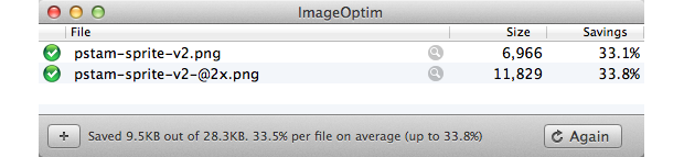
You run every production PNG through ImageOptim right?
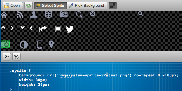
After saving and optimizing the sprites, it came time for the chore of writing the CSS and identifying all the icon coordinates. Fortunately a little website called Sprite Cow makes this a bit easier than going around measuring things in Photoshop. Just upload the sprite, select each icon (no need to be accurate, it auto-selects) and it outputs the CSS.
I'm only interested in the coordinates and width/heights, but Sprite Cow was often a pixel off in calculating the size so keep that in mind.
And now for some Sass mixins of course.. here's a simple one to just identify high-DPI devices. You'll see it's similar to the image-2x() mixin from earlier but doesn't concern itself with the background image.
@mixin retina {
  @media only screen and (-webkit-min-device-pixel-ratio: 1.3),
  only screen and (-o-min-device-pixel-ratio: 13/10),
  only screen and (min-resolution: 120dpi) {
    @content;
  }
}
Then I created a two Sass variables to keep track of the sprite URLs so I didn't have to keep pasting that around for every icon.
$sprite_url_2x: "https://turbo.paulstamatiou.com/assets/pstam-sprite-v2-@2x.png";
$sprite_url: "https://turbo.paulstamatiou.com/assets/pstam-sprite-v2.png";

@mixin retina-sprite {
  background-image: url($sprite_url_2x);
  @include bg-size(250px, 225px); // my sprite dimensions, halved
}
// silly function to divide the width and height to save me 2 seconds
// whenever I need to calculate the halved retina background position
@function half-pos($w, $h) { @return $w/2 $h/2; }
Finally, here's how this all ties together to display some of the icons in my header:
.photos i, .posts i, .about i, .search {
  background-image: url($sprite_url);
  background-repeat: no-repeat;
  @include retina {@include retina-sprite;}
  display: inline-block;
}
.about i {
  width: 24px;
  height: 22px;
  background-position: -100px 0;
  @include retina {
    background-position: half-pos(-100px,0);
  }
}
.posts i {
  width: 24px;
  height: 26px;
  background-position: -150px 0;
  @include retina {
    background-position: half-pos(-150px,0);
  }
}
.photos i {
  width: 28px;
  height: 21px;
  background-position: -200px 0;
  @include retina {
    background-position: half-pos(-200px,0);
  }
}
.search {
  width: 24px;
  height: 24px;
  background-position: -256px 0;
  @include retina {
    background-position: half-pos(-256px,0);
  }
}
That's it! HiDPI devices will load the @2x sprite and accordingly set the proper background-position to load the right icon. Regular devices will load the 1x sprite and respective icons.
As you read in Developing a responsive, Retina-friendly site (Part 1), the side effect of using Sass @media bubbling and @content blocks like this retina mixin is you get compiled CSS with lots of extra media queries. The snippet above will end up compiling to five of the same retina media query. I'll leave it as an exercise to the reader about how to rewrite it to save bandwidth.
Don't forget the Retina favicon!
And of course, we can make a HiDPI favicon.ico. Create both a 16x16 and a 32x32 png and import the into x-icon editor. It will let you export a single .ico with all size variants baked in.

For comparison the YouTube favicon is not Retina and noticeably pixelated
There's a lot more to cover with HiDPI image assets, but I'd rather point you to Thomas Fuchs' excellent Retinafy ebook than trying to summarize it here.
Responsive Images
Responsive design doesn't just stop at adjusting layout. It also applies to dealing with images. Up until now most web developers would add max-width: 100%; to their images and call it a day (so-called "fluid/flexible images"). But now with more devices with higher PPIs in use, we can do better.
My interest in responsive images began when I was reading through Medium.com's source, as some nerds are wont to do when bored. Despite the fact that they use font-smoothing: antialiased; (read this) and text-rendering: optimizeLegibility; (a performance pitfall on mobile; only use for headers), I kept poking around5.
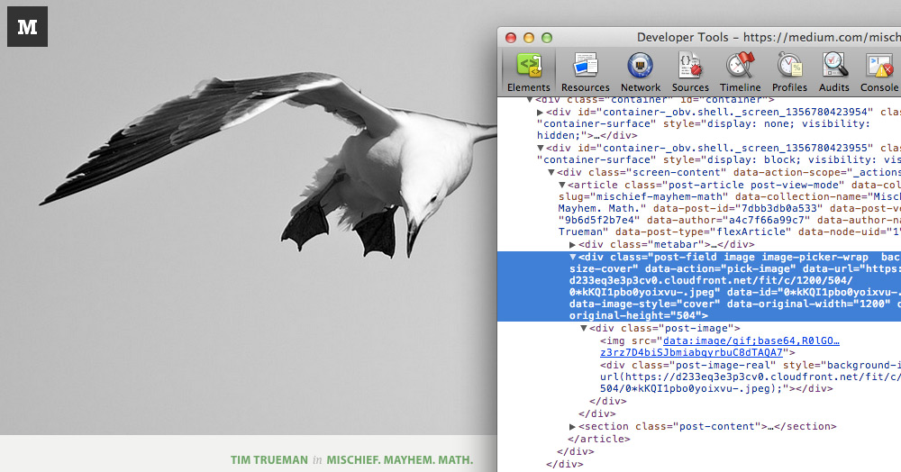
I noticed their header image had a unique URL that changed when I resized my browser and reloaded the page. Looking at the image response headers showed nginx as the server and a Via of Amazon Cloudfront. Looks like they're using nginx's image filter module to do the on-the-fly resizing and utilizing it as an origin for Cloudfront, but I digress.
Why should mobile visitors still waste bandwidth loading the same 1000px image you display for desktop visitors? What about desktop visitors tethered to a slow connection? They shouldn't have to wait for the 2x HiDPI version of that large image to load. As you can imagine there are other edge cases mixed in here too. We should loading HiDPI assets for mobile devices that support it and everything in between (depending on the breakpoints) to provide properly sized images and forgoing the old manner of simply downsizing images with CSS.
Technically this is simply adaptive images and that's what you'll find most often when researching this — providing several versions (for example 4 sizes) of the same image and then having the browser select the proper one to load depending on conditions like media query breakpoints6. A true responsive images solution would serve up the exact size needed with the help of server-side image resizing and caching. More on that later.
I want photos on my photos pages to be crisp all the time — something that should be possible given the user's bandwidth, browser width/screen resolution and device pixel ratio. If we know they are on a slow connection, we can load a lower quality version.
History of Responsive Images
So I read pretty much everything the Internet has to offer about responsive images, including W3C drafts, W3C respimg Community Group discussions et cetera. There are several ways to get it working right now but there is no great solution. The <img> tag wasn't built with this in mind.
It all started with folks in 2010 using HTML5 data attributes like data-fullsrc in <img> tags to provide an alternate, high-resolution version of the same image. Some JavaScript would loop through the images and swap in the fullsrc for src if certain conditions like browser width were met. However, clients destined to load the larger image ended up making a request for the first image before the JavaScript kicked in, resulting in additional HTTP requests and bandwidth usage. To counteract this people started using server-side rewrite rules to catch issues like that and load tiny spacer gifs instead so there wouldn't be much of a penalty for the first request. For that to work, it depended on a cookie checked by the server with the client's resolution. It was a mess, but it worked.
<img src="mobile-version.jpeg" data-fullsrc="desktop-version.jpeg">
Then browser advancements introduced the lookahead pre-parser that helped browsers load pages more quickly by fetching all page assets before the HTML finished loading and before JavaScript can run. The browser's image prefetching would break that aforementioned server-side redirect created to reduce the penalties associated with making two requests.
There-in lies the entire problem with getting responsive images to work today:
How do we reconcile a pre-parser that wants to know what size image to download ahead of time with an image technique that wants to respond to its environment once the page layout has been calculated?
Where are we now?
Based on those trials and tribulations, developers started coming up with other ways to solve this with the img tag. Some folks thought about not even setting a src so there was no prefetching penalty, having JavaScript load in the appropriate image from data attributes, and setting another image tag inside a noscript as a fallback for visitors with JavaScript disabled.
Unfortunately that has SEO implications on its own (no src), can cause ugly page reflowing as the images begin loading, and results in a slower page load from lack of prefetching. Matt Cutts has said that Google tends not to look at content inside of noscript tags due to noscript abuse from spammers.
Then developers started thinking, well what if we extend img to support a sourcelist of sources to choose from? It would be more semantic and utilize media queries to determine the version of the image to load instead of depending on JavaScript.
<img src="default.jpg" srclist="alternativeSizes" alt="Picture of Unicorn">
<sourcelist id="alternativeSizes">
  <source src="big.jpg" media="min-width: 600px" width="600" height="400">
  <source src="small.jpg" media="max-width: 600px" width="320" height="320">
</sourcelist>
That seems to have evolved into the W3C-proposed srcset attribute for img:
<img src="banner.jpeg"
     srcset="banner-HD.jpeg 2x, banner-phone.jpeg 100w, banner-phone-HD.jpeg 100w 2x"
     alt="">
The srcset attribute contains up to three optional URLs and accompanying descriptors for different versions of the image to load. In this example, the 2x descriptor denotes a "maximum pixel density of 2 device pixels per CSS pixel" and 100w means "maximum viewport width of 100 CSS pixels."
Another suggestion around this time was creating a new image format entirely; one that points to alternative resolutions. Googler Ilya Grigorik recently wrote about this kind of solution (content negotiation) at length. It turns out this is also something the W3C seems to be okay with in their recently updated Use Cases and Requirements for Standardizing Responsive Images draft:
The solution MUST NOT require server-side processing to work. However, if required, server-side adaptation can still occur through content negotiation or similar techniques
If all this wasn't confusing enough, Apple decided that people were having too much fun without them and decided to put their hat in the ring with a proposal for CSS4 image-set. It's pretty much the same concept as srcset but in CSS. The problem there is that folks will just start converting their img tags to divs utilizing image-set for background images in CSS, thereby removing alt text (divs can't have alt text) and throwing all accessibility out the window.
<picture> the future of responsive images
It seems like developers on the W3C and W3C Responsive Images Community Group are leaning towards the proposed picture element. In a W3C Working Draft for the picture element, syntax utilizes a simplified srcset tag restricted to only carrying information about images for devices with different pixel densities per source.
<picture width="500" height="500">
  <source media="(min-width: 45em)" srcset="large-1.jpg 1x, large-2.jpg 2x">
  <source media="(min-width: 18em)" srcset="med-1.jpg 1x, med-2.jpg 2x">
  <source srcset="small-1.jpg 1x, small-2.jpg 2x">
  <!-- img is the fallback -->
  <img src="small-1.jpg" alt="">
  <p>Accessible text</p>
</picture>
This seems to be the current state of responsive images. I probably got the order of some of these thing wrong, so don't hold me to it exactly. The picture element looks promising but has a few limitations in my eyes:
- It's rather verbose and will be rather confusing for new developers.
- Media queries have no sense for bandwidth available to the browser so this will hypothetically still load a large 2x image on a HiDPI-capable device even if it's on a slow connection.
Media queries can bring some interesting affordances including device pixel ratios and the upcoming luminosity media feature, but bandwidth is not one of them. Aside from a manual bandwidth test, the only hope is either waiting for browsers to get smarter about picking the right image source given what it knows about the available bandwidth or letting sites access something like navigator.connection7.
I'm using foresight.js for now
While I'm waiting for picture to get implemented in all major browsers8, I decided to use one of the more popular responsive image solutions:
Foresight.js gives webpages the ability to tell if the user's device is capable of viewing high-resolution images (such as the 3rd generation iPad) before the image has been requested from the server. Additionally, it runs a bandwidth test to see if the user's device should load high-resolution images. Depending on the display and network connectivity, foresight will request the appropriate image for the webpage.
Foresight can be configured for a number of different responsive image setups ranging from simply swapping out an image with a higher resolution version all the way to requesting an image the exact width of the client's browser. I went with the latter.
Here's the markup for the image itself. Notice how the img tag doesn't have a src specified. It gets added after foresight evaluates the environment and decides what image version to load. (The curly braces are just my Jekyll liquid tags.)
<figure class="feature-image loading">
  <img class="fs-img" data-src="{{ "{{site.cdn" }}}}{{"{{page.image_lg" }}}}?w=1400"
       data-width="{{ "{{page.photo_width" }}}}"
       data-height="{{ "{{page.photo_height" }}}}"
       alt="{{ "{{page.title" }}}}" />
  <Caption>Example caption goes here</Caption>
  <noscript>
    <img src="{{ "{{site.cdn" }}}}{{"{{page.image_lg" }}}}?w=1400" alt="{{ "{{page.title" }}}}"/>
  </noscript>
</figure>
Now here's where it gets a little hacky. All foresight images are assigned a CSS class that uses font-family to store an image-set value. As Foresight developer Adam Bradley states, "font-family is one of the few CSS properties which lets you enter free-text in the value and the browsers still consider it valid, which makes the value viewable by the DOM and javascript (yup, even IE doesn't care)."
.fs-img {
  max-width: 1400px;
  font-family: 'image-set( url(w=1400|w={requestWidth}) )';
  display: none;
}
The value I have for image-set() is a little cryptic on its own too. It makes use of foresight's URI Find/Replace functionality. It looks for the string "w=1400" in my image data-src and replaces that with the actual width of the client (this also takes into account HiDPI resolutions).
But what is that query string param in my image URL? Well here's the other hacky part — I'm using a service to on-the-fly resize and cache the image for exactly the request. For example, if your browser is 837px wide, it will change that width param in the URL to 837. If you're on a Retina MacBook Pro, that request will be for a 1674px wide image. I just dump a fairly large image on the service and it does the rest for me. And if I make my browser wider, foresight will automatically request a larger version of the image to swap in!9
On the photos index page, I use foresight differently and only have it swap in 2x high-res images for HiDPI devices. I'll discuss the query string parameters at the end of all those image urls below.
{{ "{% for photo in site.photos offset: 1 " }}%}
  <li>
    <figure class="in-photo-list">
      <a class="photo_item" href="{{ "{{site.base_url" }}}}{{"{{photo.url" }}}}" title="{{ "{{photo.title" }}}}">
        <!-- the fs-thumb class is simply display: none; -->
        <img alt="{{ "{{photo.title" }}}}" class="fs-thumb"
             data-high-resolution-src="{{ "{{site.cdn" }}}}{{"{{photo.image_lg" }}}}?w=333&h=333&fit=crop&q=75&dpr=2"
             data-src="{{ "{{site.cdn" }}}}{{"{{photo.image_lg" }}}}?w=333&h=333&fit=crop&q=75"
             data-width="333" data-height="333" />
        <noscript>
          <img src="{{ "{{site.cdn" }}}}{{"{{photo.image_lg" }}}}?w=333&h=333&fit=crop&q=75" alt="{{ "{{photo.title" }}}}"/>
        </noscript>
        <Caption>{{ "{{ photo.title " }}}}</Caption>
      </a>
    </figure>
  </li>
{{ "{% endfor " }}%}
I do feel a bit guilty about this solution, especially as having any server-side processing is one of the no no's mentioned in the W3C picture proposal. It's just introducing another point of failure. It works pretty well right now and it's not like I can use picture yet.
I'm not using it in blog post articles just yet. As an FYI, if you do decide to use a similar solution for your jekyll posts, you'll need to write a filter for your RSS feed otherwise the images won't load for RSS readers since there's no src and no foresight JavaScript to run.
On-the-fly image resizing and caching with imgix
After I poked around and found out how Medium started doing some of this, I started brainstorming about how I could do it. A number of solutions surfaced from the same nginx image filter setup with Cloudfront to something utilizing the dragonfly gem but at the end of the day I don't want to manage yet another thing.
I'm using imgix, a service from a fellow Y Combinator batchmate. Setup was ridiculously easy. I just had to create AWS IAM user credentials with read-only access for the Amazon S3 bucket where I store my images. Something like this:
{
  "Statement": [
    {
      "Effect": "Allow",
      "Action": [
        "s3:GetBucketAcl",
        "s3:GetObject",
        "s3:GetObjectAcl",
        "s3:ListBucket"
      ],
      "Resource": [
        "arn:aws:s3:::YOURBUCKETNAMEHERE",
        "arn:aws:s3:::YOURBUCKETNAMEHERE/*"
      ]
    }
  ]
}
I gave that and its accompanying AWS access key and secret to imgix. Then all I had to do was replace the host for my images to my newly created stammy.imgix.net. The rest of the path remains the same.
# old URL, with Cloudfront CNAME
https://turbo.paulstamatiou.com/uploads/2012/12/santa_cruz_beach.jpg

# new imgix url
http://stammy.imgix.net/uploads/2012/12/santa_cruz_beach.jpg
With imgix setup, I can now easily manipulate the image by adding various query string params for their image URL API like w for width, q for quality, dpr for device pixel ratio and so on.
Speeding up my photo posting flow
One asterisk when it comes to using foresight is that it needs to know the image aspect ratio for each photo so you must provide it with data-width and data-height attributes in the markup. This can be rather annoying to manually add every time I post a new photograph with Jekyll. I was already manually adding several other attributes for my photo layout, like camera type and post processing software used.
I decided to write up a quick rake task to automate the creation of each new photo post — upload the image to S3, grab any relevant EXIF data, fetch an address if the EXIF has GPS coordinates and finally create the file and open it up in Sublime Text 2 for me to begin writing.10
# usage: rake s3p title="My Photo" slug="my-photo-seo-keywords"
desc 'upload photo in _new_photo dir and create new photo post with image URL as image_lg attribute'
task :s3p do
  require 'exifr'
  require 'open-uri'
  require 'json'

  photo_dir = "/Users/Stammy/Documents/_new_photo/"
  month = Time.new.strftime("%m")
  year = Time.new.strftime("%Y")

  # upload image(s) to S3 via http://s3tools.org/s3cmd
  sh "s3cmd put --acl-public --guess-mime-type #{photo_dir}* s3://my-s3-cloudfront-bucket/uploads/#{year}/#{month}/"

  Dir.chdir(photo_dir)
  # glob goes by alpha
  images = Dir.glob("*.{jpg}")

  # in case I'm uploading multiple images for a single photo post, only pull exif from first
  main_img = images.first

  if EXIFR::JPEG.new(main_img).exif?
    # used to set data-width/data-height as needed for foresight.js
    exif = EXIFR::JPEG.new(main_img)
    camera_model = exif.model.gsub('EOS ','')
    photo_w = exif.width
    photo_h = exif.height
    is_portrait = photo_h > photo_w ? true : false
    is_mobile = exif.make == "Apple" ? true : false
    photo_e = exif.exposure_time.to_s
    photo_f = exif.f_number.to_f
    photo_mm = exif.focal_length.to_i
    photo_iso = exif.iso_speed_ratings.to_s
    photo_pp = exif.software.gsub(" (Macintosh)",'').gsub('Photoshop ','')

    if !exif.gps.nil?
      # turn gps coords into address
      coords = exif.gps.latitude.to_s + "," + exif.gps.longitude.to_s
      url = "http://maps.google.com/maps/api/geocode/json?latlng=#{coords}&sensor=false"
      photo_gps = JSON.parse(open(url).read)['results'][0]['formatted_address']
    else
      photo_gps = false
    end
  end

  post_process = photo_pp || "Adobe Lightroom 4"
  photo_url = "uploads/#{year}/#{month}/#{main_img}"

  # and create the photo file
  title = ENV["title"] || "New Title"
  tstamp = Time.new.to_s
  slug = ENV["slug"].gsub(' ','-').downcase || title.gsub(' ','-').downcase
  Dir.chdir("/Users/Stammy/code/pstam-blog/")
  path = File.join('_photos', "#{Time.new.strftime('%Y-%m-%d')}-#{slug}.markdown")
  data = <<-HTML
---
layout: photo
type: photo
title: "#{title}"
date: #{tstamp}
description: ""
image_lg: "#{photo_url}"
photo_width: "#{photo_w}"
photo_height: "#{photo_h}"
camera: "#{camera_model}"
photo_exposure: "#{photo_e}"
photo_iso: "#{photo_iso}"
photo_mm: "#{photo_mm}"
photo_focal: "#{photo_f}"
photo_gps: "#{photo_gps}"
post: "#{post_process}"
mobile: #{is_mobile}
portrait: #{is_portrait}
---

HTML
  File.open(path, 'w') { |f| f.puts data }
  puts "new file generated in #{path}"
  system "sublime #{path}"
end
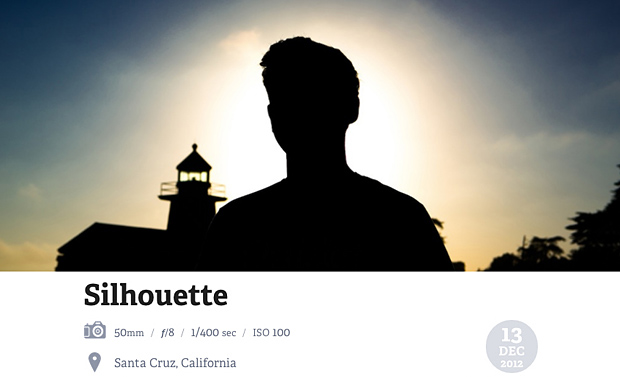
Photo page with extra metadata shown on hover – location, aperture, exposure, ISO, etc
What's next with images?
As I mentioned above, I'm only using responsive images on my photos pages for now. I'd rather not end up with hundreds of blog posts to change when a particular solution to responsive images becomes a standard. That being said, I do use focal-point CSS in some of my blog posts and pages. Focal Point lets you add classes to your images that crop the image when triggered by a media query breakpoint.
This is an attempt to address "art direction" outlined by the W3C in responsive images:
In a responsive design, it is typical to change an image so it can be targeted towards the features of a particular display (or set of displays). Sometimes this means cropping an image.
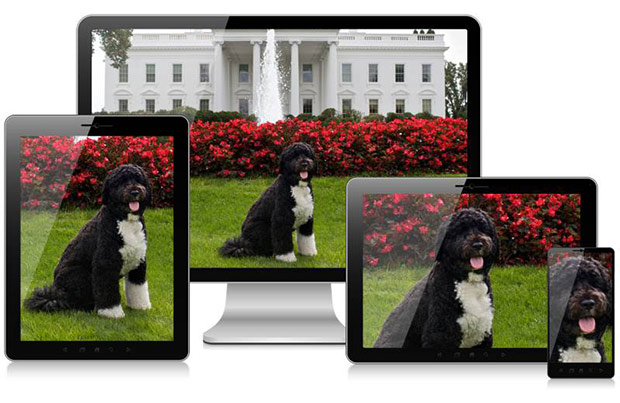
If the full size of that image was simply scaled down on mobile, Bo would be tiny. Art direction suggests smart cropping of the subject for various devices.
It's just CSS that hides part of the image so that as it gets smaller, it crops in on the area you specify as being the focal point (get it?) of the image. One side effect of this particular implementation is that it hides captions below the image when the media query gets triggered. Focal point is only an aesthetic solution, a true one would address bandwidth concerns as well and load a different, cropped image for smaller displays. Now you can see much more there is to go with this whole "responsive" thing huh? It's just getting interesting.
Let me know what you think!
Comments and feedback keep me going and writing articles like this. Drop me a comment below, share this post if you enjoyed it and shoot me a tweet. I'd love to hear from you.
Note: Be sure to check out part 1 of the development track of this series and the initial design post that started it all.
1 This works because browsers only load images referenced in a CSS file when the appropriate class/id is used in markup on that page. In other words, there's no harm (aside from extra request/latency/etc) in having multiple versions of an image referenced in CSS.
2 Or if SVG is your thing...
3 Related: An interested A List Apart read, The Era of Symbol Fonts with some interesting ways to use ligatures to your advantage when thinking about icon webfonts.
4 Though in hindsight I didn't really investigate the cause of the 2x being blurry on a regular display too much because I knew I wanted to do it the proper two sprite, media query way regardless. I'd say that I probably could have tweaked the icons a bit more and fidget with the insides to make them work at the sizes I wanted -- the equivalent of font hinting I guess you could say.
5 I'm a total hypocrite and use antialiased font-smoothing on this site for the time being.
6 Though quite confusingly there is a responsive images solution named Adaptive Images.
7 which some Android mobile browsers have
8 without the need for a polyfill like picturefill, which isn't quite seamless as it requires different markup conventions.. that you'd have to end up fixing in a few years when picture is fully supported.
9 Definitely overkill and a more reasonable solution would be to round up to the nearest 100px and request that size, increasing likelihood that size has already been requested by other visitors before and is cached by the resizer. This is what Medium.com does.
10 Though in hindsight I might need to edit this to take the EXIF data and then use something like pngcrush to optimize the image for posting to the web (even though I use imgix for resizing, it'll save me storage costs in the longrun).