In my last post, Designing a responsive, Retina-friendly site, I covered my design process and thoughts behind redesigning this site. I did not cover any aspects of actual development or any Jekyll specifics. This post will mainly cover coding up responsive design and the third and final post will cover retina media queries, responsive images and more.
Note: The final part to this series is now published: Developing a responsive, Retina-friendly site (Part 2).
Jekyll + Rack on Heroku
I last redesigned my blog in 2010 when I migrated from WordPress to Jekyll. I eventually forked jekyll to support a separate photos post type outside of the main site.posts. I then wrapped it in Rack::Rewrite with Rack::TryStatic so I could host it on Heroku and 301 some old permalinks. I won't cover the details of that too much, but I recall reading this post by Matt Manning when I made the switch.
Most of the configuration is in the config.ru file. I loathe URLs that end in .html so my jekyll fork is based on this gist for Apache-inspired "multiviews" support — basically it writes links without the file extension and then I get Rack to do the same.
require 'rubygems'
require 'bundler/setup'
require 'rack/request'
require 'rack/rewrite'
require 'rack/contrib/try_static'

use Rack::Deflater
# also, look into Rack::ETag

use Rack::Rewrite do
  # rewriting old WordPress permalinks I had
  # Do not show .html file extensions

  # I largely gave up /year/month/day style permalinks for the ridiculous
  # extra page generation time in jekyll (ie if /2013 loaded its own archives page)
  r301 %r{/[0-9]{4}/[0-9]{2}/[0-9]{2}/([a-z0-9\-/]+)}, '/$1'
  r301 %r{/categories/(.*)},       '/posts'
  r301 %r{/tags/(.*)},             '/posts'
  r301 %r{/people/(.*)},           '/posts'
  r301 %r{/([0-9]{4})/([0-9]{2})}, '/posts'
  r301 %r{/([0-9]{4})},            '/posts'
  r301 '/index.html',              '/'
  r301 '/index',                   '/'
  r301 '/archives',                '/posts'
  r301 %r{/(.*).html$},             '/$1'

  # I set USER=Stammy in .env -- you use foreman right?? -- to ignore these in dev locally
  unless ENV["USER"] == "Stammy"
    # remove all trailing slashes.. probably a better way to do this
    r301 %r{/(.*)/}, '/$1'

    # i have a few domains that point here like pstam.com
    # rewrite them to only use paulstamatiou.com
    r301 %r{.*}, 'https://paulstamatiou.com$&', :if => Proc.new {|rack_env| rack_env['SERVER_NAME'] != 'paulstamatiou.com' }
  end
end

# serve up some static goodness
use Rack::TryStatic, :root => "_site", :urls => %w[/], :try => ['.html', 'index.html', '/index.html']

# Serve the 404 error page
error_file = '_site/404.html'
run lambda { |env| [404, {
  'Last-Modified'  => File.mtime(error_file).httpdate,
  'Content-Type'   => 'text/html' ,
  'Content-Length' => File.size(error_file).to_s },[ File.read(error_file)] ]
}
To ensure deflater is properly compressing markup run this and you should see Content-Encoding: gzip returned:
# change 5000 to whatever port you run locally
curl -i -H "Accept-Encoding: gzip,deflate" http://localhost:5000 2>&1 | grep "gzip"
grunt watches over
When I started developing the new site I wanted to automate some of my workflow. Things like Coffeescript, JavaScript and Sass compilation to production-ready assets whenever any of the source files changed.
I took a look at the grunt build tool to help me with these issues. If you use jekyll, you probably have a Rakefile1 where you have specified several tasks to aid in create new posts and so on. In layman's terms, grunt is very similar but based on node.
Installation is an npm command away: npm install -g grunt
I setup the main grunt.js file in my project directory root to do a few things:
- Monitor all files in my
styledirectory and compilescreen.scssif any of them changed, like imported scss files. - Watch and compile the Coffeescript file
app.coffeeinto JS and put it in thejsdirectory. - Watch all specified js files in the
_jslibsdirectory and minify them along with the compiled coffee file, app.js, into a single file. - Gzip then upload assets to Cloudfront as necessary.
I installed grunt-coffee and grunt-compass plugins to be able to work with Coffeescript and Compass for Sass. And then grunt-s3 to upload some assets to my S3 Cloudfront bucket. Finally, I installed grunt-smushit to be able to optimize images from the command line (or you can use ImageOptim if you like).
  cd ~/code/your-blog
  npm install grunt-coffee
  npm install grunt-compass
  npm install grunt-s3
  npm install grunt-smushit
In the root of the directory I created a simple package.json file. I really only use it to add a banner to the top of my js file builds but it also keeps track of dependencies so you can easily re-setup grunt on a new machine with npm install.
{
  "name": "pstam-blog",
  "description": "jekyll 'n shit.",
  "version": "1.0",
  "homepage": "https://paulstamatiou.com",
  "author": {
    "name": "Paul Stamatiou"
  },
  "repository": {
    "type": "git",
    "url": "https://github.com/stammy/pstam-blog"
  },
  "devDependencies": {
    "grunt": "latest",
    "grunt-coffee": ">= 0.0.6",
    "grunt-compass": ">= 0.3.7",
    "grunt-s3": ">= 0.0.9"
  }
}
Then I created the grunt.js gruntfile2.
module.exports = function(grunt){
  // https://github.com/avalade/grunt-coffee
  grunt.loadNpmTasks('grunt-coffee');
  // https://github.com/kahlil/grunt-compass
  grunt.loadNpmTasks('grunt-compass');
  // https://github.com/pifantastic/grunt-s3
  grunt.loadNpmTasks('grunt-s3');
  // https://github.com/heldr/grunt-smushit
  grunt.loadNpmTasks('grunt-smushit');

  grunt.initConfig({
    pkg: '<json:package.json>',

    // fetch AWS S3 credentials in another json file
    // name with underscore prefix or exclude in jekyll's config.yml
    // otherwise this will end up being public!!!
    aws: '<json:_grunt-aws.json>',
    s3: {
      key: '<%= aws.key %>',
      secret: '<%= aws.secret %>',
      bucket: '<%= aws.bucket %>',
      access: 'public-read',
      gzip: true,
      upload: [
        {
          // upload search assets - get src filename from the min block below
          src: '<config:min.search.dest>',
          dest: 'assets/pstamsearch.js'
        },
        {
          // upload main js assets
          src: '<config:min.main.dest>',
          dest: 'assets/pstambuild.js'
        }
        // etc
      ]
    },
    meta: {
      banner: '/*! <%= pkg.name %> - v<%= pkg.version %> - ' + '<%= grunt.template.today("yyyy-mm-dd") %> */'
    },
    smushit: {
      // recursively run through *.png, *.jpg in img/ dir and optimize
      path: { src: 'img' }
    },
    min: {
      main: {
        // minify and bundle several js files together
        src: [
          '<banner:meta.banner>',
          '_jslibs/head.load.min.js',
          '_jslibs/foresight.js',
          'js/app.js'
          ],
        dest: 'js/pstambuild.js',
        separator: ';'
      },
      search: {
        // separately, put search-related js files together
        // to be async loaded only when search is used
        src: [
          '_jslibs/jquery.ba-hashchange.js',
          '_jslibs/jquery.swiftype.search.js'
        ],
        dest: 'js/pstamsearch.js',
        separator: ';'
      }
    },
    coffee: {
      // compile one coffeescript file to js
      app: {
        src: ['coffee/app.coffee'],
        dest: 'js/',
        options: {
          bare: true
        }
      }
    },
    compass: {
      // compile Sass
      dev: {
        specify: 'style/screen.scss',
        dest: 'assets/',
        linecomments: false,
        forcecompile: true,
        outputstyle: 'compressed',
        require: [],
        debugsass: true,
        images: '/img',
        relativeassets: true
      }
    },
    watch: {
      // setup watch tasks. anytime a file is changed, run respective task
      coffee: {
        files: ['<config:coffee.app.src>'],
        tasks: 'js'
      },
      jslibs: {
        files: ['_jslibs/*.js'],
        tasks: 'js'
      },
      sass: {
        files: ['style/*'],
        tasks: 'compass'
      }
    }
  });

  grunt.registerTask('default', 'compass js');
  grunt.registerTask('js', 'coffee min');
  grunt.registerTask('uploadjs', 'js s3');
};
Grunt has several built-in tasks, such as min. It accepts a directory or a bunch of specific JavaScript files and a single destination. One of those source files is from a compiled Coffeescript file, so it's important I only run min after the coffee task. To do that, I registered a js task that runs coffee first, then min.
I've also registered a default task (runs when grunt is called by itself) to call the compass task to compile Sass and then run the js task.
Setting up watch is the last and most important step. I configured it to run the coffee task anytime my coffee file changes, run compass anytime any file in the style directory changes, et cetera. I'm only working with a few files so it's instant.
That's it. I just run grunt watch and get back to work.
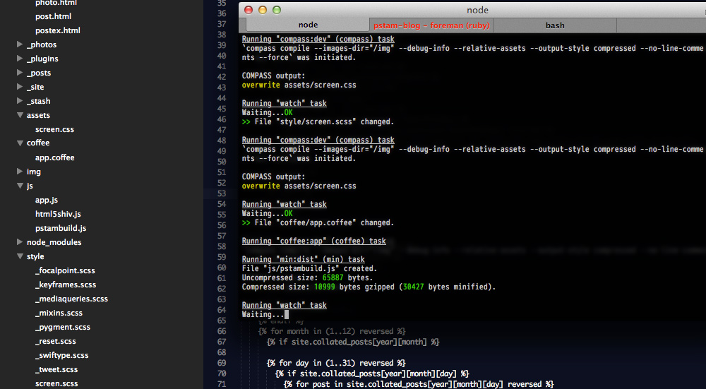
Grunt watching and compiling Coffeescript and Sass
This was a very basic overview of how I use grunt. It can do a lot more so it's worth exploring for other uses. I don't update the CSS or javascript on my site often so digestification2 of the compiled assets wasn't important for this, but it's something I want to look into.
Currently I manually run that last task (uploadjs) to build the js and upload it to S3. I'll have to spend some time reading the grunt-s3 source but at first glance it looks like it didn't support upload subtasks, so I couldn't abstract out only css uploading, search-related js uploading, and so on. It just uploads all specified files at the same time right now.
Matt Hodan's Jekyll Asset Pipeline is an alternative to using grunt entirely.
Search
I decided to ditch Google CSE and try out Swiftype, a Y Combinator search startup that has been dubbed the Stripe for site search. I have to agree, it's pretty slick. The best thing is that Swiftype lets me control the search results. I can find popular searches and pin certain results to the top.
There are a few install methods for Swiftype but I chose their self-hosted jQuery plugin. I ended up modifying it to provide pagination controls on the top and bottom of the results, add a no-results-found state and some extra markup to help me style it.
The plugin operates by listening to hash changes that include search params. I may end up refactoring it to remove that. Ideally I don't want to have to load an additional jQuery plugin to watch for hash changes and would like to forgo jQuery in favor of the smaller zepto.
Here's what the completed search interaction looks like, thanks to Photoshop CS6's new Timeline feature that helps me create annoying gifs:
A snippet of the header markup with the search bar:
<li><a href="javascript:void(0)" id="search" class="search ir" title="Search">Search</a></li>
<div id="searchbar">
  <form>
    <input type="text" id="st-search-input" class="st-search-input" />
    <a href="javascript:void(0)" id="st-cancel" class="cancel_search ir">Cancel</a>
    <a href="javascript:void(0)" id="st-close" class="close_search">Close</a>
  </form>
</div>
I only load the Swiftype libraries when the user clicks on the search icon. No need to load all that extra JS for everyone when only a few people will end up searching. Below is the coffeescript that hooks up all of the interactions, downloads the swiftype libraries concatenated and uploaded by grunt, and runs it.
$("#search").on 'click', ->
  # cache some frequently used elements
  search_input_el = $("#st-search-input")
  # create the wrapper for the results and prepend it to the main site div
  search_results_el = $('<div/>', {id: 'st-results-container'}).prependTo '#site'
  search_bar_el = $("#searchbar").fadeIn 200
  nav_li_el = $("#headernav li").hide()

  # load swiftype search libraries
  head.js 'https://turbo.paulstamatiou.com/assets/pstamsearch.js', ->
    search_input_el.swiftypeSearch
      resultContainingElement: "#st-results-container"
      engineKey: "YOUR_API_KEY"
      top_pagination: true
      perPage: 15
    search_input_el.focus()
    search_results_el.fadeIn()

  $("#st-close").on "click", ->
    # and/or bind to ESC key (event.keyCode 27)
    search_bar_el.hide()
    nav_li_el.fadeIn 150
    search_results_el.slideUp 150
    # this line clears hash fragments from the URL, not necessary but I prefer to clean up the URL
    history.pushState "", document.title, window.location.pathname + window.location.search

  search_input_el.keypress ->
    # since it's a link, jQuery wants to display: inline; with show()
    # so I manually set inline-block instead
    $("#st-cancel").css('display', 'inline-block').on 'click', ->
      $(@).hide()
      search_input_el.val("").focus()
      search_results_el.empty()
      history.pushState "", document.title, window.location.pathname + window.location.search
Take it for a spin and try searching above!
Getting Responsive
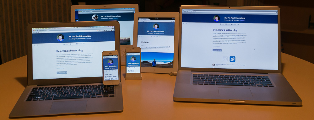
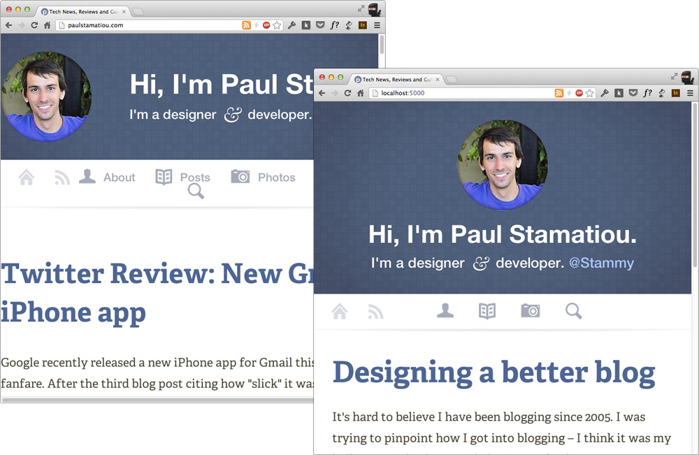
The new responsive & retina-friendly PaulStamatiou.com.
I'm sure you already know what RWD design is, but to dive a bit deeper responsive design is usually defined as multiple fluid grid layouts while adaptive design is multiple fixed breakpoints / fixed width layouts. However, most of the time you see a mixture of both: fixed width for larger layouts and fluid layouts for smaller viewports.
That's what I do here. Content is 37.62136em wide (multiply that with 16px browser default and the 103% font-size I have on content = 620px) until the smaller viewports when it expands to 100% width.
Right about here I would start talking about how I adapted my site to be responsive on mobile. Except I didn't. I began thinking mobile first and as such it was designed with only a few elements that would need to change between viewports. There was really very little to plan for; I coded it up instead of designing responsive pixel perfects first.
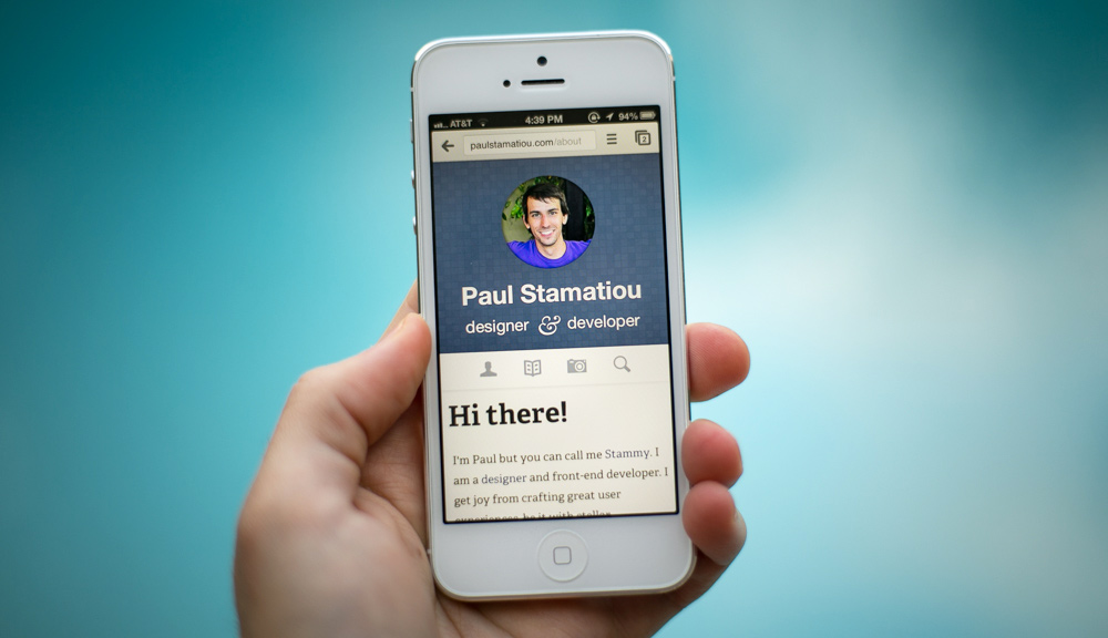
Responsive pstam.com at 50mm @ f/1.8. I love Chrome for iOS.
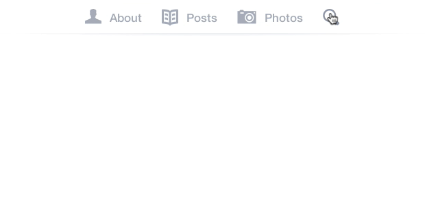
Only a few elements elements needed fiddling:
Header: Show some extra subtitle text and increase font-size for larger viewports in addition to moving the avatar to the left size. Also, showing navigation button text for larger screens ("About" next to about icon, etc)
Footer: Increase font-size considerably on smaller viewports to make links easier to tap. Apple HIG suggests at least 44pt x 44pt for tappable UI elements4.
Content: Overall, making buttons larger and full-width where necessary. Adjusting font-size.
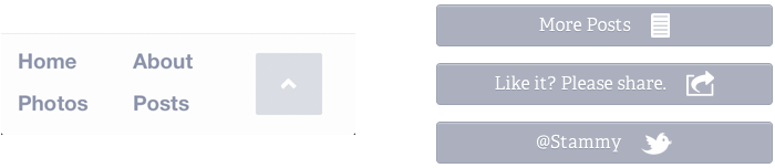
Simplified footer (left) and full-width post-content buttons (right) for smaller viewports.
For larger sites, you'll usually hear people buzzing about content choreography — adjusting layouts and moving elements around as content reflows with smaller viewports — and responsive navigation patterns, things like collapsing larger menus into the header. You can also get a good idea for how others work with layouts by scrolling through screenshots mediaqueri.es
Responsive Setup
To get started we need to tell the browser to set the viewport width by using the device's native width in CSS pixels (different than device pixels, CSS pixels take into account ppi). We also need to disable the browser's default zoom level, called initial-scale. Setting maximum-scale to 1 ensures this zoom remains consistent when the device orientation changes. This is necessary as most smartphones set the viewport width to around 1,000 pixels wide, thus bypassing any media queries you have for smaller screens.
Apple created this viewport tag to be placed in the head:
<meta name="viewport" content="width=device-width, initial-scale=1, maximum-scale=1">
EDIT: While setting maximum-scale to 1 fixes the iOS orientation change bug it also limits users from manually zooming into your site. I have since removed , maximum-scale=1 from the viewport line above and updated my website to use this accelerometer-based javascript solution: iOS-Orientationchange-Fix. It's very tiny when minified and works like so:
How it works: This fix works by listening to the device's accelerometer to predict when an orientation change is about to occur. When it deems an orientation change imminent, the script disables user zooming, allowing the orientation change to occur properly, with zooming disabled. The script restores zoom again once the device is either oriented close to upright, or after its orientation has changed. This way, user zooming is never disabled while the page is in use.
I'm also taking a suggestion from normalize.css to set text-size-adjust: 100% to prevent iOS from changing text size after orientation changes and without having to set user-scalable=0 on the viewport5. Just be sure to never, ever set text-size-adjust to none — it has the nasty effect of messing up accessibility by preventing visitors from using browser zoom to increase text size.
html {
  -webkit-text-size-adjust: 100%;
  -ms-text-size-adjust: 100%;
}
Then we want to make sure less capable browsers like Internet Explorer 8 can make use of media queries. There are a myriad of ways to polyfill or gracefully degrade media queries on such browsers. I've decided to go with css3-mediaqueries.js as it supports em units.
Similarly to how you conditionally load JavaScript like html5shiv in your head, we load css3-mediaqueries.js in the same way:
<!-- Ideally you should minify + gzip and host this yourself like a boss -->
<!--[if lt IE 9]>
<script src="http://css3-mediaqueries-js.googlecode.com/svn/trunk/css3-mediaqueries.js"></script>
<![endif]-->
WTF are Media Queries!?
Media queries are the lifeblood of any responsive website. They are used to conditionally6 load CSS for a media type (like screen, tv, print) based on at least one media feature expression. Well to be technically correct, the browser loads all of them regardless of whether they will be used. More on how to fix that later.
You're probably already familiar with them being used for screen width and resolution, but it can also be used to respond to other device characteristics like orientation, monochrome, pointer (presence and accuracy of a pointing device; i.e. use larger buttons/input fields for devices with inaccurate pointing devices to combat Fitts's law), hover and luminosity (soon).
For example, the media query below targets devices with viewport widths of at least 481px, which is pretty much the portrait width of most tablets and above. That's where the extra 1px comes into play so it doesn't overlap with another media query you may have of say 480px and below, or between 320px to 480px. This can all be a bit confusing at first.
@media only screen and (min-width : 481px) { // your css }
Breakpoints 101
Those "ranges" of widths which you want to target differently are called breakpoints. But how do you know where to set those viewport ranges? Do you just set them up for a few devices?
This has been a rather large topic of discussion in the web development community. Typically you would make breakpoints for the iPhone and iPad and have your design conform to those viewports. The current trend is the opposite—your content and design should determine your breakpoints.
I started with the "regular" breakpoints. You know the ones: 320px (iPhone portrait), 480px (iPhone landscape), 768px (iPad portrait), 1024px (iPad portrait), and a desktop one for anything larger.
However, the max width of my primary content (I like to keep the measure7 under 75 characters) was awkwardly right in between 480px and 768px. It looked odd to display a condensed mobile header for browsers wide enough to show the full version. I changed the 768px breakpoint to 640px as a result.
As web developers like to say...
Start with the small screen first, then expand until it looks like shit. Time to insert a breakpoint!
Working with Media Queries
Generally speaking, with media queries you'll have a big ugly section on the bottom of your CSS where you set your breakpoints and manually define styles you want to override. If only someone slapped me when I first did this in 2010. This was wrong for a few reasons.
For one, in an ideal world you should not be overriding styles, only augmenting them. One code smell is if you see yourself "canceling" out or undoing styles you defined elsewhere. I must admit it's something I always forget to do when I start a new project and want to get to "it works!" as fast as possible. Bookmark this article and read it sometime: Code smells in CSS. Then spread the gospel with me.
Any CSS that unsets styles (apart from in a reset) should start ringing alarm bells right away.
What I really wanted to point out is the placement of all your media queries. Placing them at the bottom of your CSS breaks when you end up changing the original value and forget to change the appropriate media query style if necessary. That's where Sass saves the day.
Thanks to Sass 3.28 @media bubbling and @content blocks, you can write ridiculously easy to use media query mixins. Yes, you can nest @media directives just like regular selectors and they will bubble up to the top level! Toss in a pinch of @content and that means you can write mixins like the ones below, as written by Anthony Short.
$mq-mobile-portrait   : 320px !default;
$mq-mobile-landscape  : 480px !default;
$mq-tablet-portrait   : 768px !default;
$mq-tablet-landscape  : 1024px !default;
$mq-desktop           : 1382px !default;

// Both portrait and landscape
@mixin mobile-only {
  @media (max-width : $mq-mobile-landscape) {
    @content;
  }
}

// Everything up to and including the portrait width of the phone
// Since it's the smallest query it doesn't need a min
@mixin mobile-portrait-only {
  @media (max-width : $mq-mobile-portrait) {
    @content;
  }
}

// Everything up to and including the mobile portrait
@mixin mobile-portrait-and-below {
  @media (max-width : $mq-mobile-portrait) {
    @content;
  }
}

// Everything above and including the mobile portrait
@mixin mobile-portrait-and-up {
  @media (min-width : $mq-mobile-portrait) {
    @content;
  }
}

// Everthing larger than a portrait mobile up until mobile landscape
@mixin mobile-landscape-only {
  @media only screen and (min-width : $mq-mobile-portrait + 1) and (max-width : $mq-mobile-landscape) {
    @content;
  }
}

// Everything up to and including the mobile landscape width
@mixin mobile-landscape-and-below {
  @media only screen and (max-width : $mq-mobile-landscape) {
    @content;
  }
}

// Everything above and including the mobile landscape width
@mixin mobile-landscape-and-up {
  @media only screen and (min-width : $mq-mobile-portrait + 1) {
    @content;
  }
}

// Both the portrait and landscape width of the tablet
// Larger than a landscape mobile but less than or equal to a landscape tablet
@mixin tablet-only {
  @media only screen and (min-width : $mq-mobile-landscape + 1) and (max-width : $mq-tablet-landscape) {
    @content;
  }
}

// Everything larger than mobile landscape up until the portrait width of the tablet
@mixin tablet-portrait-only {
  @media only screen and (min-width : $mq-mobile-landscape + 1) and (max-width : $mq-tablet-portrait) {
    @content;
  }
}

// Everything below and including the portrait width of the tablet
@mixin tablet-portrait-and-below {
  @media only screen and (max-width : $mq-tablet-portrait) {
    @content;
  }
}

// Everything above and including the portrait width of the tablet
@mixin tablet-portrait-and-up {
  @media only screen and (min-width : $mq-mobile-landscape + 1) {
    @content;
  }
}

// Larger than portrait but less than or equal to the landscape width
@mixin tablet-landscape-only {
  @media only screen and (min-width : $mq-tablet-portrait + 1) and (max-width : $mq-tablet-landscape) {
    @content;
  }
}

// Up to and including the tablet landscape
@mixin tablet-landscape-and-below {
  @media only screen and (max-width : $mq-tablet-landscape) {
    @content;
  }
}

// Everything larger than portrait tablet
@mixin tablet-landscape-and-up {
  @media only screen and (min-width : $mq-tablet-portrait + 1) {
    @content;
  }
}

// Everything larger than a landscape tablet
@mixin desktop-and-up {
  @media only screen and (min-width : $mq-tablet-landscape + 1) {
    @content;
  }
}

// Everything below and including the desktop
@mixin desktop-and-below {
  @media only screen and (max-width : $mq-desktop) {
    @content;
  }
}

// Everything larger than a landscape tablet but less than or equal to the desktop
@mixin desktop-only {
  @media only screen and (min-width : $mq-tablet-landscape + 1) and (max-width : $mq-desktop) {
    @content;
  }
}
Now all of your media queries can be nested in the same place as the CSS, instead of at the end of the file or in another one entirely.
Skim through this tiny example of how I use these mixins for my header scss:
#masthead {
  margin: 0 auto;
  width: $main_content_width;

  @include tablet-portrait-and-below {
    text-align: center;
    width: 100%;
  }

  // circle avatar
  .stammy {
    display: block;
    width: 133px;
    height: 133px;
    background: url('https://turbo.paulstamatiou.com/assets/stammy.png') no-repeat 0 0;
    // HiDPI media query mixin, I describe it a bit later
    @include image-2x('https://turbo.paulstamatiou.com/assets/stammy@2x.png', 133px, 133px);
    @extend %back-n-forth-anim;
    &:active { background-position: 0 1px; }

    @include tablet-portrait-and-up { float: left; }
    @include tablet-portrait-and-below { margin: 0 auto; }
  }

  hgroup {
    margin: 1em auto 0.6em;

    @include mobile-landscape-and-below {
      margin-bottom: 0;
      .twttr { display: none; }
    }
    @include tablet-portrait-and-up {
      float: right;
      margin-top: 1.95em;
    }

    h1 {
      font-size: 1.95em;

      // using exact font-size #s here to get h1 and h2s to line up perfectly on both ends
      // yeah this is probably a code smell.. but it works :)
      @include tablet-portrait-and-up { font-size: 2.42718446601942em; } // equal to 40px @ 16px baseline * 103% font-size I use in main content areas
      @include mobile-landscape-and-up { font-size: 2.25em; }
      @include mobile-landscape-and-below {
        font-size: 2.1em;
        span { display: none; }
      }
    }

    h2 {
      font-weight: 400;
      font-size: 1.29em;

      @include mobile-landscape-and-below {
        font-size: 1.45em;
        .amp { font-size: 2rem; }
        span:not(.amp) { display: none; }
      }
    }
  }
}
Notice how I'm only using media queries to add or change properties, not remove them? Each selector only has CSS that is shared amongst every breakpoint and then I add whatever is necessary. This goes back to the CSS code smell thing I mentioned earlier. For all intents and purposes, you can call this mobile first CSS. I started with the narrow mobile-friendly design and hooked up media queries to get it to respond to larger viewports instead of starting with the desktop design coded up.
I actually had this backwards at first and here was the code I was able to remove after refactoring to mobile-first.. err, sorry I'll try to stop using these buzzwords.
// don't use -- merely an example of bad MQ coding
#masthead {
  @include mobile-portrait-and-below {
    .intro {
      h1 span { display: none; }
      h2 { font-size: 1.45em; .amp { font-size: 38px;} }
    }
  }
  @include tablet-portrait-only {
    .intro {
      h1 { font-size: 2.1em; }
    }
  }
  @include tablet-portrait-and-below {
    width: 100%;
    .stammy {
      float: none;
      margin: 0 auto;
    }
    .intro {
      float: none;
      text-align: center;
      margin: 15px auto 10px;
    }
  }
  @include mobile-landscape-and-below {
    .intro {
      h1 {
        font-size: 1.8em;
        span { display: none; }
      }
      .twttr { display: none; }
      h2 {
        span:not(.amp) { display: none; }
      }
    }
  }
  @include mobile-portrait-and-below {
    .intro { margin-bottom: 0;}
    .intro h1 { font-size: 2.2em; }
  }
  hgroup { ... }
  .stammy { ... }
}
That looked pretty hacky right?
It's all relative (why you should use ems for breakpoints)
There's one thing I did to modify those media query mixins. I converted them to use ems instead of pixels for the breakpoints (the min/max-width values in the conditionals).
Why? Take a look at the two screenshots below. Each was taken in a roughly 750px wide browser. They are also both at a browser zoom level of 3. Yeah, I know you probably never use browser zoom but many, many folks do and it doesn't work well with fixed units. On the left you'll see what happens to a site using pixels for media queries, and on the right I'm using ems for media queries.
As the zoom level increases, the active media queries change! Mind-blowing right?!! Instead of being stuck on my 640px-equivalent breakpoint which starts getting cramped as zoom increases, the em-based media queries trigger the next breakpoint down, in this case my mobile landscape media query. Much, much better!
However, I've learned that when you test your media queries you will need to reload the page each time you change the zoom level. It's just a nitpick where media queries won't get affected by zoom level adjustments after the page load unlike browser resizes.
Left: media queries using px, Right: media queries using em
Doing so was easy; just a bit of pixel math. For example, take the 320px breakpoint and divide by the 16px browser baseline to get em, assuming you are using font-size 100%. Here's a gist.
$mq-mobile-portrait   : 20em !default;
$mq-mobile-landscape  : 30em !default;
$mq-tablet-portrait   : 40em !default;
$mq-tablet-landscape  : 64em !default;

// and then changing the "+ 1" in each MQ conditional to a smaller unit like .001
Optimizing your media queries
By now you should have a pretty good idea of how to start using media queries to get your responsive designs off the ground. But like almost everything in technology these days, there are some compromises with the easy to use Sass @media bubbling route we took. The compiled CSS file gets fat since Sass is generating all these scattered media queries.
The Sass folks are definitely aware of this but don't expect it to be solved soon. What should you do? I chose not to worry about it right now. I don't have that many media queries for the size difference to be a huge deal given the convenience of working with Sass.
The other option is to create separate files for each of your breakpoints and handcrafting it yourself. Definitely more annoying to code this way but the benefit of having each breakpoint's CSS stored in individual files is that you can conditionally load them!
If you go that separate file route, don't load them in your head like this:
<link rel="stylesheet" href="base-styles.css">
<link rel="stylesheet" media="screen and (max-width: 40em)" href="mobile-portrait.css">
<link rel="stylesheet" media="screen and (min-width: 40.01em) and (max-width: 70em)" href="tablet-portrait.css">
<link rel="stylesheet" media="screen and (min-width: 70.01em)" href="desktop.css">
Even if your browser is only wide enough to use the mobile portrait stylesheet, it will still download all of them! No reason to penalize mobile devices on slower connections by making them load all this useless CSS they'll never use. Though in WebKit's defense, it is smart enough to make links with media attributes non-blocking and low download priority.
eCSSential was made to get around this but I find Christian Heilmann's matchMedia() suggestion more intriguing.
Note: This is all super nitpicky and you should ignore this section unless you get ridiculous traffic.
How do I execute JavaScript for certain media query breakpoints?
I don't have this need with my blog, but you may find yourself looking to run certain bits of code, such as collapsed menu logic for mobile devices. Fortunately, it is 2013 and this has been solved with window.matchMedia() and is supported in Chrome (10+), Firefox (6+) and Safari (5.1+). But you may want to grab Paul Irish's matchMedia() polyfill for more support.
"Give an example Stammy!" you exclaim. Alright, you could use this to only load Disqus comments on larger devices and gracefully degrade to showing a "load comments" button. Why should mobile users have to load their extra 100kB+ of assets?
if (window.matchMedia('only screen and (max-width: 30em)').matches) {
  // don't run disqus loading code, instead show load button instead
  $('#disqus_btn').show().on('click',
    function(){
      // load disqus code
    }
  );
}
if (window.matchMedia('only screen and (min-width: 30.01em)').matches) {
  // tablet or larger, load disqus code here
}
I must say that matchMedia() is a much cleaner solution to the hacks of yesteryear where people would use media queries to store identifiers for use in JavaScript. Such as a hidden :after pseudo-element with a content value of something like 'mobile-portrait' and then use JavaScript to pull that value for use in a conditional. Yuck!
In some ways I'm glad I didn't bother with responsive design much until now. It was just an ugly and hack-filled development scene in 2010-2011. Then again I used to know these CSS hacks by heart.
Responsive Design Testing
By now you've been tinkering with your media queries and want to test them out efficiently. Sure you can just manually resize your browser constantly but let's face it, that gets old pretty fast. You should be able to tell what breakpoint is active at a glance, without having to open up the inspector.
- Johan Brook suggests having each media query set a
:beforepseudo-element on thebodyto display acontentvalue like "tablet media query" as a site header. - By itself Chrome can't go narrower than 400px wide (unless you have right-docked dev tools and expand accordingly), so you will need to look into Chrome's Device Metrics feature to test smaller viewports. Firefox has an equivalent tool as well.
- Various responsive design testing sites like screenqueri.es and responsive.is as well as bookmarklets like Viewport Resizer have become all the rage.
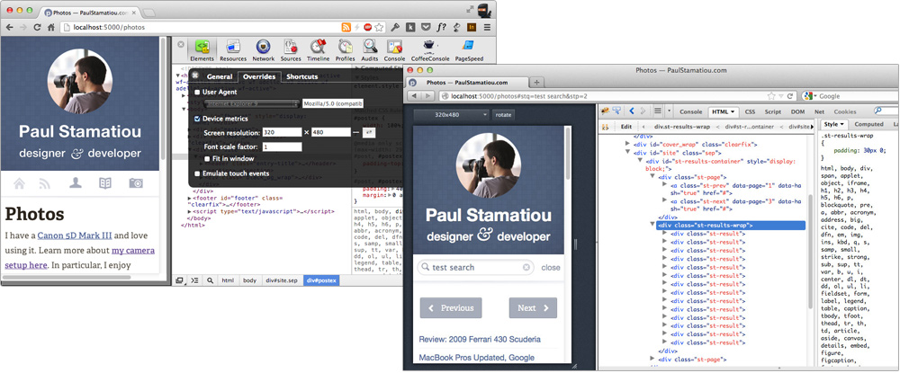
Firefox has a little known Responsive Design View and Chrome has Device Metrics
Testing with Adobe Edge Inspect
But at the end of the day you only really care about what it looks and performs like on a real device. That's why I checked out Adobe Edge Inspect. Frankly, I was blown away. It is not your typical behemoth Adobe application. It's a combination menubar app, Chrome extension and iPhone/Android app. Here's Adobe's guide about Edge Inspect.
Edge Inspects helps you remotely inspect sites on your mobile device (even locally hosted ones) and remotely grab device screenshots. Then I started actually trying to put Edge Inspect into my dev workflow. I found a few annoying issues. For example, you can't actually see your media queries in the remote inspector. That's kind of a big deal. To get around this, Adobe suggests you manually put each of your media queries in separately linked files, not as @media blocks in your CSS. No thanks.
Edge Inspect is definitely promising, but it has a few showstoppers at the moment.
Responsive Text with viewport-percentage length units
Want text to get larger as the viewport increases so you can keep your measure the same while keeping the layout fluid, all without resorting to tons of breakpoints to constantly adjust the font-size? You can use viewport-percentage lengths: vw, vh, vmin, vmax.
I'm not currently using them due to lackluster browser support, but I find it worth mentioning. Until we get better support or a performant polyfill for these units the next best thing is FitText.js (only use it for headers, not body content). That's the same reason I haven't been using rems as much as I'd like. EDIT: Paul Irish pointed me to a new polyfill, vminpoly, for this.
300ms of doom
Mobile Safari and other iOS and Android browsers have a feature which introduces a slight 300ms delay between a tap and actually becoming active. This delay is actually rather noticeable. Google talked about this in January 2011 in their now popular guide Creating Fast Buttons for Mobile Web Applications:
The problem with this approach is that mobile browsers will wait approximately 300ms from the time that you tap the button to fire the click event. The reason for this is that the browser is waiting to see if you are actually performing a double tap.
Fortunately, we can remove it and make the site seem faster and more responsive with a browser polyfill called FastClick; an adaptation of Google's concept.
In this example below, I load FastClick asynchronously only for iOS devices; I've heard there are some Android issues but haven't tested myself yet. I use the tiny JavaScript loader head.js for this since the majority of my visitors won't need to load FastClick. If you already use RequireJS, FastClick is an AMD module so it should just work when you require it.
# Coffeescript: load fastclick if mobile safari
if navigator.userAgent.match(/(iPhone|iPod|iPad)/i)
  head.js "js/fastclick.min.js", ->
    window.addEventListener "load", (->
      # ideally you would call it directly on the links/btns rather than the body..
      new FastClick(document.body)
    ), false
Enable :active link states
While we're talking about mobile, we can enable CSS active states on links by adding a touchstart event listener. This is only necessary if you have defined your own custom link active states that you want to use instead of Mobile Safari's default gray tap–highlight color. For example, I have a simple active style of orange links and then a subtle "pressed in" inner shadow style for my buttons.
// remove the default gray highlight
html { -webkit-tap-highlight-color: rgba(0,0,0,0); }
# Coffeescript: enable :active pseudo in mobile safari
document.addEventListener "touchstart", (->), false
Twitter Cards in yo' <head>
Before I was ready to push everything live I added support for Twitter Cards. You might not know the name for it, but you've certainly seen tweets that have certain snippets of content and metadata attached to them. Twitter wants to keep the experience consistent across devices and giving them some data helps them do that for you.
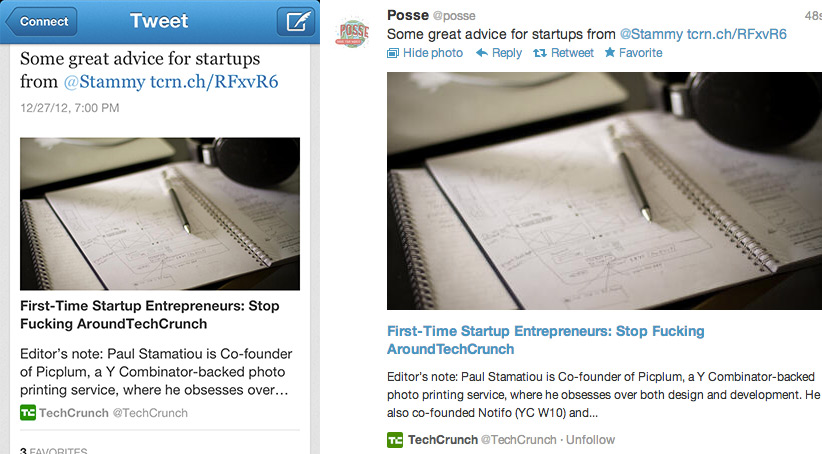
Twitter Cards as seen in their mobile app and on the web.
Setup is just a few lines of meta tags. I added their tags for photo and summary cards. To do that, I used Jekyll liquid syntax to determine whether it was a regular post or a photo post. (Unrelated but do you know how hard it is to post escaped liquid syntax with pygments?.. all of the hacks)
{{ "{% if page.layout == 'photo_layout' " }}%}
  <meta name="twitter:card" content="photo">
  {{ "{% if page.image_lg " }}%}
  <meta name="twitter:image" content="{{ "{{site.cdn" }}}}{{"{{page.image_lg" }}}}?w=560">
  <meta name="twitter:image:width" content="{{ "{{page.photo_width" }}}}">
  <meta name="twitter:image:height" content="{{ "{{page.photo_height" }}}}">
  {{ "{% endif " }}%}
{{ "{% else " }}%}
  <meta name="twitter:card" content="summary">
  {{ "{% if page.image_lg " }}%}
  <meta name="twitter:image" content="{{ "{{site.cdn" }}}}{{"{{page.image_lg" }}}}?w=120">
  {{ "{% endif " }}%}
{{ "{% endif " }}%}
<meta name="twitter:site" content="@stammy">
<meta name="twitter:creator" content="@stammy">
<meta name="twitter:url" content="https://paulstamatiou.com{{"{{page.url" }}}}">
<meta name="twitter:title" content="{{ "{{ page.title " }}}}">
<meta name="twitter:description" content="{{ "{{ page.content | strip_html | xml_escape | truncate: 200 " }}}}">
Much of those page properties (image_lg, photo_width, photo_height) are YAML front matter attributes unique to my layout. Chances are you'll only need the meta tags for the summary card which doesn't require an image. As I'll explain later, the image size params are resized on the fly to the maximum width allowed by Twitter – 560px for photo cards and 120px thumbnail for summary cards.
Then I added some Open Graph tags, which are also pretty self-explanatory.
Share this post :) Part 3 coming soon
What's your mobile web development process like? Have you worked on a mobile first or responsive site yet? Let me know in the comments below or shoot me a tweet.
If you'd like to learn more about media queries and responsive development, take a look at this article about responsive design with flexbox or this RWD guide. I haven't read either of them but they look legit.
Note: This post is part of a series documenting the design and development of this blog. The first part was Designing a responsive, Retina-friendly site. The third post is published here.
1 Take a look at the Rakefile from Octopress for example.
2 It is likely that grunt v0.4 will be out by the time you read this and that introduces some new syntax, so keep that in mind.
3 Digestification basically means append the md5 hash to the filename so that every file is unique and there are no cache issues when pushing new files. For example, screen-201e33eaffa31ab1a1fde5564bb30631.css.
4 That translates to 6.875mm on the iPhone and 8.536mm on the iPad and ~7mm on the iPad Mini. Though Nielsen Norman Group in their 2nd edition iPad Usability study suggest that 1cm by 1cm with adequate spacing in between performs best.
5 That would entirely disable users from manually pinching and zooming, which I think is a usability concern regardless of how much you mobile optimize your site.
6 Notice how I've used the word "conditionally" several times.. responsive design is really about various conditions to which your site — from JavaScript and CSS to images and videos — must react.
7 Measure is the length of a line of text. Word of thumb is 40-75 characters per line for good readability.
8 Not currently out as of this writing, but you can install via gem install sass --pre