Designing a responsive, Retina-friendly site
It's hard to believe I have been blogging for more than 7 years. Michael Wozniak, my hallmate during my freshman year at Georgia Tech, had gotten me into Gentoo Linux the year prior and told me he was playing with WordPress 1.2. Compared to the MediaWiki site I was running at the time that piqued my curiosity and I began blogging on WordPress on my G4 Mac Mini that summer. I immediately fell in love with it and began learning CSS and PHP to tweak the theme1.
Eventually I found my thing – writing technical guides, product reviews and tech editorials. I still remember the feeling when I noticed one of my articles got picked up by Lifehacker. Then digg. Then 5 other sites. 20,000 uniques in 4 hours. I wrote a follow up to that article. Same thing. And another follow up. I received enough traffic that month in 2005 to kill the hard drive in my dorm-hosted Mac.
Unfortunately, I haven't blogged as much in recent past; my waking hours spent worrying about startup issues than crafting new content. Things I would have blogged about in the past are now published as tweets.
When the time arises, I thoroughly enjoy writing long-form articles and with that in mind I wanted to design a better experience for consuming them.
Note: This article got rather long (15,000 words), so I split it up into a few posts. This one is about design. Developing a responsive, Retina-friendly site (Part 1) covers responsive development while the third part will cover responsive images.
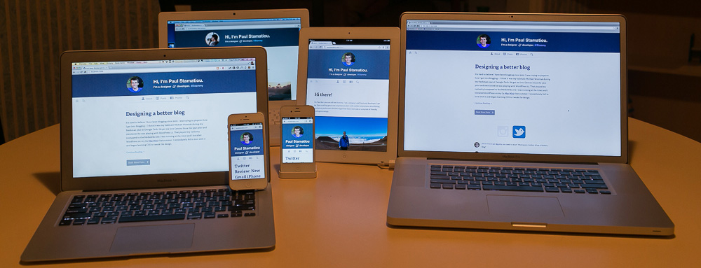
Mobile
My last redesign in 2010 was not built with mobile in mind. It was more of a lets-get-this-new-Jekyll-thing-working project than a planned website overhaul. Visiting on an iPhone meant the typical double-tap-to-zoom fiasco.Having seen my traffic breakdown go from 3% iPhone and 2% iPad in 2011 to 7% iPhone and 4% iPad in 2012 I knew it was time to focus on the mobile experience throw mobile visitors a proverbial bone. iPad visitors in particular spent more time on site than desktop or iPhone visitors. Approximately 132,000 people read this site on a mobile device in 2012. Damn.
These numbers are only going to grow. It helps that proliferation of LTE networks and devices means the fastest Internet connection people have will likely be on their smartphone, not their home connection. That's crazy.
Picture Perfect
Many of my posts and reviews are filled with my own photos. My blog actually got me into photography. I first purchased a DSLR to take better pictures for articles and product reviews. In the last 3 years I have fallen in love photography. But most of my shots were getting published on Instagram. It made me feel a bit bad that I don't often share many of my photos on my blog.
I liked this photo so much that I was vexed I couldn't share it with my Instagram followers. I began pondering about a clean way of sharing it on my blog.
The Retina Revolution
If I was going to touch my site, it would need to be Retina friendly. I'll be referring to Retina as the device agnostic term HiDPI from here on out. What does that mean? Every icon, background or image used should look crisp on HiDPI displays. The most pressing area for that is on mobile devices as there aren't yet that many HiDPI desktops and laptops out. As much as people love the Retina MacBook Pros, that's not even a single percentage of anyone's web traffic yet.Don't expect to have a HiDPI 27-inch display just yet. The first 4K (3,840 x 2,160) big displays are shipping and they are expensive.. around $5,500. But in 2-3 years? That'll be another story entirely; HiDPI displays will be standard on most high-end desktops2.
If responsive web design was the fad of the web design/development community for the last few years, the next one is going to be HiDPI support. With HTTP 2.0 (with SPDY forming the starting point) slated to drop in 20143 it will be perfect timing to combat the larger filesizes needed for HiDPI image assets. As I'll discuss in the second part of this post, there are some development challenges associated with this.
Design
I wanted to completely rethink my site, not just a add new coat of candy paint. I planned to rewrite copy on all static pages, reorganize content as necessary and generally simplify things. This would also give me a good excuse to start using more semantic HTML5 tags.
My design process was a little different from how I mentioned it in my ridiculously popular Crash Course: Design for Startups. I usually start with some inspiration-wrangling, a few ideas about direction and lots of sketching before any Photoshop or code. I couldn't exactly whip out a big sketch pad in lovely last-minute seat 37B so I worked in Photoshop for most of my 6 hour flight back to SF (until they started playing How I Met Your Mother).
If you need to use something like Readability or Safari Reader to read my articles, I've failed as a designer.
I began thinking single column. The content should be the star of the show. No sidebars or extraneous post metadata that gets in the way of reading. If you need to use something like Readability or Safari Reader to read my articles, I've failed as a designer. And lets not forget the impetus behind this rethinking; I wanted to be able to publish large photos – within posts that extend beyond the narrow copy and also on individual photo pages. Bandwidth and latency be damned, I want to show dozens of 1000px+ wide photos at a time.
Planning Mobile First RWD
The premise behind Mobile First Responsive Web Design4 is that you should trim your site to only the essentials, establish the priority or question the necessity of all elements and focus on mobile before adding complexity for larger/desktop versions of the site. This is going to sound ridicu-cheesy, but this is a way of thinking and it applies to every aspect of your site planning. Even down to writing mobile first CSS to keep things lightweight and simple and conditionally load extra stylesheets and content for larger devices (that are also likely to have faster connections) as necessary.Categorizing your site into pieces and setting priority before even pondering aesthetics stems from Dan Brown's page description diagrams back in the early 2000s.
The page description diagram, by demonstrating priorities and providing a context for the content and functionality, gives visual designers the information they need to create an effective layout.
It's a great little exercise when embarking on a redesign. Given that this site only has a few pages and then blog posts, it wasn't really needed. For the sake of teaching, I'll elaborate a bit. You generally start with three columns from high to low priority page elements. You list out each element and you can optionally provide a description of it and a simple wireframe of that element.
| High | Medium | Low | ||
| Archives/Posts | RSS/Subscribe | Contact | ||
| Photos | "Bits" (asides) posts | Search | ||
| About | Comments | "Stuff I Use" page | ||
| @Stammy | FB/Twitter share | |||
| Post metadata, date |
Some of this organization was by personal preference and some was metrics-driven. Take the post date for example. I have some articles dating back 7 years and I don't want to advertise that the content may be outdated5, so I place less importance on that and display the publish date after the post. For the most part my articles are evergreen and more of my content is becoming less product reviews and more editorial.
I've also found that time on site increases when users don't see the post date immediately. The majority of my visitors come from Google SERPs and they'll leave without reading if the first thing they see is that the content is more than a year or two old. Increasing time on site also tends to decrease bounce rate for these Googlers. After reading the post they are likely to open up a few other articles I link to or just browse around for another pageview. It's important that I do whatever I can to capture that first time visitor.
If someone won't share a post because I don't have a Twitter button in 10 places on the page, then I'm writing pretty crappy content.An example of priority based on personal preference is my decision to place low importance on Facebook and Twitter sharing functionality. I like to believe that if the content is good enough, people will share it on their own accord. I also didn't want to load Facebook and Twitter javascript. This gives me a mental test before publishing.. is this content really good enough to publish?
I could simplified things more by merging my "bits" (smaller posts) into the main posts section. Bits had their own RSS feed and index page. It was another navigation element; another forced decision upon visitors to visit another page. Bits now appear styled differently inline with the rest of the posts.
But I messed up. When I first did this page description diagram I prioritized search functionality as high. My first header designs as I'll show below had a huge search bar next to the main navigation as if it was one of the most important elements on the site. I looked into my Google CSE analytics ‐ search was rarely used; less than 10 queries a day on average. Only 8,500 on-site searches in the last 3 years. I since relegated search to low priority on this diagram.
Where to begin with visual design?
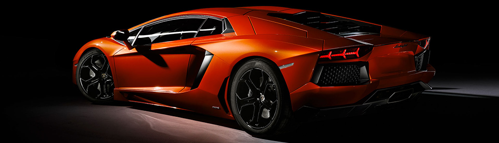
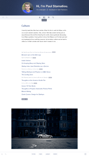
After that basic IA and planning was out of the way, I had a good idea of what to include in the header. I was going to distill it down to the essentials. There would be such little difference between the mobile version and larger responsive versions that I wouldn't really need to plan the responsive designs. The focus is on the content at all times, not just on mobile, so there's no need for me to do any content choreography and adjust layouts between responsive designs. No sidebars to hide or move, et cetera.Some designers start with a blank slate of copy and begin with typography and layout, while others begin with the site header and navigation. I began with the header. I tend to start my designs on an extreme with the intention of toning it down later as necessary. As a tiny example of that, I made the avatar and header text much larger than I was comfortable with. If you only ever design within your comfort zone, you won't come across unexpected ideas that you may end up loving. That's how the folks at Lamborghini design 2 too — starting with the most absurd and extreme lines that come to mind.
I previously had a terse Twitter-like bio on the top of my homepage and decided to further reduce that into a subtitle. As for having my avatar there, I wanted to put a face to the content, much like people have become accustomed to seeing a face next to every tweet.
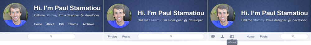
Below you can see some early versions of the header that I was left with by the time the flight was ready to land. The one on the left was the first stab. It felt like there were too many menu items and the search just didn't line up. The middle version was my attempt to distill navigation into the most important elements, posts and photos. I wasn't happy with the visual hierarchy there either and it made search look too important. In the third iteration I began playing with icons to minimize space used by navigation. I was trying to line it up under the avatar, but I had too many menu items and it just looked weird.
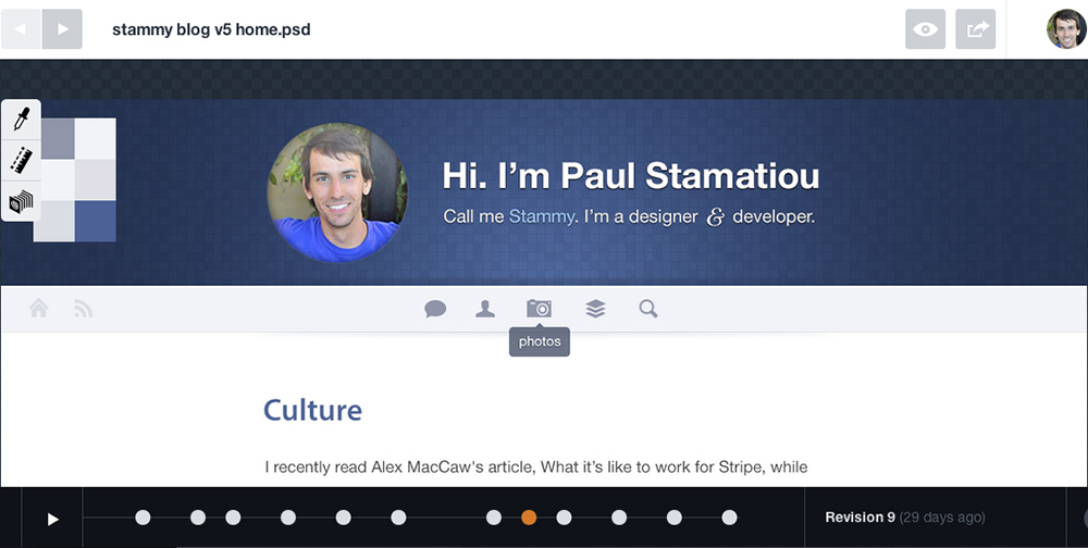
Around this point that I dug into my metrics to find out that search wasn't used much. I initially opted for icon-only navigation with tipsy-style tooltips, but felt it violated Rams' "as little design as possible" principle, in addition to being cumbersome (having to hover over each icon first to see what they meant).
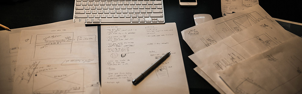
Some hours of tinkering later I ended up with my current design with only three main navigation elements. In between Photoshop iterations, I would constantly sketch UI on paper to refine my ideas. Just drawing any tangentially-related solution that came to mind helps organize my thoughts.
Keeping track of iterations
I've made it a habit over the past year to constantly take screenshots of my designs in progress. Either of Photoshop work or in-browser tweaks with Chrome dev tools. Over the course of this blog design I ended up with 67 screenshots. It's nice to be able to go back and trace your thought process over again. Danny Hertz from Twitter had an interesting idea about how to automate this with Selenium, but I digress.I've started using LayerVault to help me with this. It's like GitHub for PSDs and you can visually flip through your PSD revisions.
The Sandboxed Cover Photo
Going along with my wanton lust for big photos, I also designed a second header to be displayed for particular posts and pages that have a cover photo defined in Jekyll's YAML front matter. I built it (and incorporated some slick parallax scrolling) but decided not to use it. I'm not quite sold on it yet. Back to the sketch pad.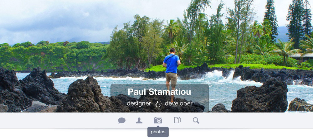
I've got the blues
At this point, the design was coming together and needed to focus on typography, make a simple footer and some button styles.I created a muted blue shade button style to use throughout the site.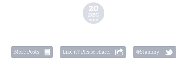
As we all know you should never use black so I chose a fairly muted color palette of desaturated blue shades. For one, blue is awesome and two cooler colors recede and since the content is the centerpiece here I want it to stand out. My main copy is a subtle warm gray, as warmer colors come to the foreground.
Not all displays are alike
I wanted to get some feedback on a PSD so I showed it to my friend Anand on my MacBook Air. I quickly realized that I could barely see parts of the design! The colors were way too light. I had been designing the whole time on a 27-inch Apple display and a 24-inch Dell display that made them seem like they had adequate contrast. Not so on any Apple laptop I tested it with.Enter WCAG 2.0. Yes, another W3C acronym! The Web Content Accessibility Guidelines cover various aspects of website accessibility, including contrast minimums. There is actually a rating system for contrast! It takes text size, color and background color into account to come up with an AA or AAA level.
No need to worry, Lea Verou came up with a handy tool called contrast ratio. Punch in your color and background color to see if it has adequate contrast. But if you have to ask yourself if there's enough contrast, there probably isn't. I still need to darken the color of my footer links, they're a bit light.
Serifs.. on the web?!?
I decided to go with the lovely serif Adelle for article headings and text. It's the first time I've really used a serif on the web.
I've grown up being told that you shouldn't use serif typefaces on the web—the serifs themselves6 on certain curvy typefaces don't lend well to being displayed with a grid of pixels unless the particular font has been properly hinted (unlikely). Well, my official stance is this all matters less when you're dealing with HiDPI displays so I'm going for it.
If you want good type on Retina displays, stop discussing hinting et al. Just search for faces that happen to look good. Like the old days.
Erik Spiekermann
You can learn more about web typography with this interactive guide or The Elements of Typographic Style Applied to the Web.
Photo Layout Ideation
Up until this point, the homepage mockup in Photoshop just had an article excerpt, a list of recent posts and then a few photos. I thought it would be interesting to show more information about the photos on hover.
 After I was satiated with hover style, I quickly coded it up ghetto-style directly in Chrome dev tools to see how the interaction felt. I'm glad I made a prototype first because I quickly realized that hovering over each photo and then displaying a full-width overlay was jarring and abrupt to the user.
It could also be inadvertantly triggered while scrolling down the page and it was unexpected. It taking up too much space and you couldn't see the photo while reading the title. Not to mention how would I make this mobile web friendly? I wanted to have it always display on mobile but that wouldn't work if it hid the image.
Then I thought about having it only appear on the bottom section of the image on hover.
That almost worked but then there was the case of longer photo titles wrapping and looking unpleasant. I decided to forget the image hover stuff and instead vertically stack the photo metadata and put it below the image in its own photo layout. Again, I quickly marked it up to see what the experience was like in the browser. It worked, but I had another problem now.
Having the same large site header and navigation took too much attention away from the photo itself.
I kept removing and de-emphasizing elements until it was clear the focus was on the photo. This brings up a tradeoff with usability though. This breaks the user's expectation of a consistent and familiar header navigation that they are familiar with on all other pages of this blog. I decided that was an acceptable tradeoff when the user is moving into a photo viewing mode. I added left/right arrows that display on the image on hover, and bind the left/right cursor keys so visitors can browse other photos easily. Since photo pages are not long, there was a simplified footer with all the necessary navigation to get back to the homepage.
</design>
It was a bit challenging for me to explain how I approached the design of this blog. It's one thing to explain the finished product but it's another to explain all the iterations in between and how you got from one to the next. It's a lot of fiddling, having a few rules of thumb and constantly questioning yourself about those designs.Subtletly, something I also mentioned in my design crash course, is one of those rules of thumb for me. I very, very often find myself thinking "can I make that lighter?", "can I remove this line?" and so on.
If there are any visual garnishings, such as a button block sheen or inner white glow on a menu bar background, that don't serve a functional purpose (like grouping sets of elements together for Gestalt Law of Proximity), it can and likely should be de-emphasized by changing color, reducing opacity or removing it altogether.
I spent a few hours per day over the course of about a week and 19 PSDs coming up with this before doing any real coding aside from prototypes to test certain design decisions. The design of this blog is still a work in progress and I'm sure I'll be changing things in the near future.
Share this post :) Part 2 coming soon
What's your design process like? Have you worked on a mobile first or responsive site yet? Let me know in the comments below or shoot me a tweet.Note: This post is part of a series documenting the design and development of this blog. The next part(s) covering development in great detail will be posted this coming week. Developing a responsive, Retina-friendly site (Part 1) covers responsive development while the third part covers HiDPI and responsive images: Developing a responsive, Retina-friendly site (Part 2).
1 Several redesigns later I ended up making and releasing my own theme, 281, that ended up becoming an option on WordPress.com.
2 I remember paying more than $700 for my first 80GB SSD (and then another for RAID) in late 2008. Now they're affordable and ubiquitious on any decent computer.
3 HTTP/2.0 to be submitted to IESG for consideration as a Proposed Standard in November 2014.
4 You can read more about Mobile First in Luke Wroblewski's excellent book.
5 I know this is a controversial issue. Some people despise sites that don't list publish date adjacent to the title. But as a site owner, it benefits me to put it after the post.
6 By my use of "serif" here I don't mean the typeface but the small lines shooting off the edges of letters.