New Logo, New Design
For the past month, I have been working closely with designer Mike Rohde on developing some personal branding - essentially a logo for this site, my business cards, etcetera. The logo has been completed and as such I tweaked this site a bit to accommodate for it.
There are a few things here and there that I would like to implement in the near future. I kind of rushed this design out as I’m flying home to Texas tomorrow for my sister’s wedding, where I will be a groomsman and self-acclaimed backup photographer.
As with all new designs, it might look weird for you until the new CSS file gets called - so refresh a few times, or in Safari hit shift+refresh to purge the cache for my site. Also as usual, I didn’t have the time to do IE6/7 testing, so things might look wonky on that front. Let me know what you think.
You can see all of Mike Rohde’s work from brainstorming to completion in this flickr photoset I made. I’m happy with the new logo and plan on making a ton of business cards with it. I think investing in personal branding like this was one of the best things I’ve put money towards, even if it did cost more than an iPhone. Thanks to everyone who commented on the logo design process on flickr.
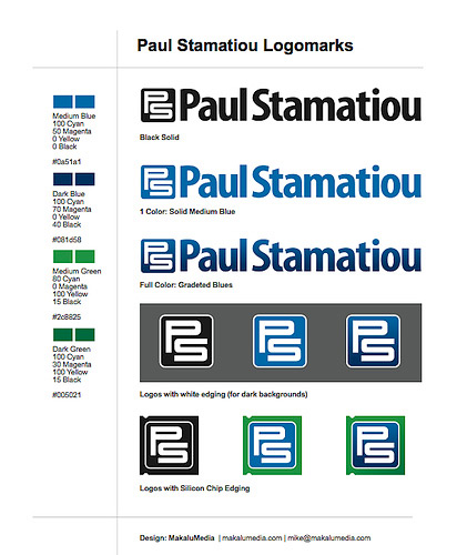
Oh and speaking of the iPhone, I finally got my BlackBerry Curve. I don’t know why I ever waited so long to get a BlackBerry.


Love the new design! Awesome job!
Totally awesome and sexy. Love the logo, typography is really strong.
Dimitry
Super schlick, man.
Well done.
the site has taken on a much more professional and cleaner tone.
Good work!
The logo seems a bit clunky, but it still looks great.
Now that you’ve revamped it’s time to clean out that horrid sidebar maybe? ;)
Very clean, sharp and contains just enough color to remain exciting.
Great job, Paul.
I like this design a lot Paul, nice work.
I like the design, Paul, it’s looking good. Out of interest, do you plan to put up the headshot and the “Paul is a student at…” in the right of the header again? It’s just that you’ve got it in the screenshot, but it’s not showing up on the actual blog.
I don’t think it really matters, but there’s a bit of white space there you could use for something.
@Brian - it’s up for me. what browser are you using? try refreshing 1000x maybe? =)
Looking pretty sharp. I love how the logo is almost the exact size of the blog link in the nav bar. Kudos man, this is good stuff.
Nice tweaks. The logo is cool too.
@Snook - yeah that happened to be a nice coincidence.
I love how simple this site is!
It’s mainly text, no nonsense. Nice work, Paul.
Nice new design.
Check out print100.com for business card printing. Their site looks terrible, interaction is terrible, but all that aside the prices for full-color two-sided business cards is incredible. I had my color matched to a pantone color. They also offer some cool extras at low cost such as UV Varnish (think glossy cover over selected areas, custom die-cut shapes, rounded corners and more). All the templates are downloadable and my designer had no problem working with their instructions. They are quick and ship for free Fed-Ex overnight from Hong Kong!
If you want, I can send you a copy of my 4×6 postcard and business cards which they printed with the UV Varnish as an example. I would suggest signing up for a mailer with some examples of their work too.
I am not affiliated nor was I paid for this mini-review, just a happy customer! Although, if you think about ordering I can send you a link because they do referrals.
@Paul - when I use IE7, it doesn’t display the headshot and the “Paul is a student…” bit. With FireFox, and Opera, it displays fine.
Thanks for the info Ian. I created a few design samples with overnightprints.com but I’m willing to try new services. I’ll contact you if I go with them/finish designing my new cards.
Hmm. I like it, though I miss the blue top and the defined blue page end- the light light blue is hard to see. The new blue kind of reminds me of 90’s tech companies- at least it’s not teamed with silver/grey.
Still, looks sharp!
Took a few refreshes to get the homepage to display properly, theres an odd 1px gap in your navigation bar that makes the header seem a little weird. Very nice logo as well, you might have to redo your favicon
and the stats are gone! or I’m blind? Like the new submit button.
@titanium_geek - they have found a new home on the archives page.
Nice!
Great design Paul! Love the dark shade of blue that you are implementing now. On IE7 (Win XP) the site looks just as it is supposed to, but on Firefox (Win XP) the navigation and the Twitter bar are slightly different from the screenshot. The active navigation link is a pixel above the Twitter bar.
Paul - I think it looks great and I really like the blue and green silicone chip I hope you find a good use for it.
@Arjun - do you think you can provide me with a screenshot?
Loving it, great job!
Looks real sharp Paul, much more pro. Well done! (And great work from Mike, as usual!)
Looks clean, and the darker blue is very smooth.
Nice work.
Nice logo and a clean design.
Congratulations Paul !
This reminds of me something boring like your apartment in ATL:)
Your feed isn’t loading for me… Could be my flakey ‘puter though.
Have you updated the feed/site icon? It’s a black and white PS on my livebookmark, yet the same old P on the tab/url bar.
Really like it - the stronger blues particularly :)
Very nice - and you beat me by one day :-)
Very nice Paul, I like the strong blue against the white.
On a completely different tangent altogether, I only just noticed the sexy bit of javascripting with the scroller on flickrslidr.com, very nice work!
Awesome Paul ! good work mike !
hey now you should provide us your old theme for download ! eagerly waiting for your reply
new design/logo looks great Paul. I def agree that it is worth the money to spend on personal branding.
Also when can we get a bb curve review?!! is that ever going to come out for verizon?
Site looks great! I like the new shade of blue.
BTW, I finally picked up a BB 8800 and like you, I cannot believe I waited so long to get it. This this is awesome.
I can now email, IM (AIM, MSN, GTalk), and surf the web from the convenience of my pocket. It’s great!
We will have to get together to make a comparison.
I like it a lot. Excellent work.
cool. like it. congratulations.
Looks great Paul. Nicely done.
There you go mate
http://flickr.com/photos/arjunattam/534565799/
This new blue really makes the site pop! It looks great! Love the logo and the contrast it brings into the design. Great choice and well done!
Really nice Paul, the dark blue is very eye-catching against the white. You might want to slightly fix the face icon, (top right), it looks slightly off-white on my screen.
@Adam, you’re right. The background on my mugshot is still a light blue from the last design.
Very nice - looks very pro! You planning to do a review of the of the Blackberry Curve? I’m interested in getting one but am unsure whether to wait until the iPhone comes to the UK (which could be 2008!).
Good stuff man, it all looks nice. Especially the logo.
Beautiful new logo man! Definitely an eye catcher!
Nice subtle updates Paul, makes me want to change things up again… A fan of that new logo. Great for avatars, mini logos, etc. Mike did a great job.
That’s a really nice shade of dark blue :).
for some reason i like it better on my macbook but think the old design was alot better on my pc. do like the dark blue though.
Love the design and boldness of it. One minor suggestion… bring in another accent color to contrast with the bold. I’d try something with a bit of color and this design will pop.
The design overall is very professional and legit. Good work!
Very nice design Paul! Subtle, but elegant!
I really like the new design Paul! I don’t know if this is what you were going for, but it appears a little more “professional” now than it did before.
Great work!
Dude!!! The new design is hot!!!! Very crisp. Now you’ve got me wanting to re-design my blog!!
^_^
It looks great! I really like the colors. I also like the logo, I could use the same one, cause we have the same initials lol. I thought about making a logo for myself… but it is hard to make a logo for my name.
I like the older logo, before your last redesign, where it was also a search box, and i like the old blue better than this dark blue. If it ain’t broke, don’t fix it. Just my two cents.
Hey Paul
Always feels good to get a new site design ,,
It looks great ,, congrats
Im doing the same with my photoblog http://www.fotoshift.com
johnpiercy
I like the new stuff, Paul. It’s still subtle staying consistent with the older designs, yet bolder and sleek. Also, the blue is an awesome shade.
Photoshop, anyone?
Looks good Paul - branding is important, even if it was more than the iPhone, it’s with you for a long time or forever, so a that price it’s pretty reasonable!
Definitely much better than before. Congratulations!
great design you have reminded me i need to do mine too :)
Great Paul! I love it.
I think the logo is good, but I still don’t like the color changes. I think you could make your headings for the articles bigger too (did they shrink or am I imagining that?). Also on the headings, maybe create a little space between the date and the start of the article too, that part always looks cramped to me. Also, the comment form is a downgrade IMO, including the submit button.
Nice job on the logo. Looks sharp. Cheers.
some tactile/visual feedback on the submit button would be nice. AKA a hover effect. it’s a bit “flat” at the moment. As someone who “thrives on tactile feedback from [real] buttons” I would think you would make sure the buttons on your site would indicate their responsiveness. :)
I really like it, very clean. Looks good!
I think your money was well spent.